Purpose
SoMenuItem is a menu item for use with SoBorderMenu, SoFixedMenu, or SoPopupMenu.
Usage
Add SoMenuItem nodes to an Open Inventor scene, and add one of the menu nodes after that.
Make sure that the Parent Id is the same as the SoBorderMenu.menuId of the targeted menu, or the Sub Menu Id of another menu item if you want to have submenus.
Details
This item is intended to replace SoView2DMenuItem.
Interaction
See the targeted menu for interaction.
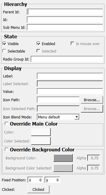
Windows
Default Panel
Output Fields
self
- name: self, type: SoNode
Add this to the scene.
Parameter Fields
Field Index
|
|
|
|
|
|
|
|
|
|
|
|
|
|
|
|
|
|
|
|
|
|
|
|
|
|
Visible Fields
Id
- name: id, type: String
Sets the ID of the menu. Only needed if you plan to differentiate the clicked items from the menu node.
Parent Id
- name: parentId, type: String
Sets an ID that is either the
SoBorderMenu.menuIdof a menu node, or theSub Menu Idof another item.This tells the menu system that this item shall appear in the (sub) menu of the targeted menu node/menu item.
Radio Group Id
- name: radioGroupId, type: String
Sets the ID of a radio item group.
If an item with this radio item group ID is selected, all other items with the same radio item group ID are deselected (even if the clicked item is not selectable).
Visible
- name: visible, type: Bool, default: TRUE
If checked, this item appears in the targeted menu.
Enabled
- name: enabled, type: Bool, default: TRUE
If checked, the user is able to interact with this menu item.
Color
- name: color, type: Color, default: 1 1 1
Sets the override color for the text (and the icon, if the item has a grayscale icon) of this item if not
Selected.Only applied if
overrideColoris true.
Color Selected
- name: colorSelected, type: Color, default: 1 1 1
Sets the override color for the text (and the icon, if the item has a grayscale icon) of this item if
Selected.Only applied if
overrideColoris true.
Background Color
- name: backgroundColor, type: Color, default: 0.400000005960464 0.400000005960464 0.400000005960464
Sets the override color for the background of this item if not
Selected.Only applied if
overrideBackgroundColoris true.
Alpha (backgroundAlpha)
- name: backgroundAlpha, type: Float, default: 0.75, minimum: 0, maximum: 1
Sets the override alpha value for the background of this item if not
Selected.Only applied if
overrideBackgroundColoris true.
Background Color Selected
- name: backgroundColorSelected, type: Color, default: 0.699999988079071 0.699999988079071 0.699999988079071
Sets the override color for the background of this item if
Selected.Only applied if
overrideBackgroundColoris true.
Alpha (backgroundAlphaSelected)
- name: backgroundAlphaSelected, type: Float, default: 0.75, minimum: 0, maximum: 1
Sets the override alpha value for the background of this item if
Selected.Only applied if
overrideBackgroundColoris true.
Fixed Position
- name: fixedPosition, type: Vector2, default: 0 0
Sets a fixed position for this item.
If and how this is used depends on the menu node.
Is Mouse Over
- name: isMouseOver, type: Bool, persistent: no
Shows whether the mouse is over the menu item (and ready to interact with it, which also depends on the configured mouse/keyboard bindings).
Label
- name: label, type: String
Sets a label text for the menu item.
Label Selected
- name: labelSelected, type: String
Sets a label text for the selected menu item. If empty, the normal label text is used.
Value
- name: value, type: String
Sets a value string that is appended to the
LabelorLabel Selectedstring, separated by a space (if non-empty)
Icon Path
- name: iconPath, type: String
Sets an optional path to an icon image for this menu item.
If this is a grayscale image (that is, it has one or two channels: luminance plus possibly alpha), the text color will be applied to the icon as well.
Icon Selected Path
Icon Blend Mode
- name: iconBlendMode, type: Enum, default: IconBlendDefault
Defines the blend mode for the icon.
Values:
Title |
Name |
Description |
|---|---|---|
Menu default |
IconBlendDefault |
Use this to use the blend mode of the menu ( |
Replace |
IconReplace |
|
Blend |
IconBlend |
|
Pre-multiplied blend |
IconPremultipliedBlend |
Selectable
- name: selectable, type: Bool, default: FALSE
If checked, this menu item can be selected.
Selected
- name: selected, type: Bool, default: FALSE
Shows whether this item is currently selected.
Clicked
- name: clicked, type: Trigger, persistent: no
This field is triggered if the menu item is clicked.