Purpose
The module SoView2DMenu collects a number of SoView2DMenuItems from the scene graph and makes them visible and/or selectable for a user in the Open Inventor display.
It requires that a SoView2D follows somewhere in the scene graph to draw the menu.
Usage
Note
This module can only be used correctly in one viewer at a time. Sharing between viewers will lead to interaction problems and a high CPU load.
Interaction
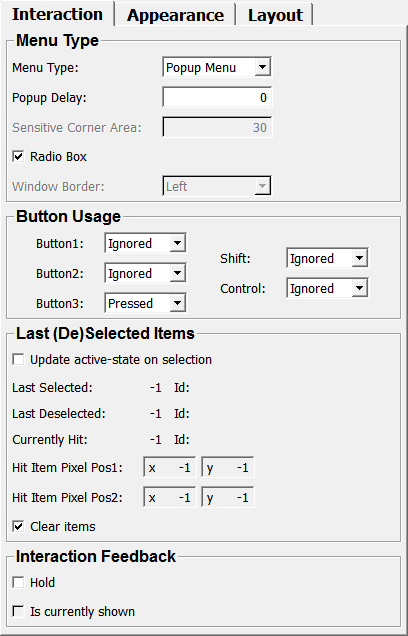
This node offers different modes how to interact with a menu. The menu can be visible or invisible while interacting with it. Use the Popup Delay time to specify how long the menu pop-up shall be delayed.
It is also possible to activate a one-of-n selection mode (by enabling Radio box) to avoid that more than one item is activated at a time. Otherwise, any selectable subset of items can be enabled or disabled. Notifications of selected and deselected items can be queried by connecting your module with the Last Selected or Last Deselected fields.
The SoView2DMenuItem nodes can be configured to react differently to events. The SoView2DMenuItem.sensitive field controls whether the item can be selected or highlighted. An item itself can function as a toggle button (SoView2DMenuItem.useAsButton), whose state is toggled when selected, or as a normal button that can be selected temporarily; however, upon releasing the mouse button, it returns to its inactive state.
Windows
Default Panel
Output Fields
self
- name: self, type: SoNode
Parameter Fields
Field Index
|
|
|
|
|
|
|
|
|
|
|
|
|
|
|
|
|
|
|
|
|
|
|
|
|
|
|
|
|
|
|
|
|
|
|
|
|
|
|
|
|
Visible Fields
Color (color)
- name: color, type: Color, default: 1 1 1
Sets the color of the menu background and the menu border.
see also SoView2DExtension.color
Shift
- name: shift, type: Enum, default: IGNORED
Control
- name: control, type: Enum, default: IGNORED
Font Size
- name: fontSize, type: Integer, default: 10
Sets the size of the displayed font.
Layout
- name: layoutType, type: Enum, default: TOP_DOWN
Defines the layout type for the menu items.
Values:
Title |
Name |
Description |
|---|---|---|
Top Down |
TOP_DOWN |
The items are draw one after each other from top to bottom; the first item found during the scene graph traversal is drawn top at the |
Left Right |
LEFT_RIGHT |
Like TOP_DOWN where the first item is drawn left at the |
Circular |
CIRCULAR |
A circle with radius |
Free Normalized |
FREE_NORMALIZED |
The values from the items’ Position fields are taken as normalized window coordinates to place the item. |
Free Absolute |
FREE_ABSOLUTE |
The items are drawn at the pixel position given by the items’ Position field. |
Relative To Mouse |
RELATIVE_TO_MOUSE |
The items are drawn centered at the positions given by the sum of the items’ Position field added the |
Icon Blend Mode
- name: iconBlendMode, type: Enum, default: IconReplace
Defines the blend mode for icon drawing.
Values:
Title |
Name |
Description |
|---|---|---|
Replace |
IconReplace |
No blending, just replace. |
Blend |
IconBlend |
Enables alpha blending for icon drawing. This allows for drawing icons with transparent background (alpha channel). |
Premultiplied Blend |
IconPremultipliedBlend |
Enables alpha blending for icon drawing. This mode is useful if the color is already premultiplied with the alpha channel. |
Sensitive Corner Area
Border Width
- name: borderWidth, type: Float, default: 3, minimum: 0
Sets the width of the border around the menu items.
Show background
- name: drawBackground, type: Bool, default: TRUE
If checked, a background around the menu items is drawn.
Radio box
- name: radioBox, type: Bool, default: TRUE
If checked, only one menu item can be active at any one time.
Otherwise, multiple items can be checked.
Suppress highlighting
- name: suppressHighlighting, type: Bool, default: FALSE
If checked, menu items are not highlighted. That means that they do not react on mouse-over.
Opacity
- name: transparency, type: Float, default: 0.2, minimum: 0, maximum: 1
Sets the opacity of the menu items.
Radius
Color (gestureLineColor)
- name: gestureLineColor, type: Color, default: 1 1 1
Sets the color of the gesture line.
Show
- name: showGestureDirection, type: Bool, default: TRUE
If checked, a gesture line is shown.
Disable z-buffer
- name: disableZBuffer, type: Bool, default: FALSE
If checked, the z-buffer is disabled.
Update active-state on selection
- name: updateActiveStateOnChange, type: Bool, default: FALSE
If checked, the active state is only updated on selection.
Last Selected
- name: lastSelected, type: Integer, persistent: no
Shows the last selected menu item index.
Last Deselected
- name: lastDeselected, type: Integer, persistent: no
Shows the last deselected menu item index.
Id (lastSelectedId)
- name: lastSelectedId, type: String, persistent: no
Shows the last selected menu item ID. The ID must be set in the menu item itself.
Id (lastDeselectedId)
- name: lastDeselectedId, type: String, persistent: no
Shows the last deselected menu item ID. The ID must set in the menu item itself.
Fixation Position
Normalize fixation
- name: normalizeMPos, type: Bool, default: TRUE
If checked, the fixed position is treated as a relative position in the viewer instead of an absolute position in pixels.
Propagate first item style
- name: useFirstItemProps, type: Bool, default: FALSE
If checked, all menu items have the same style as set in the first menu item.
Popup Delay
- name: popupDelay, type: Float, default: 0
Sets a delay time in seconds for popping up a menu.
Currently Hit
- name: hitItem, type: Integer, persistent: no
Shows the index of the menu item currently under the mouse cursor.
Id (hitItemID)
- name: hitItemID, type: String, persistent: no
Shows the ID of the menu item currently under the mouse cursor. The ID must be set in the menu item itself.
Hit Item Pixel Pos1
- name: hitItemPixelPos1, type: Vector2, persistent: no
Shows the pixel position of the upper left hand corner of the hit menu item.
A value of -1/-1 means that no item is hit.
Hit Item Pixel Pos2
- name: hitItemPixelPos2, type: Vector2, persistent: no
Shows the pixel position of the lower right hand corner of the hit menu item.
A value of -1/-1 means that no item is hit.
Clear Items
- name: clearItems, type: Bool, default: TRUE
If checked, all collected menu item nodes are cleared if handled by the menu.
This allows a separation of several menus in one scene graph.
Hold
- name: hold, type: Bool, default: FALSE
If checked, the menu status stays the same even if mouse events occur.
This option can be used, e.g., to handle submenus (if the submenu is shown => hold the status of the superior menu).
Is Currently Shown
- name: isCurrentlyShown, type: Bool, persistent: no
Shows whether the menu is currently shown or not (e.g., this field is combination with the “hold”-field of another menu to realize submenus).
Window Border
Defines the style of the menu item border.
Values:
Title |
Name |
|---|---|
Left |
BORDER_LEFT |
Right |
BORDER_RIGHT |
Top |
BORDER_TOP |
Bottom |
BORDER_BOTTOM |
Top Left |
BORDER_TOP_LEFT |
Top Right |
BORDER_TOP_RIGHT |
Bottom Left |
BORDER_BOTTOM_LEFT |
Bottom Right |
BORDER_BOTTOM_RIGHT |