Purpose
This module SoView2DMenuItem defines properties of one item for a SoView2DMenu.
If it is traversed before a SoView2DMenu it describes appearance and functionality of one item in the shown menu.
The SoView2DMenuItems macro is a predefined convenience module with 10 SoView2DMenuItem modules, which have identical settings like a SoView2DMenuItem module. The Menu Id parameters for the items are set from MenuId01 to MenuId10.
Details
A menu item can have three different states:
on: The menu item has been clicked or chosen by other means.
off: The menu item is deselected and the mouse cursor is not over the item.
over: The mouse cursor is over the menu item; it can be active or inactive.
Windows
Default Panel
Output Fields
self
- name: self, type: SoNode
Parameter Fields
Field Index
|
|
|
|
|
|
|
|
|
|
|
|
|
|
|
|
|
|
|
|
|
|
|
|
|
|
|
|
|
|
|
|
Visible Fields
Label (labelOn)
- name: labelOn, type: String
Sets a label for an active menu item.
Value (valueOn)
- name: valueOn, type: String
Sets a value for an active menu item.
Label (labelOff)
- name: labelOff, type: String
Sets a label for an inactive menu item.
Value (valueOff)
- name: valueOff, type: String
Sets a value for an inactive menu item.
Label (labelOver)
- name: labelOver, type: String
Sets a label for a menu item under the mouse cursor.
Value (valueOver)
- name: valueOver, type: String
Sets a value for a menu item under the mouse cursor.
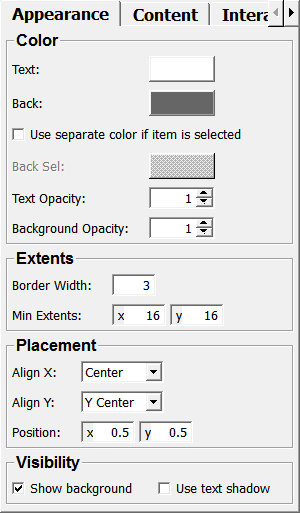
Text
- name: color, type: Color, default: 1 1 1
Sets a color the menu item’s text.
Back
- name: backgroundColor, type: Color, default: 0.400000005960464 0.400000005960464 0.400000005960464
Sets a color for the menu item’s background.
Use separate color if item is selected
- name: useBackgroundColorSelected, type: Bool, default: FALSE
If checked, a different color is used for an active menu item.
Back Sel
- name: backgroundColorSelected, type: Color, default: 0.699999988079071 0.699999988079071 0.699999988079071
Sets the background color for a selected menu item.
If only used if
Use separate color if item is selectedis checked.
Text Opacity
- name: transparency, type: Float, default: 1, minimum: 0, maximum: 1
Sets the opacity of the menu item’s text.
Background Opacity
- name: bkTransparency, type: Float, default: 1, minimum: 0, maximum: 1
Sets the opacity of the menu item’s background.
Show
- name: showItem, type: Bool, default: TRUE
If checked, the menu item is shown.
Show background
- name: showBackground, type: Bool, default: TRUE
If checked, the background of the menu item is shown.
Use text shadow
- name: useShadowText, type: Bool, default: FALSE
If checked, the text of the menu item is rendered using a shadow.
Border Width
- name: borderWidth, type: Float, default: 3
Sets the border width.
Sensitive
- name: sensitive, type: Bool, default: TRUE
If checked, the menu item is sensitive to mouse release events.
Selected
- name: selected, type: Trigger
If checked, the menu item sends a notification if being clicked.
Deselected
- name: deselected, type: Trigger
If checked, the menu item sends a notification if being deselected.
Is active
- name: isSelected, type: Bool, persistent: no
Shows whether the menu item is currently active.
Is mouse over
- name: isHighlighted, type: Bool, persistent: no
Shows whether the menu item is currently under the mouse cursor.
Align X
- name: alignX, type: Enum, default: ALIGN_CENTER
Defines how the menu item aligns the label and value in the x-direction.
Values:
Title |
Name |
|---|---|
Left |
ALIGN_LEFT |
Right |
ALIGN_RIGHT |
Center |
ALIGN_CENTER |
Align Y
- name: alignY, type: Enum, default: ALIGN_Y_CENTER
Defines how the menu item aligns the label and value in the y-direction.
Values:
Title |
Name |
|---|---|
Y Top |
ALIGN_Y_TOP |
Y Bottom |
ALIGN_Y_BOTTOM |
Y Center |
ALIGN_Y_CENTER |
Position
- name: itemPosition, type: Vector2, default: 0.5 0.5
Sets a position of the menu item. The actual position on the viewer also depends on position settings in the
SoView2DMenu.
Icon (iconOffPath)
- name: iconOffPath, type: String
Sets a path to an icon that is shown when the menu item is neither active nor under the mouse cursor.
Icon (iconOnPath)
- name: iconOnPath, type: String
Sets a path to an icon that is shown when the menu item is active.
Icon (iconOverPath)
- name: iconOverPath, type: String
Sets a path to an icon that is shown when the menu item is under the mouse cursor.
Min Extents
- name: minItemExt, type: Vector2, default: 16 16
Sets the minimum x/y extent of the menu item in pixels.