Purpose
The node SoFixedMenu shows a menu of SoMenuItem items arranged at the positions given by SoMenuItem.fixedPosition. This can be a static menu where the top-level items are always shown, or a pop-up menu, where the items are shown when the mouse button is pressed, and relative to the initial mouse cursor position.
Usage
Interaction
The interaction mouse button is the left button for static menus and the right button if Popup Menu is set.
This can be overridden with SoInteractionMapping.
Tips
If Popup Menu is false, the same tips as for SoBorderMenu apply.
Windows
Default Panel
Output Fields
self
- name: self, type: SoNode
Parameter Fields
Field Index
|
|
|
|
|
|
|
|
|
|
|
|
|
|
|
|
|
|
|
|
|
|
|
|
|
|
Visible Fields
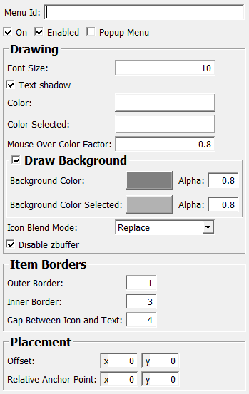
On
- name: on, type: Bool, default: TRUE
Enabled
- name: enabled, type: Bool, default: TRUE
Icon Blend Mode
- name: iconBlendMode, type: Enum, default: IconReplace
Color
- name: color, type: Color, default: 1 1 1
Color Selected
- name: colorSelected, type: Color, default: 1 1 1
Background Color
- name: backgroundColor, type: Color, default: 0.5 0.5 0.5
Alpha (backgroundAlpha)
- name: backgroundAlpha, type: Float, default: 0.80000001, minimum: 0, maximum: 1
Background Color Selected
- name: backgroundColorSelected, type: Color, default: 0.699999988079071 0.699999988079071 0.699999988079071
Alpha (backgroundAlphaSelected)
- name: backgroundAlphaSelected, type: Float, default: 0.80000001, minimum: 0, maximum: 1
Mouse Over Color Factor
- name: mouseOverColorFactor, type: Float, default: 0.80000001, minimum: 0, maximum: 1
Disable ZBuffer
- name: disableZBuffer, type: Bool, default: TRUE
Font Size
- name: fontSize, type: Integer, default: 10, minimum: 0
Text Shadow
- name: textShadow, type: Bool, default: TRUE
Outer Border
- name: itemOuterBorder, type: Float, default: 1, minimum: 0
Inner Border
- name: itemInnerBorder, type: Float, default: 3, minimum: 0
Gap Between Icon and Text
- name: textIconGap, type: Integer, default: 4, minimum: 0
Offset
- name: offset, type: Vector2, default: 0 0
Sets a pixel offset to apply to the
SoMenuItem.fixedPositionof each menu item.If
Popup Menuis set, the initial mouse cursor position when the mouse button went down is also added.
Relative Anchor Point
- name: relativeAnchorPoint, type: Vector2, default: 0 0
Sets an anchor point of the menu in relative coordinates [0-1] of the current viewport.
This position is added (together with
Offset) to theSoMenuItem.fixedPositionof each menu item, but only ifPopup Menuis not set (as the anchor point is determined by the mouse cursor position then).