Abstract
This document describes the MDL (MeVisLab Definition Language) of MeVisLab and was published on 2026-04-10.
Table of Contents
- 1. MDL Syntax
- 2. Module (Abstract) Declaration
- 3. Other Module-Related MDL Features
- 4. GUI Controls
- 4.1. GUI Example Modules in MeVisLab
- 4.2. Abstract GUI Controls
- 4.3. Layout Group Controls
- 4.4. User Input GUI Controls
- 4.4.1. Field
- 4.4.2. FieldLabel
- 4.4.3. Button
- 4.4.4. ToolButton
- 4.4.5. CommonButtonGroup
- 4.4.6. PushButtonGroup
- 4.4.7. RadioButtonGroup
- 4.4.8. ToolButtonGroup
- 4.4.9. ButtonBar
- 4.4.10. CheckBox
- 4.4.11. ComboBox
- 4.4.12. MenuBar
- 4.4.13. ColorEdit
- 4.4.14. LineEdit
- 4.4.15. NumberEdit
- 4.4.16. VectorEdit
- 4.4.17. DateTime
- 4.4.18. Slider
- 4.4.19. IntervalSlider
- 4.4.20. ThumbWheel
- 4.4.21. TextView
- 4.4.22. HyperText
- 4.4.23. HyperLabel
- 4.4.24. ListBox
- 4.4.25. ListView
- 4.4.26. IconView
- 4.5. Decoration GUI Controls
- 4.6. Menu GUI Controls
- 4.7. Complex GUI Controls
- 4.8. Event Handling Controls
- 4.9. Other Design Options
- 5. Translations
- 6. Test Cases
- Index
List of Figures
- 4.1. Category vs. Vertical
- 4.2. TestVerticalLayout Module
- 4.3. TestHorizontalLayout Module
- 4.4. TestTableLayout Module
- 4.5. TestGridLayout Module
- 4.6. TestSplitterLayout Module
- 4.7. TestBoxLayout Module
- 4.8. ScrollView Example
- 4.9. TestTabViewLayout Module
- 4.10. VectorEdit Example
- 4.11. IntervalSlider Example
- 4.12. ThumbWheel Example
- 4.13. TestHyperText Module
- 4.14. TestListBox Module
- 4.15. TestListView Module
- 4.16. TestIconView Module
- 4.17. ProgressBar Example
- 4.18. TestPopupMenu Module
- 4.19. TestViewers Module
- 4.20. TestEventFilter Module
- 4.21. TestStyles Module
List of Tables
List of Examples
- 4.1. Window
- 4.2. Vertical
- 4.3. Horizontal
- 4.4. Table
- 4.5. Grid
- 4.6. Splitter
- 4.7. Box
- 4.8. ScrollView
- 4.9. TabView
- 4.10. ComboBox
- 4.11. MenuBar
- 4.12. ColorEdit
- 4.13. LineEdit
- 4.14. NumberEdit
- 4.15. VectorEdit
- 4.16. DateTime
- 4.17. Slider
- 4.18. IntervalSlider
- 4.19. ThumbWheel
- 4.20. HyperText
- 4.21. HyperLabel
- 4.22. ListBox
- 4.23. ListView
- 4.24. IconView
- 4.25. ProgressBar
- 4.26. PopupMenu, SubMenu, and MenuItem
- 4.27. Panel
- 4.28. Viewer
- 4.29. EventFilter
This is a short introduction to the MeVisLab Definition Language (MDL), in which all .def,
.script and various other files for the MeVisLab are
written. The MDL is a configuration and layouting language, not a real
programming language. You can set tags and values for the tags, but there
are some extensions to this static scheme.
If found in .def or .script files,
the MDL is used for layouting the GUI of modules. That is the arranging of
fields implemented in C++ on a module panel or adding new fields and
functionality to modules, especially to macro modules.
Besides just layouting the GUI for a module, the MDL offers adding commands that call scripting methods (Python) on occasions like altering a field's value or opening a module's panel. The MDL controls can be scripted with Python, a scripting link into the MeVisLab Scripting Reference is given where appropriate.
MDL is tag-based. Typically, a tag is set to a certain value or to a group of tags. There are also special tags to conditionally parse parts of a file or to test for miscellaneous conditions.
Setting a tag is simple:
TAGNAME = VALUE
The equal sign = has to be used between every tag and its
value, except for groups, where the value is optional (see Groups). TAGNAME
as well as VALUE need to be a single token. If a token should contain
whitespace, there are various ways to quote this value.
The most simple way is to enclose a value containing whitespace in quotes:
myTag = "Example with whitespace and \"quotes\" and a \\ backslash "
Quotes and backslashes are escaped using backslashes, which can be cumbersome when frequent usage is required. There are two alternative ways to enclose long values that contain special characters:
// Enclosing with "* *"

droppedFileCommand = "* py: ctx.field("fileName").value = args[0] *"


// Enclosing with @@

droppedFileCommand = @@ py: ctx.field("fileName").value = args[0] @@
Inside strings starting with a quote-star "* and ending with a
star-quote *", or inside strings enclosed in double @ characters @@, you can use
all characters without escaping them except for the backslash character. Only
if you want to use a sequence of characters that is the same as the
ending of the used delimiters, you need to escape them with
backslashes.
If you use any kind of quoting, you need to escape backslashes
with a double backslash \\.
Overview of quoting and the characters you need to escape with a backslash:
" ... "Escape
"with\"or use'in Python instead.Escape
\with\\."* ... *"Escape
*"with*\".Escape
\with\\.@@ ... @@Escape
@@with@\@.Escape
\with\\.
The different tags in the MDL have different data types. Those data types are listed here with a general explanation. A more detailed explanation can be found at the actual tags.
STRINGAn arbitrary description string. If the string contains spaces, it has to be enclosed in quotes.
The tag data of type
STRINGmay be translated to other languages by an internationalization mechanism.This type is used as a control's
name, as itstitle,comment,whatsThis- andtoolTiptext.Examples:
title   = SomeExampleTitle
comment = "This example comment contains spaces"
STRINGLISTA list of strings, separated by commas or spaces.
This type is used for the
genreandgroupand various other tags.Examples:
genre = Lung
group = "Release, LungPrivate"
AUTHORSA list of comma separated strings. The authors have to be written as "FirstName LastName".
Have a look at the detailed description of the author tag.
NAMEA unique identifier that must not contain spaces.
This type is used for identifying objects across script, scripting, and C++ code. Tags such as
item,module,DLL,fieldpanelordeprecatedNameare of this type.NAMELISTA list of unique identifiers, separated by commas. The unique identifiers must not contain spaces.
This type is used for the
filtertag of the EventFilter.To get a list of the possible values of the
filtertag, use the auto-completion of the text editor MATE.BOOLA boolean value.
Possible values are
Yes(alternatives:True,1,On) andNo(alternatives:False,0,Off).UINTAn unsigned integer value.
INTAn integer value.
FLOATA floating-point value.
ENUMOne of a fixed list of unique identifiers.
Have a look at the detailed description of tags of type
ENUMfor the possible values and the default value. Also, the possible values are shown in MATE's auto-completion.FIELDA unique and existing identifier of a field.
This type is used, i.e., for the
fieldtag of the Accel.FIELDLISTA list of unique and existing field identifiers, separated by commas.
This type is used for the list of fields in the Persistence description.
FIELDEXPRESSIONAn expression that is based on field values.
This type is used for the tags
min,max,dependsOn, andvisibleOn.The following operators are supported (precedence in order of appearance):
( )Parentheses
||Logical or expression (lazy-evaluated)
&&Logical and expression (lazy-evaluated)
== != < <= > >=Comparison; Boolean fields and expressions are compared as boolean, numbers are compared as numbers, and everything else is compared as strings. If the right hand side is a regexp, the left hand expression is matched to the regexp.
+ -Addition and subtraction; numbers are handled as expected. If one of the arguments is not a number, the values are concatenated as strings, or the second argument is removed from the first argument string if found.
*Multiplication, only applicable on numeric arguments
-Unary minus that can be used in front of parentheses and numbers or number fields
!Unary not that can be used in front of parentheses and boolean fields
[sequence of digits (with optional . somewhere but not in the first place)]
Numeric value
fieldNameThe name of a field (may also be a qualified name with modulename.fieldname)
Bool Fields are interpreted as their bool value, all other fields are interpreted as their string or numeric value, depending on the operation applied.
"String"A string constant that is given in quotes. Note that there is no way of quoting " inside a string at the moment.
/regexp/[i]A regular expression, the optional i after the closing / makes the expression case-insensitive
Regular expression can only be used on the right hand side of a comparison.
Note that there is no way of quoting / inside a string at the moment.
Some operations are provided as functions, i.e., like
functionName(argument0, ...)min(): Returns the minimum value of all arguments.max(): Returns the maximum value of all arguments.abs(): Returns the absolute (positive) value of argument.if(condition, argTrue, argFalse): Returns the second argument if the first argument evaluates toTrue; otherwise, the third argument is returned.
PATHA relative or absolute path to a directory. If it is a relative path, useful variables are listed in Section 1.4, “Variables”.
The path delimiter is a
/, independent of the platform.FILESame as
PATHbut with a specified file. This file can be, e.g., a scripting file (.py), an HTML file (.html), or a network file (.mlab).SCRIPTA unique name of a scripting function implemented in a separated and included scripting file, or a single line of scripting code.
COLORA color definition, explained in more detail here.
KEYSEQUENCEA keysequence or shortcut to trigger certain functionality. The set string may be translated to other languages by an internationalization mechanism.
A
KEYSEQUENCEis used in menus and in the Accel.RICHTEXTA string containing HTML formatting.
This type is used in the TextView or similar controls.
A table with all supported HTML tags can be found in the chapter RichText.
FORMATSTRINGA C-like expression for formatting a (floating-point) number.
Have a look at the NumberEdit control for more information.
REGEXPA regular expression for string matching.
This type is used in the LineEdit control for validating the entered string.
QTSLOTA Qt slot that is triggered if a control emits a signal.
This type is used in the MenuItem.
Group tags are used for hierarchical tags. This means that you can build not only flat tag lists but also complete tree hierarchies. A group tag starts with a tag name, an optional value, and an opening curly brace, it ends with a closing curly brace. Inside the braces, you can set normal tags with values or other group tags:
myGroup exampleGroup {
    normalTag = "This is a normal tag"
    groupInside {
        insideTag = "Another example tag"
    }
}
tagOnlyGroup {
    normalTag = "This group has no value"
}
In contrast to normal tags, a group tag does not need to have a value. The second example above shows a group that has only the tag name but no value before the group is opened.
The MDL has some predefined variables that are useful for its
purposes. To get the value of a variable, write its name inside a pair
of parentheses with a dollar sign prefix:
$(VARNAME).
The following variables are defined:
LOCAL - Contains the full path of the currently parsed
file. |
HOME - The home directory of the user. |
PackageIdentifier - A unique name with the structure:
MLAB_PackageGroup_PackageName |
In addition to these predefined variables, you can get the values
of all tags from the mevislab.prefs file.
Variables in MDL can be escaped by writing $(*VARNAME*), which
expands to $(VARNAME).
The MDL allows you to include files with the #include statement. This
is equivalent to pasting the given file at the position of the include
statement:
#include $(LOCAL)/anotherfile.script
The same file can be included multiple times at different places
in an MDL file. It is recommended to name included files either
.script or .inc.
You should not use the .def extension, as this is
reserved for module definition files and would be read automatically by
MeVisLab on startup.
The MDL allows parsing or skipping parts of files depending on conditions. Additionally, there are statements that enable simple debugging and message printing.
#ifset and #ifnset are used
to test if a variable is set to one of the following values: Yes, True,
On, or 1 . If the variable is not set or has a different value, the block
is not parsed.
The variables can be defined in the mevislab.prefs file.
#ifset ApplicationAdvanced {
   // If $(ApplicationAdvanced) is defined and set to Yes, True, On, or 1, parse inside this block
   Field advancedField {}
}
#ifnset ApplicationAdvanced {
   // If $(ApplicationAdvanced) is undefined or not set to Yes, parse the following block
   Field normalField {}
}
#ifdef and #ifndef are used
to test for existence of variables (and not its value)
#ifdef CPU {
    // If $(CPU) is defined, parse inside this block
    cpuTag = "$(CPU)"
}
#ifndef CPU {
    // If $(CPU) is undefined, parse the following block
    cpuTag = "CPU unknown"
}
The #if statement is another conditional for
parsing blocks. With #if you can test the boolean
value of a variable or compare two variables as strings or numbers, or
compare a variable with a static string. The following operations are
possible for a comparison: <, >, ==,
>=, <=, !=
#if $(DEBUG) {
    // Parse this if DEBUG is a defined variable and has the boolean value Yes (True, On, or 1)
    debugTag = "Debugging is fun"
}
#if "$(VERSION) >= $(MINVERSION)" {
    // If the variables can be parsed as floating-point numbers, make numeric comparison;
    // otherwise, a lexical comparison is performed
    featureForVersion = true
}
#if "$(HOME) == $(LOCAL)" {
    // Parse this if the current MDL file resides in the user's home directory
    myHome = "is my castle"
}
The #echo statement allows you to print out the value of variables or any other string to the console, which can be very useful for debugging:
#if $(DEBUG) {
    #echo "HOME-Dir is $(HOME)"
}
The #abort statement is used to print an error message and to stop the parser:
#ifndef DefaultFont {
    #abort "No default font available!"
}Comments in MDL are the same as in C++:
// This is a comment before a tag
myTag = myValue
/*
 The following tags are not parsed, as they are inside a comment block
 tag01 = unparsed
 tag02 = unparsed
*/
anotherTag = anotherValue  // Comment after tag/value pair
Comments can be placed anywhere in the MDL file, except between a tag and its value.
Although it is not needed by the parser, it is recommended to use tag names without whitespace and to separate words in tag names with uppercase characters. Both of the following examples are allowed, but the latter is recommended:
"Tag with four words" = "The Value"
tagWithFourWords = "The Value"
You can use any character sequence for tag names as long as they
are parsable as one tag. To start tag names with characters that end or
start new syntactic constructs, for example, { or =, you have to
enclose them in quotes or use the same methods as for values.
MeVisLab supports three different types of modules, which are derived from an abstract module:
MLModule - An image processing module using the ML.
InventorModule - A visualization module derived from an OpenInventor node.
MacroModule - A macro module that encapsulates an internal network, and has its own panel and script.
The following module tags are supported by all module types. Details on the different modules are given in the following sections.
Dynamic scripting: MLABModule (common base class), MLABMLModule, MLABInventorModule, MLABMacroModule
[MLModule|InventorModule|MacroModule] NAME {

  genre              = STRINGLIST
  author             = AUTHORS
  status             = STRING
  group              = STRINGLIST
  comment            = STRING
  keywords           = STRING
  exampleNetwork     = FILE
  seeAlso            = STRING
  documentation      = FILE

  hasTranslation       = BOOL           [No]
  translationModules   = STRINGLIST
  translationLanguages = STRINGLIST

  deprecatedName     = STRING
  externalDefinition = FILE
  associatedTests    = STRINGLIST
  relatedFile        = FILE

  activeInputIndex   = FIELDEXPRESSION
  activeOutputIndex  = FIELDEXPRESSION

  exportedWindow     = STRING

  Interface {
    Inputs {
      Field NAME {...}
      ...
    }

    Outputs {
      Field NAME {...}
      ...
    }

    Parameters {
      Field NAME {...}
      ...
    }
  }

  Description {
    Field NAME {...}
    ...
  }

  Commands {

    source = FILE

    // more source tags...

    importPath = PATH

    // more importPath tags...


    initCommand         = SCRIPT
    wakeupCommand       = SCRIPT
    droppedFileCommand  = SCRIPT
    droppedFilesCommand = SCRIPT

    FieldListener [FIELD] { ... }
  }

  Deployment {

    directory = PATH
    ...
    file     = FILE
    ...
    module   = NAME
    ...
    DLL      = NAME
    ...
  }

  Persistence {

    fields = FIELDLIST

    Module NAME {
      fields = FIELDLIST
    }
  }

  NetworkPanel {

    info = EXPRESSION

    Button [FIELD} { ... }
  }


  Window [NAME] {
    ...
  }

  // more windows...

}
genre = GENRENAMESSpecifies one or more genre this module is in. Genres are separated by comma and have to be declared in the global genre file of MeVisLab. If a given genre is not defined, you will get a validator warning and the module is put into the "Other" genre. The genre tag is used to generate automatic entries in the Modules menu of MeVisLab and in the documentation. A module can be in multiple genres.
Example:
genre = "Image, Diffusion"See also: Section 3.1, “Module Genre Definition”
author = AUTHORSSets the author(s) of the module, starting with the primary author. Authors have to be separated by comma and should contain both first and last names.
Examples:
author = "Author1, Author2"author = "First1 Last1, First2 Last2"However, if you list a single author, do not use the format "Last, First" as this results in a pair of authors with just one last name each. Just state the author's name with "First Last".
![[Warning]](images/warning.png)
Warning Do not write anything except the authors' names in this tag, because the names are used for automatic documentation generation.
status = STRINGSets the status of the module.
Currently used words are:
StableWork-in-progressTestDeprecated
group = STRINGLISTSets a list of group names separated by comma. If no group is set, the module is always visible in MeVisLab. If a list of groups is set, the module is only visible in MeVisLab if one of the groups is enabled in the MeVisLab prefs file (
mevislab.prefs) via the "EnabledGroups" tag.![[Note]](images/note.png)
Note Visible means that the user can find the module in the search dialogs and in the Modules menu. The modules can still be loaded from a saved network or inside an application, even if they are not visible.
Special groups:
- Release: if the string contains the keyword "release", the module is only visible in the MeVisLab release version; otherwise, it is not visible in the release version, regardless of the other groups.
- Deprecated: if the string contains the keyword "deprecated", you have to enable the "deprecated" group in MeVisLab's preferences to see those modules, regardless of the other groups.
Examples:
group = Deprecated // module will only be visible if
          "EnabledGroups" contains "deprecated"
group = Release // module will be visible in MeVisLab releasegroup = LungPrivate // module will only be visible if "EnabledGroups" contains "LungPrivate" and if MeVisLab is not in release modegroup = Release, LungPrivate // module will only be visible if "EnabledGroups" contains "LungPrivate"comment = STRINGSets a short comment that is shown in the MeVisLab help system and on the network.
(We recommend that you only write a short comment here and use the module documentation for further information.)
keywords = STRINGSets keywords that are used in the MeVisLab search to find a module by its keywords. The keywords are separated by space.
Make sure that you only use adequate keywords; otherwise, your module will be found more often than wanted. Having no keywords decreases the chance that someone finds the module.
You do not need to set any part of a module's name as a keyword; it does not help in the least. For example, refrain from setting "examiner viewer" as keywords for the module SoExaminerViewer.
exampleNetwork = FILESets an example MeVisLab network that the user can open to see how the module could be used in connection with other module.
This tag can be used multiple times for a module to link to a number of example networks.
seeAlso = STRINGSets a reference to other modules that are related to this module, separated by space.
Example:
seeAlso = "SoView2D
          SoOrthoView2D"
externalDefinition = FILEDefines a module's interface, GUI windows, and field properties in an external file, typically with the file extension
.script. It is advised to use the naming convention$(LOCAL)/ModuleName.scriptif you use this tag. The advantage of using this feature is that the MDL file needs only be parsed when the module is really created and not when MeVisLab is started. Make sure that you still provide the simple tags (author,comment, etc.) in the.deffile so that they are available when MeVisLab is started.Example:
externalDefinition = $(LOCAL)/ModuleName.script![[Tip]](images/tip.png)
Tip This is typically used in MacroModules, especially when they are applications, to avoid that MeVisLab reads the entire application definition on startup.
associatedTests =
        STRINGLIST
Specifies a list of functional tests that are associated to the module.
Use the macro module TestCaseManager to generate new tests or to browse and modify existing tests.
See the document TestCenter Manual for more information about functional test cases for specific modules.
hasTranslation = BOOLDefines whether this module has translations. If a module has translations, then all MDL strings of that module and all occurrences of ctx.translate() in its Python source files will be collected and written to a
.tsfile. See Translations for more information.translationModules = STRINGLISTDefines a comma-separated list of modules that also have translations. See Translations for more information.
translationLanguages =
        STRINGLIST
Defines a comma-separated list of language initials. For example, "en,de,it". See Translations for more information.
deprecatedName = STRINGDefines an old, deprecated name for this module, so that networks that contain a module with this name can still be loaded even if the module name was changed.
relatedFile = FILEReferences a file that belongs to this module and should appear in the list of related files in the module context menu (besides the automatic entries). It is advised to reference files relative to
$(LOCAL). The tag can be used multiple times.Example:
relatedFile =
          $(LOCAL)/../SomeSharedConfigFile.xml
activeInputIndex = FIELDEXPRESSIONThe given field expression is evaluated and the calculated integer index is used to highlight the active input connector (e.g., for modules like Switch). Negative values mean that no connector will be active, except for -3, which means that all connectors are active.
activeOutputIndex =
        FIELDEXPRESSION
The given field expression is evaluated and the calculated integer index is used to highlight the active output connector (e.g., for modules like BaseSwitch). Negative values mean that no connector will be active, except for -3, which means that all connectors are active.
exportedWindow = STRINGNote Only evaluated by the MeVisLab Web Toolkit, which is not part of the public SDK.
Gives the names of GUI panels that should be available remotely. This may also be the name of a panel of a submodule by giving the name as submodulename.panelname. This tag may be used multiple times. If the given panels reference fields of submodules, these fields are exported automatically as fields of the remote module under the name submodulename.fieldname.
The Interface section is used to declare any extra fields of a module. While it is possible to use the interface section in an ML/InventorModule, it is typically only used for MacroModule, since the ML and Inventor modules get their fields automatically from C++. If you want to add a description for a C++ field, refer to the Description section.
The Interface section can contain three subgroups: Inputs, Outputs, and Parameters. Inputs and Outputs are typically Image, SoNode, or MLBase fields, while the Parameters section typically holds parameter fields like floats, vectors, or color. The declared fields can be both standalone script fields or they can alias an internal field of the internal network of a MacroModule.
Interface {
  Inputs {
    Field ...
  }
  Outputs {
    Field ...
  }
  Parameters {
   Field ...
  }
}
In each of the subgroups, a field is defined as follows:
Field NAME {
  type         = ENUM
  value        = STRING
  comment      = STRING
  hidden       = BOOL             [No]
  priority     = INT              [100]
  editable     = BOOL             [Yes]
  persistent   = BOOL             [Yes]
  isFilePath   = BOOL             [No]
  min          = FIELDEXPRESSION
  max          = FIELDEXPRESSION
  internalName = FIELD
  allowedTypes = STRING
  legacyValue  = STRING
  visibleOn    = FIELDEXPRESSION
  dependsOn    = FIELDEXPRESSION

  // for enums:
  items {
    item NAME {
      title          = STRING
      deprecatedName = STRING

      // more deprecatedName tags
    }
    ...
  }
  // old, deprecated enum syntax:
  values = STRING
}
type = ENUMDefines the type of the field (is automatically given if
internalNameis used).Possible values:
String
Integer (alias: Int)
IntVector2
IntVector3
IntVector6
Float
Double
Bool
Trigger
Vector2
Vector3
Vector4
Vector6
Plane
Rotation
Color
Matrix
Enum
SoNode
MLBase
Image
IntegerList (alias: IntList)
DoubleList
Vector2List
Vector3List
Vector4List
value = STRINGSets a default value for the field (it will only be assigned when a module is newly created, not on reload of a module), it will be overwritten by a stored value when loaded from a network.
Table 2.1. Value formats by field type
Type Value Format Example Bool Yes,True,1, andOnevaluate to True (case-insensitive), all other strings to FalseYes Color Three floating-point values (RGB) in the range 0.0 to 1.0 "1.0 0.5 0.0" Double A single floating-point value 0.33 Enum The name of an enum item item2 Float A single floating-point value 0.33 Image N/a: images are programatically specified N/a Integer A single integer value 7 Matrix 16 floating-point values; if less are given, then missing elements are taken from the identity "1.0 0.0 0.0 0.0 0.0 1.0 0.0 0.0 0.0 0.0 1.0 0.0 0.0 0.0 0.0 1.0" MLBase N/a: base objects are programatically specified N/a Plane Four floating-point values "12.0 14.0 5.23 33.0" Rotation Four floating-point values "9.0 2.22 7.33 55.2" SoNode N/a: nodes are programatically specified N/a String A string that must be quoted if it contains spaces "A string with spaces" Trigger N/a: a trigger has no value, but triggers an action N/a Vector2, Vector3, Vector4 Two, three, or four floating-point values "234.33 221.0 223.0 11.23" legacyValue = STRINGSets a default value for the field when a module is loaded from a network and no value was specified for the field in the saved network. This allows to give a new default value with the value tag and to keep old networks working by setting a compatible legacyValue for old networks.
comment = STRINGSets a comment describing the field. This comment is shown as a tooltip for input or output fields.
hidden = BOOL (default:
          No)
Sets whether the field should be visible in the MeVisLab network. This can be used to hide existing input or output images.
priority = INT (default:
          100)
Sets the notification priority of the field. A value of 0 means that the field has high priority and GUI controls depending on this field will be updated immediately when the field changes.
editable = BOOL (default:
          Yes)
Sets whether the field should be editable by default. Also sets the
persistentattribute to the same value if not specified explicitly.persistent = BOOL (default: Yes)Sets whether the field value should be stored in networks, i.e., on saving to disk and on copy&paste.
isFilePath = BOOL (default:
          No)
Only applicable for fields of type String. Marks the field as containing a file path. When saving to a network file, the value of this field will be expressed with a defined set of path variables, such as
$(NETWORK), to make the network relocatable. Also provides Field controls with an automatic browse button.Tip If the user enters a file path in such a control containing any path variables, the visible path will be automatically expanded, and a toggle icon is shown. To force this automatic expansion via scripting, use setPersistentValue() instead of setStringValue()/setValue() on the string field.
min = FIELDEXPRESSIONSets a minimum value for the field. It only works on Number fields. The value can be given as a float value or as an expression containing other fields, which provides and updates the minimum value if these fields change.
max = FIELDEXPRESSIONSets a maximum value for the field. It only works on Number fields. The value can be given as a float value or as an expression containing other fields, which provides and updates the maximum value if these fields change.
visibleOn = FIELDEXPRESSIONSets an expression that is used to decide whether the field should be visible on the GUI. In case of an input/output field, the field's connector on the network is shown/hidden depending on the expression. In case of a parameter field, the expression is used as visibleOn default for all MDL GUI controls that display this field. A visibleOn tag in a GUI control overrides the field's default for that GUI control.
dependsOn = FIELDEXPRESSIONSets an expression that is used to decide whether the field should be enabled/disabled on the GUI. In case of an input/output field, the field's connector on the network is rendered in an active/non-active state depending on the expression. In case of a parameter field, the expression is used as dependsOn default for all MDL GUI controls that display this field. A dependsOn tag in a GUI control overrides the field's default for that GUI control.
internalName = FIELDDefines that the field should alias an internal field of the internal network of a macro module.
If the internal name is given, the
typeof the generated field cannot be selected and is given by the internal field.allowedTypes = STRINGGives the names – separated by whitespace – of Base types this field accepts or provides. Only valid for fields of
typeMLBase.This is used by MeVisLab as a hint for which MLBase fields can be connected. Specifying this should not be necessary if
internalNamewas given for a field, as the type information of that field will be used in this case. Note that this is only a hint, you will still be able to set any Base object by scripting.As long as the specified type(s) is/are not loaded by the runtime type system of MeVisLab, the type(s) cannot be resolved and MLBase fields of any type are allowed to be connected to this field. Base types are automatically loaded if other modules that use this type are loaded in MeVisLab.
deprecatedName = NAMESets an old name to the field, which allows to rename fields in MacroModules/C++ and keep old networks and scripts working. If any
deprecatedNameappears anywhere in a GUI description, a stored network, or in scripting, it is automatically mapped to the name of this field.Any number of
deprecatedNametags can be given; they are all parsed.itemsSpecifies the enumeration items if the field is of type Enum.
item = NAMESpecifies the (token) name of the item.
title = STRINGSpecifies the user visible name of the item.
deprecatedName = STRINGSpecifies an old, deprecated name for the item, which can be used with setStringValue and causes the enum to take the value of the item instead of the deprecated value.
This tag is used to allow old networks and scripts to work even if enum items have changed or are completely removed.
values = STRINGDefines the enum values in a comma-separated list.
This tag is deprecated and should no longer be used, use
itemsinstead.
The Description section can be used in addition to the Interface section to assign extra properties to existing C++ fields. No new fields can be created in the Description section; only properties can be added to existing fields.
Description {
  Field NAME {
    value          = STRING
    legacyValue    = STRING
    comment        = STRING
    hidden         = BOOL             [No]
    priority       = INT              [100]
    editable       = BOOL             [Yes]
    persistent     = BOOL             [Yes]
    isFilePath     = BOOL             [No]
    min            = FIELDEXPRESSION
    max            = FIELDEXPRESSION
    visibleOn      = FIELDEXPRESSION
    dependsOn      = FIELDEXPRESSION
    deprecatedName = NAME
    removed        = BOOL             [No]

    // for enums:
    items {
      item NAME {
        title = STRING
        deprecatedName = STRING

        // more deprecatedName tags
      }
      ...
    }
   ...
  }
}
value = STRINGSets a default value for the field, which will be assigned only when the module is newly created and not when reloading the module. This default value will be overwritten by a stored value when loaded from a network.
Note If you specify a value in both the Interface section and the Description section, the value from the Description section will take precedence.
legacyValue = STRINGSets a default value for the field when a module is loaded from a network and no value was specified for the field in the saved network. This allows to give a new default value with the value tag and to keep old networks working by setting a compatible legacyValue for old networks.
comment = STRINGSets a comment describing the field, which is shown at the input and output field as a tooltip.
hidden = BOOL (default:
          No)
Sets whether the field should be visible in the MeVisLab network. This can be used to hide existing input or output fields.
priority = INT (default:
          100)
Sets the notification priority of the field, a value of 0 means that the field has high priority and GUI controls depending on this field will be updated immediately when the field changes.
editable = BOOL (default:
          Yes)
Sets whether the field should be editable by default. Also sets the
persistentattribute to the same value if not specified explicitly.persistent = BOOL (default: Yes)Sets whether the field value should be stored in networks, i.e., on saving to disk and on copy&paste.
isFilePath = BOOL (default:
          No)
See Interface isFilePath tag.
min = FIELDEXPRESSIONSee Interface min tag.
max = FIELDEXPRESSIONSee Interface max tag.
visibleOn =
          FIELDEXPRESSION
See Interface visibleOn tag.
dependsOn =
          FIELDEXPRESSION
See Interface dependsOn tag.
deprecatedName = NAMESets an old name to the field, which allows to rename fields in MacroModules/C++ and keep old networks and scripts working. If the
deprecatedNameappears anywhere in a GUI description, a stored network, or in scripting, it is automatically mapped to the name of this field.Any number of
deprecatedNametags can be given; they are all parsed.removed = BOOL (default: No)Declares this field as being removed and avoids warnings when a network containing stored values for the removed field is loaded.
itemsSpecifies the enumeration items if the field is of type Enum.
item = NAMESpecifies the (token) name of the item.
title = STRINGSpecifies the user visible name of the item.
deprecatedName = STRINGSpecifies an old, deprecated name for the item, which can be used with setStringValue and causes the enum to take the value of the item instead of the old value.
This tag is used to allow old networks and scripts to work even if enum items have changed or are completely removed.
The Commands section is used to add script files and commands to the module.
The general sequence for a module initialization is:
The detailed order is:
Creation of the internal C++ ML/Inventor class or loading the internal MeVisLab network of the MacroModule.
Reading internal fields from C++.
Creation of self/instanceName fields.
Creation of Interface fields (given in the
Interfacesection) and parsing of tags in theInterfaceandDescriptionsection (except for min/max values).Restoration of persistent stored fields (via setStringValue).
Creation of min/max values (from the
InterfaceandDescriptionsection).Creation of FieldListeners given in the
Commandssection.Field connections to other modules in a network that is restored (from disk or paste buffer) are done.
Commands {
  source             = FILE

  // more source files...

  importPath = PATH

  // more importPath tags...


  initCommand         = SCRIPT
  wakeupCommand       = SCRIPT
  finalizeCommand     = SCRIPT
  droppedFileCommand  = SCRIPT
  droppedFilesCommand = SCRIPT

  storingToUndoHistoryCommand    = SCRIPT
  restoredFromUndoHistoryCommand = SCRIPT

  moduleItemCreatedCommand = SCRIPT

  runApplicationCommand = SCRIPT

  FieldListener [FIELD] { ... }
  ...
}
source = FILESets a script file to be loaded in the script context of this module. Python variables, classes, and functions declared in the file are available in all script calls to this module. This tag can be used for multiple files, the files are parsed in the order of declaration
The file extension
.pyspecifies Python script files.Example:
source = $(LOCAL)/ModuleName.pyimportPath = PATHAdds a directory to the import path of the module's Python package. Each instance of a MeVisLab module has its own Python package containing different instances of the specified source modules. Python modules and packages from the import path must be imported relatively (see section Intra-package References of the Python documentation).
Example:
importPath =
            $(LOCAL)/../../Wherever/YourSharedPythonModules
initCommand = SCRIPTDefines a script command that is called when the module is created on a network. At the time of this call, the field connections to other modules in the network have not yet been established.
wakeupCommand = SCRIPTDefines a script command that is called after the module is created on a network and all other modules have been also created and after all field connections have been established.
finalizeCommand = SCRIPTDefines a script command that is called when the module's script context is deleted. It can be used to clean up resources that need to be removed or cleared.
This command is called when a module is reloaded or when it is finally deleted, which may occur later than expected because of the undo/redo buffer.
Typically, all Python resources are cleaned automatically, so you will probably never need this command.
droppedFileCommand =
          SCRIPT
Defines a script command that is called when the user drops a file, directory, or URL on the module's box on the network. For example, this is used in the ImageLoad module to accept dropped filenames.
droppedFilesCommand =
          SCRIPT
Defines a script command that is called when the user drops files, directories, or URLs on the module's box on the network. For example, this is used in the ImageLoad module to accept dropped filenames.
storingToUndoHistoryCommand =
          SCRIPT
Defines a script command that is called when a module is removed from the network and placed into the undo history
restoredFromUndoHistoryCommand
          = SCRIPT
Defines a script command that is called when a module is readded to the network from the undo history
moduleItemCreatedCommand =
          SCRIPT
Defines a script command that is called when the network model item gets created. This typically happens when the network becomes visible in the MeVisLab IDE.
runApplicationCommand =
          SCRIPT
Defines a scripting command that is called when a macro module is started as an application, before the macro's window is shown.
Note This command is only available with a valid ADK license. Have a look at the ADK documentation, chapter Advanced Commands for further information.
FieldListener [FIELD]The Commands section can contain multiple FieldListeners, see FieldListener for details on what a FieldListener can be used for. The listeners declared in the commands section are active after the module has been created until the module is deleted. This is typically used to provide functionality to a MacroModule's fields and react on field changes that are independent of the user interface. If you want to have a FieldListener that changes the user interface (i.e., that accesses controls), use a FieldListener inside a GUI control somewhere in a Window.
| Note |
|---|---|
Scripting methods and functions without parameter can be called
by a
If the called method or function needs parameters, the scripting string needs to be escaped:
|
The Persistence section allows to make the values of internal fields of a MacroModule persistent. It allows to specify a list of fully qualified field names as well as fields grouped by internal modules. In contrast of defining a field on the interface of the macro module, only its value is stored and restored, the persistent fields are not available on the macro module interface. A typical use case is making internal settings persistent.
Persistence {
    fields = FIELDLIST
    ...
    Module NAME {
      fields = FIELDLIST
      ...
    }
    ...
}
fields = FIELDLISTDefines the fields that are to be stored as a comma-separated list, typically modulename.fieldname. This tag can be used multiple times.
Module = NAMEDefines a section for fields of the given module. This tag can be used multiple times.
The fields listed in the Module tag are given without the leading module name, since that is already given by the section.
The Deployment section allows to tell MeVisLab about dynamic dependencies of
the module that are required when the module should be deployed to
another computer. The ModuleDependencyAnalyzer
module allows to find most dependencies automatically, but if you, e.g.,
depend on other directories or if you add modules dynamically in your
module, you need to specify these in the Deployment
section. All tags that are listed below can appear multiple times inside
the same Deployment section.
Deployment {
    directory = PATH
    file      = FILE
    module    = NAME
    DLL       = NAME
    library   = NAME

    objectWrapper     = NAME
    widgetControl     = NAME
    preloadDLL        = NAME
    scriptExtension   = NAME
    remoteBaseHandler = NAME
    ...

    // Section for files to be deployed on the web server.
    // This feature is not available in the public SDK.
    Web {
      directory = PATH
      file      = FILE
      ...
    }
}
directory = PATHDefines an additional directory that this module depends on.
file = FILEDefines an additional file that this module depends on.
module = NAMEDefines an additional module that this module depends on.
DLL = NAMEDefines an additional DLL that this module depends on. The name is given without system-specific pre-/postfix, so that the tag works cross-platform. The DLL is copied to the
binfolder of the standalone application.library = NAMEDefines an additional library that this module depends on. The dependency analyzer will look for a NAME.mli file in all Packages inside the Configuration/Installers/Libraries directory. A typical use case is to add a complete ThirdParty library, including the license information and additional files.
Have a look in
MeVis/ThirdParty/Configuration/Installers/Librariesfor some example.mlifiles.objectWrapper = NAMEDefines an additional ObjectWrapper that this module depends on. This will search for the given wrapper and put its
.deffile into the installer. For example,objectWrapper = CSOListwill add the scripting wrapper for CSOList to the installer.widgetControl = NAMEDefines an additional WidgetControl that this module depends on. This will search for the given WidgetControl and put its
.deffile into the installer. For example,objectWrapper = GLSLTextViewwill add the GLSLTextView control to the installer.Note that WidgetControls are typically auto-detected, but in DynamicFrame scenarios, it can make sense to use this tag anyway.
scriptExtension = NAMEDefines an additional ScriptExtension that this module depends on. This will search for the given extension and put its
.deffile into the installer. For example,scriptExtension = DicomToolswill add the DicomTools script extension to the installer.remoteBaseHandler = NAMEDefines an additional RemoteBaseHandler that this module depends on. This will search for the given handler and put its
.deffile into the installer. For example,remoteBaseHandler = AbstractItemModelwill add the AbstractItemModel handler to the installer.preloadDLL = NAMEDefines an additional PreloadDLL that this module depends on. This will search for the given PreloadDLL and put its
.deffile into the installer.Note that this does not cause preloading of a DLL directly, it merely searches for the PreloadDLL tag in the global MDL tree and adds the corresponding
.deffile to the installer.
Defines a module that contains a C++ image processing module derived from Module in the ML.
Typically used tags can be found at the Module's definition.
Dynamic scripting: MLABMLModule
MLModule NAME {
  class         = NAME
  DLL           = NAME
  projectSource = PATH

  // tags from Module
}
class = NAME (default: same as MLModule NAME)Sets the name of the C++ module that should be created via the ML runtime system.
Tip This can be used to have the same internal C++ class for a number of MeVisLab modules with different names and default values, or if you do not want the internal name to appear as the MeVisLab module name.
DLL = NAMESpecifies the dynamic load library where the C++ class for this module is defined in. The name is given without a system-specific pre-/postfix.
Example:
DLL = MLBaseprojectSource = PATHSpecifies the path to the project sources. This optional tag is used to make, e.g., the project file available in the module's context menu and the ModuleInspector. MeVisLab looks for the
CMakeLists.txtin the referenced directory to create or update the project file if needed.This option should not be needed if a project is placed within a package that is known to MeVisLab. However, if the project is located at some different place, use this option with either an absolute or a relative path.
Example (relative):
projectSource =
            $(LOCAL)/../../../../../Foo/Bar/MyProject
Example (absolute):
projectSource =
            $(MLAB_MY_PACKAGE)/Sources/ML/MyProject
Defines a module that contains a C++ visualization module derived from an OpenInventor SoNode or SoEngine class.
Typically used tags can be found at the Module's definition.
Dynamic scripting: MLABInventorModule
InventorModule NAME {
  class          = NAME
  DLL            = NAME
  projectSource  = PATH
  hasGroupInputs = BOOL   [No]
  hasViewer      = BOOL   [No]
  hybridMLModule = BOOL   [No]

  // tags from Module
}
class = NAME (default: same as InventorModule NAME)Sets the name of the C++ module that should be created via the OpenInventor runtime system.
Tip This can be used to have the same internal C++ class for a number of MeVisLab modules with different names and default values, or if you do not want the internal name to appear as the MeVisLab module name.
DLL = NAMESpecifies the dynamic load library (DLL) where the C++ class for this module is defined in. The name is given without a system-specific pre-/postfix.
Example:
DLL = SoView2DprojectSource = PATHsee MLModule.
hasGroupInputs = BOOL (default:
          No)
Sets whether the module is derived from a SoGroup and should have dynamic SoNode inputs.
hasViewer = BOOL (default:
          No)
Sets whether the module should have a viewer. This is typically used on SoGroup derived nodes that should have an Inventor viewer.
hybridMLModule = BOOL (default:
          No)
Sets whether the InventorModule contains a fully functional MLModule whose fields appear as if they were the fields of the InventorModule. This is an advanced feature and should typically not be needed by a module author.
Defines a macro module that can contain an internal network. Typically, a MacroModule has an Interface section that defines the fields of the macro. The fields can be aliased from internal fields or can be standalone fields.
Typically used tags can be found at the Module's definition.
MacroModules should use the externalDefinition tag to define their Interface
and Windows in an extra ModuleName.script file,
which should be named like the module itself.
If the externalDefinition tag is
given, MeVisLab automatically loads the network with the same name and
the extension .mlab. If the module only contains
scripting and does not require an internal network, use the scriptOnly tag to tell MeVisLab.
Dynamic scripting: MLABMacroModule
MacroModule NAME {
  scriptOnly      = BOOL    [No]
  onlyOneInstance = BOOL    [No]

  // tags from Module
}
scriptOnly = BOOL (default: No)Sets whether an internal network is loaded/required.
onlyOneInstance = BOOL
          (default: No)
Sets whether only one instance of this module can be started as an application; additionally created versions just show the already running application. This is used for applications that the user should only be able to start once.
The FieldListener listens to fields and calls the script command
given in the command tag whenever the
field changes.
The fields are given as the value tag and/or with multiple
listenField tag.
There are two possible uses for a FieldListener:
They can be used anywhere in the control hierarchy of a Window.
1. If used in the Commands section, the FieldListener is active throughout the entire lifespan of a module instance (from creation to deletion) and reacts to any field changes whether there is an open module panel or not. Because of this, such a FieldListener cannot access the controls of the user interface of the module with scripting, just the fields of the module.
2. If used somewhere inside a Window, the FieldListener is an invisible user interface element that is only active (and created) when the Window is actually created. Such a FieldListener can access all other user interface controls within that Window that are named using the
ctx.control(name)Python function.Note Since part of a Window can be created multiple times using the Panel GUI control, multiple instances of the same FieldListener in a Window can exist at the same time and will all work and change the user interface via the
ctx.control(name). The limitation to this is that only controls can be accessed that are also cloned by the Panel control; otherwise, thectx.control(name)function will return NULL. This means that you should put your FieldListeners (which are in the user interface) close to the GUI elements you are accessing so that they are also cloned if a subpanel is extracted.
FieldListener [FIELD] {
  init        = BOOL      [No]
  callLater   = BOOL      [No]
  listenField = FIELD

  // ...

  command     = SCRIPT
}
listenField = FIELDListens to the given field.
This tag can be used multiple times to listen to a number of fields with the same FieldListener
command = SCRIPT (argument:
          changedField)
Defines the script command that is executed when one of the fields changes. The changed field is passed as the first argument to the command.
init = BOOL (default:
          No)
Sets whether the command is triggered once when the FieldListener is created. The first of the fields it listens to is passed to the command.
Tip This is especially useful when the FieldListener updates some user interface control and needs to be initiated initially to provide a correct user interface.
callLater = BOOL (default:
          No)
Sets whether the FieldListener is scheduled for the next time the event loop is processed, rather than immediately when the field changes. You will only get one notification if multiple fields changed since the last event loop processing. If more than one field is being listened to, the command is called without a field pointer, as the FieldListener does not know which of the fields have changed since the last event loop.
Warning Be careful, setting
callLatertoYescan cause infinite loops of field notifications! Only use it when you know what you are doing!
The NetworkPanel section allows to define a basic user interface on the body of the module in the network view. Currently, only an information string and a (icon) button are supported.
NetworkPanel {
    info = FIELDEXPRESSION

    Button [FIELD] {
      symbol    = FIELDEXPRESSION
      color     = FIELDEXPRESSION
      command   = SCRIPT
      visibleOn = FIELDEXPRESSION
      dependsOn = FIELDEXPRESSION
    }
}
info = FIELDEXPRESSIONDefines an expression that returns a string displayed in the module body. See dependsOn for an explanation of how expressions work. Note that there are some special functions that are especially useful in this context:
A
#in front of a field name returns a string with a value that is formatted for display. For enum fields, this is the current value's title instead of the raw value. For numeric fields, the precision of the value is restricted.The
replacefunction can be used to replace constants in a fixed string with field values.Note that the resulting string should be short; longer strings might be truncated to avoid overly large module bodies.
Button [FIELD]Defines a small icon button. A field can be given to get some default functionality: A trigger field will display a reload icon, which will touch the field if clicked. A boolean field will display a check icon if it is checked and will toggle the field's value if clicked. A color field will display an icon with the current color and will raise a color select dialog if clicked.
The behavior of the button can be further customized with the following tags:
symbol =
                FIELDEXPRESSION
Defines the symbol to display. There are some pre-defined symbols: recycle, start, stop, pause, check, clear, and deny. It is also possible to give a full file name of an image file. This image should be a white icon on transparent background to support the color tag.
Note that this expects an expression; so if you just want to set a different symbol, you need to write something like:
symbol = "* "start" *"
color =
                FIELDEXPRESSION
Defines the color for the symbol as an expression. The color can be an HTML color specification like #FF0A80 (as string) or the value of a color field. Note that to set a static color, it must be written like:
color = "* "#FF0A80" *"
command = SCRIPTDefines the script command to execute when the button has been clicked. This overrides the default behavior if a field has been specified.
dependsOn =
                FIELDEXPRESSION
Defines the condition when the button should be clickable. This is useful to indicate some state of the module.
visibleOn =
                FIELDEXPRESSION
Defines the condition when the button should be visible. It might make sense to hide the button if it is without function in some mode of a module.
A module in MeVisLab can belong to multiple genres,
which are specified with the genre tag.
The available genres are specified in
MeVisLab/Standard/Modules/IDE/Genre.def
and can also be extended via user genres.
Extract of Genre.def:
GlobalGenres  {
   Genre FileMain {
      title = File
      Genre = DICOM

      Genre InventorFile {
         title = Inventor
      }
      Genre File {
         title = Misc
      }
   }

   Separator = ""

   Genre ImageMain {
      title = Image
      Genre = Info
      Genre = Scale
      Genre = Generators

      Genre Image {
         title = Misc
      }
   }
   ...
}
Example of a module that belongs to two genres:
MLModule MyModule {
  genre = DICOM,Scale
}
If you are a MeVisLab core developer at MeVis, you can add genres
in the Genre.def file.
If you are an external developer and you still need your own
genres, you can add a UserGenres section
to your .def file (on the top level):
UserGenres {
  Genre SomebodysGenreMain {
    title = "A longer title for the genre"
    Genre SomebodysGenre {
    }
  }
  Genre +Diffusion {
    Genre DiffExtra {
    }
  }
}
As you can see above, there are two notations:
1. Adding a new root genre by just giving a Genre tag with the name of the new genre.
2. Extending a known genre with new entries by writing a + and an
existing genre name (defined in Genre.def).
Example: Genre +ImageMain { Genre = SomeNewSubGenre
}
| Note |
|---|---|
UserGenres and GlobalGenres are only reloaded when MeVisLab is restarted or when the entire database is reloaded. |
A module in MeVisLab can be given the membership of one or several ModuleGroups via the group tag. A ModuleGroup consists of the group tag ID and extra semantic information about this ID given via the ModuleGroup tag. The ID has to be a single word and should start with your license prefix to avoid mixing up groups. The existing groups can be enabled and disabled in the Preferences Panel of MeVisLab.
There are a number of predefined groups that are used throughout MeVisLab:
- deprecated = A module that is officially gone, but
only remains to make old networks work.
- test = A module that tests MeVisLab
features.
- example = A module that provides examples.
- internal = Internal MeVisLab modules that are not
visible to the public.
To put your module into a defined group, write the following:
MLModule SomeModule {
  group = MyOwnGroup
}
Now we need extra information on the ModuleGroup to make it appear nicely in the Preferences Panel of MeVisLab.
ModuleGroup GROUPNAME {
  owner   = STRING
  title   = STRING
  comment = STRING
  type    = [internal | std]
  shy     = BOOL     [No]
}
If you are a MeVisLab core developer at MeVis, you can add your
ModuleGroups directly to
MeVisLab/Standard/Modules/IDE/ModuleGroups.def.
If you are an external developer, just put the additional
ModuleGroups into any .def file in your UserModulePath;
they are read automatically.
Shared Libraries (DLLs) are loaded by MeVisLab when they are needed by a module in a network (see the DLL tag of Section 2.6, “MLModule”). The PreloadDLL tag can be used to force MeVisLab to load a given DLL on startup. This can be useful if your own ML Type Extensions should be loaded on startup of MeVisLab.
The PreloadDLL tag can appear in any .def
file (on the top-level, not nested in other tags):
PreloadDLL DLLNAME {}
// or
PreloadDLL = DLLNAME
The DLLNAME is given without file extension. On Windows, .dll is
appended in MeVisLab Release, and _d.dll in MeVisLab Debug application.
Mac OS X uses libDLLNAME.dylib to access the shared library. On Linux,
libDLLNAME.so is used.
The same library may be specified multiple times; in this case, it will still be loaded only once.
The following chapters give an overview of all possible GUI Controls and their tags. MeVisLab also contains a number of example MacroModules that demonstrate the individual features.
The following modules demonstrate the use of the most of the GUI controls. (This list may not be completely up-to-date, try searching for modules starting with Test in the MeVisLab search.)
TestStyles - How to change the controls appearance (Colors, Fonts, etc.).
TestPrototypes - How to change tag defaults for given GUI controls.
TestLayouter - Showing the usage of AlignGroups.
TestListView - Showing a scripted ListView.
TestModalDialog - How to create a modal dialog.
TestHyperText - How to use RichText with hyperlinks.
TestDefaultStyle - Showing the default spacings, etc.
TestComboBox - Showing a scripted ComboBox.
TestViewers - Showing different Inventor viewers.
TestInventorChildren - Showing how to add inventor nodes dynamically.
TestDynamicFrames - How to change Frame content via scripting.
TestTable - Showing how to use tables.
TestSplitterLayout - Showing the use of splitters between GUI components.
TestVertical, TestHorizontal - Showing basic layouters.
TestFieldAccess - Script access to field values, especially vectors, matrices, and image properties.
TestScriptUtils - Showing the use of global script utility functions.
TestTimers - How to create scripted timers.
| Tip |
|---|---|
As an all-in-one example module, the ExampleGUIScripting module should be studied thoroughly. |
Abstract controls cannot be created directly in the MDL, but many concrete GUI controls are derived from these controls to provide their basic behavior and tags.
Control is the base class for all GUI controls and provides a
number of tags supported by every control. Some tags given here only
make sense when used in the context of a layouter, e.g., colspan in Table or x/y in Grid.
Dynamic scripting: MLABWidgetControl
name      = NAME
panelName = STRING
expandX   = ENUM                 [No]
expandY   = ENUM                 [No]
stretchX  = INT                  [0]
stretchY  = INT                  [0]
visible   = BOOL                 [Yes]
enabled   = BOOL                 [Yes]
dependsOn = FIELDEXPRESSION
visibleOn = FIELDEXPRESSION

style            = NAME
styleSheetString = STRING
styleSheetFile   = FILE
widgetName       = NAME

// Tags that are only handled by the MeVisLab Web Toolkit
html_class      = STRING
html_style      = STRING
html_styleField = FIELD

// Width and height tags
w    = INT
h    = INT
pw   = INT
ph   = INT
mw   = INT
mh   = INT
maxw = INT
maxh = INT
fw   = INT
fh   = INT

// Control tags that are read by the owning layouter control:
x       = INT
y       = INT
x2      = INT
y2      = INT
scale   = INT         [1]
colspan = INT         [1]
alignX  = ENUM        [Auto]
alignY  = ENUM        [Auto]

// Layouter tags for inter control alignment:
alignGroupX      = NAME   (alias: alignGroup = NAME)
alignGroupY      = NAME
childAlignGroupX = NAME   (alias: childAlignGroup = NAME)
childAlignGroupY = NAME
labelAlignGroup  = NAME

tooltip              = STRING
tooltipField         = FIELD
whatsThis            = STRING
droppedFileCommand   = SCRIPT
droppedFilesCommand  = SCRIPT
droppedObjectCommand = SCRIPT
acceptDrops          = BOOL
resizeCommand        = SCRIPT
initCommand          = SCRIPT
destroyedCommand     = SCRIPT

bgMode       = ENUM        [Repeat]
editBgMode   = ENUM
buttonBgMode = ENUM

screenshotCommentCommand = SCRIPT
style = NAMEDefines the style to be used for this control and its children, if any.
see also DefineStyle
styleSheetString =
            STRING
See styleSheetFile, uses the given string instead of reading the CSS definition from a file.
styleSheetFile = FILEDefines the Qt Style Sheet to be used for this MDL control and all its children.
Please note that this tag provides direct access to the underlying Qt Style Sheets. You should not mix using style sheets and the MDL style tag in the same MDL controls, as the resulting effects are somewhat undefined. This leads to a duality between QPalette/QFont, used for MDL style tags, and Qt Style Sheets, which do not work well together. This is a known Qt pitfall that we cannot address.
The Qt Style Sheet feature offers complete styling of the MDL controls, but it requires some knowledge of the underlying Qt widgets. For simple styling purposes, you should better use the MDL style tag instead. For complete styling of the GUI (e.g., changing the look&feel of TabView or ListView), the Qt Style Sheet provide possibilities far beyond what the MDL style tag offers.
See Qt Style Sheets Documentation for full details.
Tip The Widget Explorer is a useful tool for developing and debugging style sheets.
widgetName = NAMESets the object name of the Qt widget that is managed by the control. This can be used in the ID selector (
#<object
              name>
) of the Qt Style Sheet to apply style sheet rules.
panelName = NAMESets a name for this control that can be used by the Panel component to reference this control as a cloned panel in some other GUI.
expandX = ENUM (default:
            No)
Defines the space requirements of a control. It depends on the layouter (e.g., Vertical, Table) how this requirement is met.
Possible values: Yes, No, True, False, 0, 1, Fixed, Minimum, Maximum, Preferred, MinimumExpanding, Expanding, Ignored
Value Meaning Fixed(alternatives: No, False, 0)The control can never grow or shrink (e.g., the vertical direction of a button). MinimumThe preferredWidth is minimal and sufficient. The control can be expanded, but there is no advantage to it being larger (e.g., the horizontal direction of a button). It cannot be smaller than the preferredWidth. MaximumThe preferredWidth is a maximum. The control can be shrunk any amount without detriment if other controls need the space (e.g., a separator line). It cannot be larger than the preferredWidth. PreferredThe preferredWidth is best, but the control can be shrunk and still be useful. The control can be expanded, but there is no advantage to it being larger than preferredWidth (the default expandX value). Expanding(alternatives: Yes, True, 1)The preferredWidth is a sensible size, but the control can be shrunk and still be useful. The control can make use of extra space, so it should get as much space as possible (e.g., the horizontal direction of a horizontal slider). MinimumExpandingThe preferredWidth is minimal and sufficient. The control can make use of extra space, so it should get as much space as possible (e.g., the horizontal direction of a horizontal slider). IgnoredThe preferredWidth is ignored. The control will get as much space as possible. expandY = ENUMDefines the space requirements of a control. It depends on the layouter (e.g., Vertical, Table) how this requirement is met.
Possible values: Yes, No, True, False, 0, 1, Fixed, Minimum, Maximum, Preferred, MinimumExpanding, Expanding, Ignored
See
expandXfor an analogous explanation of the values.
visible = BOOL (default:
            Yes)
Sets whether the control is visible initially. It can be set to (in-)visible later by using the
setVisible(bool)method on the control.enabled = BOOL (default: Yes)Sets whether the control is enabled. It can be changed by using
setEnabled(bool)on the control.dependsOn = FIELDEXPRESSIONvisibleOn = FIELDEXPRESSIONMakes the control dependent on the given expression. If the expression changes its boolean value, the control is automatically enabled/disabled (for dependsOn), or shown/hidden (for visibleOn).
Examples:
// Normal boolean field dependency: dependsOn = someBoolField // Negated normal boolean field dependency: dependsOn = !someBoolField // Enable only if enum field has given string value: dependsOn = "* someEnumField == "SomeValue" *" // Enable only if enum field has given string value and the bool field is True: dependsOn = "* someEnumField == "SomeValue" && someBoolField *" // Enable only if enum field contains one of the given values: (using a regexp) dependsOn = "* someEnumField == /(SomeValue|SomeOtherValue)/ *" // Enable only if enum field is identical to one of the given values: (using a regexp) dependsOn = "* someEnumField == /^(SomeValue|SomeOtherValue)$/ *" // The above can also be written with a number of compares; note that due to the // precendence, no parenthesis are needed: dependsOn = "* someEnumField == "SomeValue" || someEnumField == "SomeOtherValue" *" // Numerical comparison: dependsOn = " someNumberField < 12 " // Numerical comparison with a function: dependsOn = " abs(maxField-minField) >= 1 "
Tip When you use string constants inside the expression, it is easiest to quote the MDL string with
"* ... *"so that you do not have to escape the individual quotes of the string.Tip Besides the standard operators known from C++, there are some predefined functions:
min(arg0, arg1, ...)Returns the minimum of all given numeric arguments.
max(arg0, arg1, ...)Returns the maximum of all given numeric arguments.
abs(arg)Returns the absolute value of the numeric argument.
if(condition, argTrue, argFalse)Returns argument argTrue if condition evaluates to True; otherwise, it returns argFalse.
replace(arg0, arg1[, arg2])Searches for all occurrences of arg1 in string arg0 and replaces it with arg2. arg1 may be a string or a regular expression. If no arg2 is given, matches are simply removed.
w = INT (alias: width) h = INT (alias: height)Sets the width/height in pixels (this implicitly sets the minimum and preferred size).
pw = INT (alias: preferredWidth) ph = INT (alias: preferredHeight)Sets the preferred width/height in pixels.
Tip Not all controls currently support preferred width, some controls have their own default sizes.
mw = INT (alias: minimumWidth) mh = INT (alias: minimumHeight)Sets the minimum width/height in pixels (a control cannot get any smaller than this size).
maxw = INT (alias: maximumWidth) maxh = INT (alias: maximumHeight)Sets the maximum width/height in pixels (a control cannot get any bigger).
fw = INT (alias: fixedWidth) fh = INT (alias: fixedHeight)Sets all above width/height sizes to the same value (the control will not change size in any layouter).
scale = INT (default: 1)Scales all sizes (margin/spacing/fonts) in fixed steps.
Positive integer values enlarge the control, negative values shrink it.
This is also applied to all child controls of a widget; this way, you can scale entire groups of controls with one scale tag.
This feature works additive and recursive; this way, you can also resize in a hierarchy.
alignGroupX = NAME (alias: alignGroup)childAlignGroupX = NAME (alias: childAlignGroup) childAlignGroupY = NAMElabelAlignGroup = NAMESee Section 4.9.1, “Align Groups” for details on the usage of these tags.
alignGroupY = NAMESpecifies that this control is in a vertical align group.
See Section 4.9.1, “Align Groups”for details on the usage
tooltip = STRINGSets a string used as tooltip. This can be changed by Python with the
setToolTip(string)method.Note that the first sentence of a help text of the mhelp document is used as the tooltip text when no explicit tooltip is given here (and of course, if an
.mhelpfile exists).Instead of using the tooltip tag, rather write the field's help in the mhelp format. Avoid having multiple places where the field's help has to be modified in case of a change.
Note The automatic display of the field's help is deactivated by default if the panel is displayed in an application context, since it is assumed that the help is written for developers rather than for end users.
If you want to show the field help anyway, you can set the variable "ShowFieldHelpInApplications" to
Yes, either in the preferences file of the application, or withMLAB.setVariable()(this must be set before a panel is created or shown). Also note that.mhelpfiles are excluded from application installers by default.tooltipField = FIELDProvides the tooltip for the control, precedes the tooltip tag.
Control tags that affect the control's layouters (depending on in which layouter the control is created, e.g., Table, Grid):
alignX = ENUM (default: Auto)Specifies the alignment of the control, which automatically means that the control is not expanded in that direction but aligned in its row/column.
This tag is used by the layouters a control is placed in, e.g., Table , Grid , Vertical and Horizontal.
Possible values: Auto, Left, Right, Center
alignY = ENUM (default: Auto)Specifies the alignment of the control, which automatically means that the control is not expanded in that direction but aligned in its row/column.
This tag is used by the layouters a control is placed in, e.g., Table , Grid , Vertical and Horizontal.
Possible values: Auto, Top, Bottom, Center
x2/y2 = INTSets a multi-cell column/row position for grid, the control spans the column from
xtox2.Grid layouter only.
colspan = INT (default: 1)Sets the column span used in Table layouter.
bgMode = ENUM (default: Repeat)editBgMode = ENUMbuttonBgMode = ENUMDefines how background images in the style colors bg , editBg, and button are drawn. The default is repeating the image, which Qt provides for free. All other modes have some kind of performance or memory penalty, but can give nice background effects. Especially the "smooth" modes are expensive.
Stretch, SmoothStretchStretches the image to the current size of this control.
StretchX, StretchY, SmoothStretchX, SmoothStretchYStretches the image in X or Y direction, and repeats it in the other direction. This can be used to create a gradient effect with an image.
Fit, SmoothFitResizes the image so that it fits in the available space while keeping the aspect ratio. The border is filled with the color given in the style.
TopLeft, TopRight, BottomLeft, BottomRight, CenterImage is positioned in corner/center of the control and not resized.
RepeatImage is repeated continuously (so the image used should match nicely with its borders).
ResizedBox (Advanced!)Image is split in nine parts that are stretched differently, *ModeBorderX + *ModeBorderY tags select the corner box size that is not stretched.
Possible values: Repeat, Stretch, SmoothStretch, Fit, SmoothFit, TopLeft, TopRight, BottomLeft, BottomRight, Center, ResizedBox
For the specification of background images, see the Style section.
Advanced features:
droppedObjectCommand = SCRIPT (argument: qobject object)Defines a script that is executed when an object is dropped onto the control.
acceptDrops = BOOLSets whether the object accepts the dropping of objects. If one of the above commands is set, this is automatically set to 'Yes'.
Typically, this is set to
Yesmanually if you want to handle drag-and-drop on a very low level, e.g., with an EventHandler.resizeCommand = SCRIPT (argument: none)Defines a script that is executed whenever the control is resized on the screen. This can be used to make other controls visible/invisible, depending on the available space. It can also be used to do your own layouting in a FreeFloat by repositioning controls whenever the size of the FreeFloat changes. See the EventFilter for other things that you can react on.
initCommand = SCRIPT (argument: MLABWidgetControl)Defines a script that is executed when the control was created (and before it is actually shown). The control is passed with the call of the script.
destroyedCommand = SCRIPT (argument: MLABWidgetControl)Defines a script that is executed immediately before the control is destroyed. At this point, the control is already reduced to the basic control object, so you cannot use any feature provided by derived controls! The control is passed with the call of the script.
Additional control tags for TabViewItems are given in TabViewItem; any control can be used as a TabViewItem.
Frame is an abstract control that allows to set tags that control the frame appearance. A number of controls are derived from this control.
Frame is derived from Control.
Dynamic scripting: MLABFrameControl
frameShape = ENUM [NoFrame] frameShadow = ENUM [Plain] frameLineWidth = INT [1] frameMidLineWidth = INT [1]
frameShape = ENUM (default: NoFrame)Sets the shape of the frame. The possible values are:
NoFrame, Box, Panel, WinPanel, HLine, VLine, StyledPanel, PopupPanel, MenuBarPanel, ToolBarPanel, LineEditPanel, TabWidgetPanel, GroupBoxPanel, MShape
frameShadow = ENUM (default: Plain)Sets the type of the frame's shadow. The possible values are:
Plain, Raised, Sunken, MShadow
Execute can be used to execute a script function anywhere in a
GUI definition. It can be placed in any Control that supports
children. It does not create a visible control but just executes the
given scripting function, which may be defined via the source tag in the Commands section of the module. For
Python, it is also allowed to execute inline code that starts with
py:. The given function can also be a child of an existing object
written in dotted notation, e.g., myObject.myFunction.
Execute = someFunction
Execute = "*py: MLAB.log("test") *"
Execute = "py: MLAB.log('test') "The Execute statement has access to all controls that are "named" with the name tag and that appear BEFORE the Execute statement. Controls following after the Execute statement cannot be reached. An example for accessing a Control is given below.
| Note |
|---|---|
Generally, using inline code is inadvisable as it can disrupt the functionality of your GUI. It is not possible to define your own functions and classes in the inline code, so you should prefer doing the scripting in external files given via source. |
Label = "Test" { name = mylabel }
Execute = "*py: ctx.control("label").setTitle("Title Changed"); *"The following controls group other control together and define how these child controls are laid out. Window is a special case, since it is the top level control and can only be declared on the top level of a module definition.
Window is the base control that contains any other controls. A module can have any number of Windows in its MDL definition file. The first window (or the one with the name "_default") is used as the standard parameter panel of the module.
Window is derived from Control.
Dynamic scripting: MLABWindowControl
Window NAME {
title = STRING
wakeupCommand = SCRIPT
windowActivatedCommand = SCRIPT
shouldCloseCommand = SCRIPT
maximized = BOOL [No]
fullscreen = BOOL [No]
borderless = BOOL [No]
ANYGUICONTROL { }
...
}title = STRINGSets the title shown in the window title bar.
wakeupCommand = SCRIPTDefines a command that is called when the window is shown. You should better use an Execute command, which is also called when your Window is extracted via a Panel control.
windowActivatedCommand = SCRIPTDefines a command that is called when the window is activated (i.e., when it gets the keyboard focus).
shouldCloseCommand = SCRIPTDefines a command that is called when the window is closed by the user or by the program. If you do not want the window to be closed, you can call
ctx.window().setCloseAllowed(False)within the script command. The default is that the window can be closed.
maximized = BOOL (default: No)Sets whether the window will always be shown maximized on the screen.
fullscreen = BOOL (default: No)Sets whether the window will always be shown fullscreen, with no window bar decoration and close button.
borderless = BOOL (default: No)Sets whether the window will have no decoration at all, no close button, etc. Use with care because you cannot close such a window without adding your own close button to it.
ANYGUICONTROLControls defined inside the window are the content of the window. If more than one control is specified, the window automatically uses a TabView and the controls act as TabViewItems.
Example 4.1. Window
Have a look at the View3D.script
(instantiate a View3D module in MeVisLab, right-click it and choose
Related Files → View3D.script from the context menu). There, you will find four
Window sections defined, namely 'View3D', 'Viewer', 'Settings', and
'LutEditor'. All these windows appear in the module's context menu
under 'Show Window' below the separator. Above the separator, the
default window (always called 'Panel') and the automatic panel are
listed.
In the case of the View3D, no Window is named
_default, so the first window ('View3D') is opened as
the default panel on double-clicking the module.
Interface {
Inputs {
// ...
}
Outputs {
// ...
}
Parameters {
// ...
}
}
Description {
// ...
}
Persistence {
// ...
}
Commands {
source = $(LOCAL)/View3D.py
wakeupCommand = wakeup
ContextMenu {
MenuItem "Show Inventor Inputs" { field = inventorInputOn }
}
FieldListener renderer.image {
// ...
}
// ...
}
Window View3D {
// ...
}
Window Viewer {
Viewer viewer.self {
name = viewer
clone = No
}
}
Window Settings {
Panel {
panel = Settings
}
}
Window LutEditor {
title = "Lut Editor"
Vertical {
Box Editor {
Panel {
module = SoLUTEditor
panel = editor
}
}
Box Settings {
Field SoLUTEditor.relativeLut { }
Field SoLUTEditor.alphaFactor { slider = Yes }
Field SoLUTEditor.colorInterpolation { }
}
Box Range {
Panel {
module = SoLUTEditor
panel = range
}
}
}
}Category is an alias of the Vertical with the difference that the Category has a default non-zero margin.
It is recommended use the Category as the top level layouter instead of a Vertical, because otherwise, inner controls might be clipped slightly by the window's border.
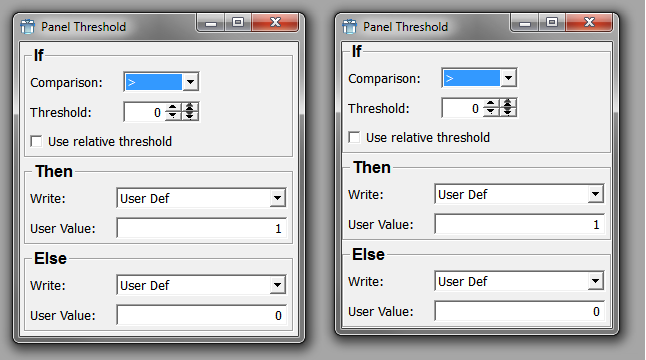
In the image above, the left window uses a Category as the top level layouter while the right window uses a Vertical instead. Note the clipping of the frames of the boxes by the window to the right.
Vertical is a vertical layout group control. Each control inside the Vertical is laid out according to its size requirements.
The following children's tags are taken into account:
Vertical is derived from Frame.
Aliases: VerticalNB, Category (see margin, though)
Dynamic scripting: MLABVBoxControl
Vertical {
spacing = INT [0]
margin = INT [0 for Vertical, non-zero default for Category]
// Additional tags: see Frame
ANYGUICONTROL { }
...
}ANYGUICONTROLAll controls declared inside the group are automatically children of the group.
Example 4.2. Vertical
Have a look at the module TestVerticalLayout. This module features some GUI components that are arranged vertically.
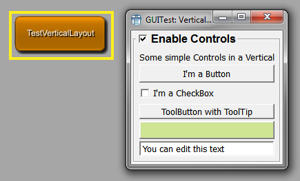
Horizontal is a horizontal layout group control. Each control inside the Horizontal is laid out according to its size requirements.
The following children's tags are taken into account:
Horizontal is derived from Frame.
Aliases: HorizontalNB, ButtonGroup
Dynamic scripting: MLABHBoxControl
Horizontal {
spacing = INT [0]
margin = INT [0]
// Additional tags: see Frame
ANYGUICONTROL { }
...
}ANYGUICONTROLAll controls declared inside the group are automatically children of the group.
Example 4.3. Horizontal
Have a look at the module TestHorizontalLayout. This module features some GUI components that are arranged horizontally.
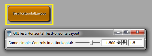
Table organizes its children in rows. Child controls can span multiple columns and can be aligned within their row/column position.
Each control inside the Table is laid out according to its size requirements, the following children tags are used by the layouter:
stretchX/Y, expandX/Y, alignX/Y, colspan
Table is derived from Frame.
Dynamic scripting: MLABTableControl
Table {
spacing = INT [0]
margin = INT [0]
// Additional tags: see Frame
Row {
visibleOn = FIELDEXPRESSION
dependsOn = FIELDEXPRESSION
ANYGUICONTROL { }
...
}
Row {
visibleOn = FIELDEXPRESSION
dependsOn = FIELDEXPRESSION
ANYGUICONTROL { }
...
}
...
}RowSpecifies a row in the table. The row can contain any number of child controls, which can also span multiple column (with the colspan tag used in a control).
Each row may also contain a dependsOn and visibleOn expression, as described for normal controls. Note that if dependsOn/visibleOn expressions are also specified for the children of the row, unspecified behavior may occur.
Example 4.4. Table
Have a look at the module TestTableLayout. Below you will find the MDL code that defines this example macro module.
scriptOnly = Yes
Window {
title = "GUITest: Table"
Table {
margin = 5
spacing = 3
Row {
Button {
colspan = 3
title = "TopLeft 3"
expandX = Yes
expandY = Yes
}
Button {
colspan = 2
title = "TopRight 2"
expandX = Yes
expandY = Yes
}
}
Row {
Button {
colspan = 2
title = "MidLeft 2"
expandX = Yes
expandY = No
}
Button {
colspan = 1
title = "MidCenter 1"
expandX = No
expandY = Yes
}
Button {
colspan = 2
title = "MidRight 2"
expandX = Yes
expandY = No
}
}
Row {
Button {
colspan = 2
title = "BottomLeft 2"
expandX = Yes
expandY = Yes
}
Button {
colspan = 3
title = "BottomRight 3"
expandX = Yes
expandY = Yes
}
}
Row {
Label "Resize this Window!" {
colspan = 5
alignX = Center
}
}
} // wrap
}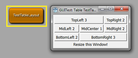
Grid organizes its children in rows and columns. Child controls can be positioned at any row/column position and can span multiple columns and can be aligned within their row/column position.
Each control inside the Grid is laid out according to its size requirements, the following children tags are used by the layouter:
stretchX/Y, expandX/Y, alignX/Y, x,
y, x2, y2
Grid is derived from Frame.
Dynamic scripting: MLABGridControl
| Tip |
|---|---|
Each child control needs to have a In contrast to Table, where controls are automatically ordered in rows, the Grid allows for more complex positioning. |
Grid {
spacing = INT [0]
margin = INT [0]
// Additional tags: see Frame
// simple control:
ANYGUICONTROL { x = INT y = INT }
// multicolumn control:
ANYGUICONTROL { x = INT y = INT x2 = INT y2 = INT }
...
}Example 4.5. Grid
Have a look at the module TestGridLayout. Below you will find the MDL code that defines this example macro module.
scriptOnly = Yes
Window {
title = "GUITest: Grid"
Grid {
margin = 5
spacing = 3
Button {
x = 0
y = 0
x2 = 2
Y2 = 0
title = "<0,0>-<2,0>"
expandX = Yes
expandY = Yes
}
Button {
x = 3
y = 0
x2 = 3
y2 = 2
title = "<3,0>-<3,2>"
expandX = Yes
expandY = Yes
alignX = Right
}
Button {
x = 0
y = 1
title = "<0,1>"
expandX = Yes
alignX = Left
}
Button {
x = 1
y = 1
title = "<1,1>"
expandY = Yes
alignY = Top
}
Button {
x = 2
y = 1
x2 = 2
y2 = 2
title = "<2,1>-<2,2>"
expandX = Yes
expandY = Yes
}
Button {
x = 0
y = 2
x2 = 1
y2 = 3
title = "<0,2>-<1,3>"
expandX = Yes
expandY = Yes
}
Button {
x = 2
y = 3
x2 = 3
y2 = 3
title = "<2,3>-<3,3>"
expandX = Yes
expandY = Yes
alignY = Bottom
}
}
}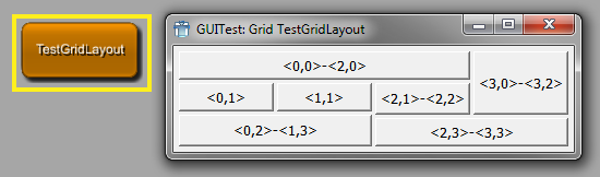
ButtonBox is a control that presents Button controls in a layout that is appropriate for the operating system's look & feel. Dialogs typically present buttons in a layout that conforms to the interface guidelines for that platform. A ButtonBox automatically uses the appropriate layout of the user's desktop environment, and may change the order in which the child buttons appear.
Dynamic scripting: MLABButtonBoxControl
ButtonBox {
orientation = ENUM [Horizontal]
// Button control:
Button { role = ENUM }
...
}orientation = ENUM (default: Horizontal)Sets the orientation of the button box.
Possible values: Horizontal, Vertical
ButtonSpecifies a Button control. The role attribute of a Button is used to determine the role of the button within a dialog window. See Button control for possible values.
If the button does not specify a role, the button title will be evaluated for known role strings. Currently known strings are: Ok, Open, Save, Cancel, Close, Discard, Apply, Reset, Restore Defaults, Help, Save All, Yes, Yes To All, No, No To All, Abort, Retry, Ignore
Splitter organizes its children in vertical or horizontal direction and allows to resize the contained controls with draggable handles. The color and shadow of the splitter are customizable.
Each control inside the Splitter is laid out according to its size requirements. The following children tags are used by the layouter:
Splitter is derived from Frame.
Dynamic scripting: MLABSplitterControl
Splitter {
direction = ENUM
color = COLOR
shadow = ENUM [Raised]
childrenCollapsible = BOOL [Yes]
// Additional: tags for frame
ANYGUICONTROL { }
...
}direction = ENUMDefines layout direction of the Splitter.
Possible values: Vertical, Horizontal
color = COLORSets the color that the splitter should have.
shadow = ENUM (default: Raised)Defines the type of shadow of the splitter. Possible values are Plain, Raised, and Sunken.
childrenCollapsible = BOOL (default: Yes)Defines whether the child widgets can be collapsed completely by dragging the splitter.
Example 4.6. Splitter
Have a look at the module TestSplitterLayout. Below you will find the MDL code that defines this example macro module.
scriptOnly = Yes
Window {
title = "GUITest: Splitter"
w = 512
h = 384
Splitter {
direction = Vertical
Button {
title = "1"
expandX = Yes
expandy = Yes
}
Splitter {
direction = Horizontal
Button {
title = "2"
expandX = Yes
expandy = Yes
}
Splitter {
direction = Vertical
Button {
title = "3"
expandX = Yes
expandy = Yes
}
Splitter {
direction = Horizontal
Button {
title = "4"
expandX = Yes
expandy = Yes
}
Splitter {
direction = Vertical
Button {
title = "5"
expandX = Yes
expandy = Yes
}
Splitter {
direction = Horizontal
Button {
title = "6"
expandX = Yes
expandy = Yes
}
Splitter {
direction = Vertical
Button {
title = "7"
expandX = Yes
expandy = Yes
}
}
}
}
}
}
}
}
}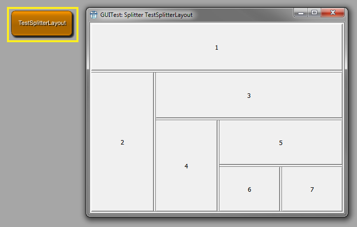
Box shows a frame with a title around its children. It can
contain any inner layout, selected by the layout tag. If no layout is chosen, a Vertical is implicitly used. Note that
all child tags of the Box are also used by the selected layout, e.g.,
the margin tag.
Dynamic scripting: MLABBoxControl
Box STRING {
title = STRING
titleField = FIELD
alignTitle = ENUM [Left]
layout = NAME [Vertical]
checked = BOOL [No]
checkable = BOOL [No]
checkedField = FIELD
ANYGUICONTROL { }
...
}title = STRINGOverwrites the title given in the Box tag.
titleField = FIELDProvides the title of the Box, precedes the title tag.
alignTitle = ENUM (default: Left)Sets the alignment of the title.
Possible values: Left, Center, Right
layout = NAME (default: Vertical)Defines a layouter.
Possible values: Category, Vertical, Horizontal, Table, Grid, Splitter, FreeFloat
checkedField = FIELDThe checkedField can be a boolean field. Its value is used to toggle the checked state that enables/disables the content of the box.
checkable = BOOL (default: No)Sets whether a checkbox appears in the title of the box that enables/disables the content of the box.
checked = BOOL (default: No)Sets the checked state that indicates whether the content of the box is enabled or disabled. This attribute will be overwritten if checkedField is given.
Note: There is a known Qt bug that causes the box contents to overlap with the checkbox if the box has no title
Example 4.7. Box
Have a look at the module TestBoxLayout. Below you will find the MDL code that defines this example macro module.
scriptOnly = Yes
Window {
title = "GUITest: Box"
Vertical {
margin = 5
Label "A Box with title and automatic layout:" {}
Box BoxTitle {
spacing = 5
margin = 5
Button { title = "A Button" }
Button { title = "B Button" }
Button { title = "C Button" }
}
Label "A Box without title and grid-layout:" {}
Box {
spacing = 2
margin = 2
layout = Grid
Button { title = "A Button" x = 2 y = 0}
Button { title = "B Button" x = 1 y = 1}
Button { title = "C Button" x = 0 y = 2}
}
}
}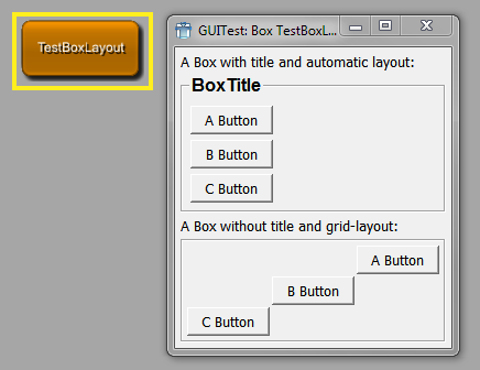
ScrollView allows to scroll a bigger control with vertical and horizontal scrollbars. If no layout is specified, the internal layout is a Vertical layout.
ScrollView is derived from Frame.
Dynamic scripting: MLABScrollViewControl
ScrollView {
layout = NAME [Vertical]
hscroller = ENUM [Auto]
vscroller = ENUM [Auto]
// Additional: tags for frame
ANYGUICONTROL { }
...
}hscroller = ENUM (default: Auto)Sets whether the horizontal scrollbar is always on, off, or should only appear when needed (auto).
Possible values: Auto, On, Off
vscroller = ENUM (default: Auto)Sets whether the vertical scrollbar is always on, off, or should only appear when needed (auto).
Possible values: Auto, On, Off
layout = NAME (default: Vertical)Defines a layouter.
Possible values: Vertical, Horizontal, Table, Grid, Splitter, FreeFloat
Example 4.8. ScrollView
The following example adds another window to the View3D, which then becomes available via the module's context menu (Show Window). It adds the settings panel in a ScrollView with no horizontal scroller but a vertical scroller if the panel's content exceeds the window (which it does).
Window ScrollViewTest {
ScrollView {
hscroller = Off
vscroller = Auto
Panel {
panel = Settings
}
}
}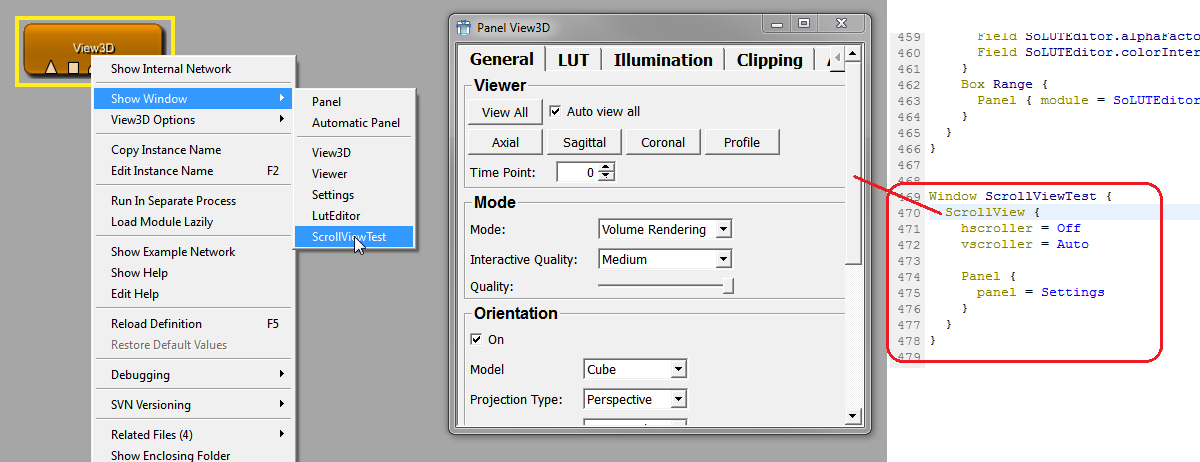
TabView shows a TabBar and contains a stack of controls that are visible depending on the selected Tab. It also offers a mode where the TabBar is not visible, allowing to change the selected Tab by scripting only (this is often used in applications that group their panels inside an invisible TabView).
The child controls of the TabView can be any control. The additional tags needed for the TabView are given as extra tags to the child controls. Refer to TabViewItem to see which tags are available.
The selected tab can be changed by using the selectTabAtIndex(int)
or selectTab(controlname)
method on the TabView, or by associating the control with a field of
type integer, whose value will be the index of the currently displayed
tab (see currentIndexField).
TabView is derived from Control.
Dynamic scripting: MLABTabViewControl
TabView {
currentIndexField = FIELD [None]
mode = ENUM [Normal]
acceptWheelEvents = BOOL [Yes]
ANYGUICONTROL { }
...
}currentIndexField = FIELD (default: None)Synchronizes the current tab index with the value of a field of type integer, i.e., the value of the field changes when the tab is changed and vice versa.
mode = ENUM (default: Normal)Defines whether the TabBar is visible and if it is on the top or bottom of the widget. If the mode is "toolbox", a ToolBox widget is used instead of a TabView; this has the advantage of internal scrollbars and the possibility of long tab description. If the mode is "listview", a ListView widget is shown on the left and shows each tab title as an entry in the list. If the ListView mode is enabled, the tabHierarchy tag of each TabViewItem can be used to show a tree structure instead of a flat list.
Possible values: Normal, Top, Bottom, Left, Right, Invisible, Toolbox, ListView
acceptWheelEvents = BOOL (default: Yes)Sets whether the TabView should accept mouse wheel events to flip through its TabViewItems.
ANYGUICONTROLEach control in the TabView is treated as a TabViewItem and can contain the tags given in TabViewItem
Example 4.9. TabView
Have a look at the module TestTabViewLayout. This module features the use of an invisible TabView where the tabs are changed by using scripting commands that are triggered by pressing a button, and the use of standard tabs.
Note that each direct child of a TabView is turned into an own tab.
scriptOnly = Yes
Commands {
source = $(LOCAL)/TestTabViewLayout.py
}
Window {
title = "GUITest: TabViews"
Vertical "TabView with invisible Tabs" {
Box Select {
layout = Horizontal
Button { title = "Boxes" command = switchTab0 }
Button { title = "Table" command = switchTab1 }
Button { title = "TextView" command = switchTab2 }
}
TabView {
name = TabViewInvisible
mode = Invisible
Vertical {
tabTitle = "Boxes"
margin = 5
Box BoxTitle { ... }
Label "A Box without title and grid-layout:" {}
Box BoxTitle { ... }
}
Table { ... }
TextView {
tabTitle = TextView
title = TextViewExample
text = "Example for a TextView-Control in a TabView"
}
}
}
TabView "TabView with visible Tabs" {
Vertical "Boxes" {
margin = 5
Box BoxTitle { ... }
Label "A Box without title and grid-layout:" {}
Box BoxTitle { ... }
}
Table "Table" { ... }
}
}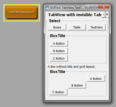
The TabViewItem can be used inside a TabView to specify the TabView entries. Any other control can also act as a TabViewItem in the TabView, just add the tags below to the control to pass the needed information to the TabView.
The TabViewItem is a Vertical layouter and has the following tags:
Dynamic scripting: MLABVBoxControl
TabViewItem STRING {
tabIcon = FILE
tabTitle = STRING
tabInitial = BOOL
tabTooltip = STRING
tabHierarchy = STRING
tabSelectedCommand = SCRIPT
tabDeselectedCommand = SCRIPT
tabEnabled = BOOL [Yes]
tabDependsOn = FIELDEXPRESSION
ANYGUICONTROL { }
...
}tabIcon = FILESets an icon to show on the TabBar.
tabTitle = STRINGSets a title to use in the TabBar (overwrites the value of the TabViewItem tag).
tabInitial = BOOLSelects a TabViewItem as the initially selected Tab (otherwise, the first Tab is selected).
tabTooltip = STRINGSets a tooltip text on the TabBar.
tabHierarchy = STRINGDefines the hierarchy name of the tab. This can be used in a TabView with mode = ListView to support nested tabs. The separation character is '/'. For example, a value of 'Root/Settings' means that the tab is a child of the TabViewItem with the tabHierarchy name 'Root'. The nesting is unlimited, but the parent TabViewItems need to be declared before the child tab view items. All TabViewItems are defined on the same MDL level/in the same TabView, the nesting is only available in the ListView mode and does not influence the title of the tabs, only the nesting.
tabSelectedCommand = SCRIPTDefines a script command that is called when this TabViewItem is selected (also called on the initial selection).
tabDeselectedCommand = SCRIPTDefines a script command that is called when this TabViewItem is deselected.
tabEnabled = BOOL (default: Yes)Sets whether this tab is initially enabled.
tabDependsOn = FIELDEXPRESSIONSets whether this tab is enabled depending on the given field expression. Have a look at the example of this tag for a more detailed explanation.
FreeFloat organizes its children at a given integer position. The coordinate system starts with (0,0) in the upper left corner.
Each control inside the FreeFloat is positioned with the tags:
The size of the controls is taken from the width/height tags:
FreeFloat is derived from Frame.
Dynamic scripting: MLABFreeFloatControl
| Tip |
|---|---|
The FreeFloat should ONLY be used where no other layouter works, since it offers fixed control positioning, which can have undesired effects when, for example, the font size changes. It can be used nicely to have a title image and some floating buttons on the image. |
FreeFloat {
autoSize = BOOL
// Additional: tags for frame
ANYGUICONTROL { }
...
}User input control are typically tightly coupled with field in MeVisLab, thus allowing an easy way to represent a module's parameter field with a desired user interface. If not stated, all controls are derived from Control and offer its tags.
Field is a very generic control that can show any of the fields
in MeVisLab as an editable GUI element. It typically shows a label
with the field name (or a given title) followed by a number of user-editable
controls, e.g., LineEdit, NumberEdit, VectorEdit, ColorEdit,
Slider.
It also allows to have field connections by using drag-and-drop of the title label and a pop-up menu to work on the underlying field. Whether drag-and-drop is turned on depends on the window the control is used in. If it is an application window, drag-and-drop is automatically disabled.
Dynamic scripting: MLABFieldControl
Field FIELD {
title = STRING
titleField = FIELD
edit = BOOL [Yes]
validator = REGEXP
slider = BOOL [No]
pressedIndicatorField = FIELD
editField = BOOL [Yes]
format = STRING
minLength = INT [5]
hintText = STRING
trim = ENUM [None]
sunkenVectorLabels = BOOL [Yes]
componentTitles = STRING
editAlign = ENUM [Left]
textAlign = ENUM [Left]
step = FLOAT
stepstep = FLOAT
sliderSnap = FLOAT
spacing = INT [0]
alignGroup = STRING
enumAutoFormat = BOOL [Yes]
acceptWheelEvents = BOOl [Yes]
comboBox = BOOL [No]
comboEditable = BOOL [Yes]
comboCompletes = BOOL [Yes]
caseSensitiveAutoComplete = BOOL [Yes]
comboSeparator = STRING [,]
comboField = FIELD
comboItems {
item {
image = FILE
title = STRING
}
...
}
applyButton = BOOL [No]
moreButton = BOOL [No]
browseButton = BOOL [No]
fileDialogCreatesUnexpandedFilenames = BOOL [No]
browseMode = ENUM [Open]
browseTitle = STRING
browseFilter = STRING
browsingGroup = STRING
browseSelectedCommand = SCRIPT
useSheet = BOOL [Yes]
fieldDragging = BOOL
updateFieldWhileEditing = BOOL [No]
}title = STRINGThe title shown on field label.
titleField = FIELDSets the title as a field; it is automatically updated when the field changes and shows that field's string value.
step = FLOATSets a step value used for NumberEdits.
stepstep = FLOATSets a stepstep value used for NumberEdits. The stepstep value is usually smaller than the step value.
sliderSnap = FLOATSets a snap value for the slider. If set to a value != 0, the slider always snaps to a value that is a multiple of this value starting at the slider's minimum.
edit = BOOL (default: Yes)Sets whether the fields value can be edited. If set to
No, text labels are typically used instead of editable GUI elements.This is different from the general Control tag
enabled, which enables or disables an entire control (also called "grayed out").validator = REGEXPSets a regular expression to check whether the input is valid when the value is editable and not a number. A description of the expression syntax can be found here: https://doc.qt.io/qt-6/qregexp.html
slider = BOOL (default: No)Sets whether a slider is shown. This only works if the field is a number field and has min and max values.
pressedIndicatorField = FIELDSpecifies a boolean field that is set to True if the user presses the slider button and to False if the user releases the slider button.
editField = BOOL (default: Yes)Sets whether the GUI element is editable. This is typically used to enable the slider without the NumberEdit to the left.
format = STRINGSets a format string to be used as in sprintf, e.g., %4.5f or %x
Note You have to use the correct %d,%x ,%f,%g type for float/double/int fields.
minLength = INT (default: 5)Sets a minimum width of characters reserved in the editable GUI element.
hintText = STRINGSets a hint text shown in an editable line edit if the line edit is empty and does not have the focus.
updateFieldWhileEditing = BOOL (default: No)Sets whether the attached field is updated while the user types text in the line edit.
trim = ENUM (default: None)Performs trimming on the string when it is not edited.
Possible values: Left, Center, Right, None
Left...LongText
CenterLong...Text
RightLongText...
NoneNo trimming
sunkenVectorLabels = BOOL (default: Yes)Sets whether labels are drawn into the same frame as the LineEdit; otherwise, they are drawn separately.
componentTitles = STRINGSpecifies titles for the separate component edit boxes of a vector value, overriding the default values. Values must be comma-separated. Extra values will be ignored, if too few values are specified, the remaining labels will be unchanged. If this is used on a non-vector field, an error is printed.
editAlign = ENUM (default: Left)Defines the alignment of the text in the Line/NumberEdits. Default depends on whether numbers or strings are edited.
Possible values: Left, Right, Center
textAlign = ENUM (default: Left)Defines the alignment of the text in the title label.
Possible values: Left, Right, Center
alignGroup = STRINGSets a hint to which other Fields this Field should be aligned. If the Control should never be aligned, use "None". This is a general feature and is explained in detail in Section 4.9.1, “Align Groups”
enumAutoFormat = BOOL (default: Yes)Sets whether enum fields should avoid automatic formatting of enumeration names. Automatic formatting means that a field called "MyName" receives the automatic title "My Name". If the enum items have a common prefix, this is also stripped when automatic formatting is active.
acceptWheelEvents = BOOL (default: Yes)Sets whether a ComboBox or a number field (integer, float, or double) should accept mouse wheel events to adjust its value.
comboBox = BOOL (default: No)Sets whether a comboBox is used instead of LineEdit.
comboEditable = BOOL (default: Yes)Sets whether the ComboxBox string is editable.
comboCompletes = BOOL (default: Yes)Sets whether auto-complete is used when editable.
caseSensitiveAutoComplete = BOOL (default: Yes)Sets whether the ComboBox auto-completion is case-sensitive.
comboField = FIELDSpecifies a field whose string value is used instead of given
comboItems. When the comboField changes, the available combo list is updated. Note that the field respresenting the selected value is not changed, even if the current value is not in the new combo list.comboSeparator = STRING (default: ",")Sets a string value to use for splitting the string value of comboField into individual values.
comboItemsSpecifies the items shown in the ComboBox, may be omitted if
comboFieldis given.Each item is specified with the
itemtag.Each item entry can contain the following tags:
applyButton = BOOLSets whether an apply button is generated for VectorEdit. Only the Rotation control has an Apply Button by default; in all other cases it is off by default.
moreButton = BOOL (default: No)Sets whether an additional "..." button is generated that opens a multiline text edit to edit the field's string value.
browseButton = BOOL (default: No)Sets whether an additional browse button is generated that opens a file dialog at current field value (path).
fileDialogCreatesUnexpandedFilenames = BOOL (default: No)The file dialog that is shown via the browse button generates absoulte path names, if fileDialogCreatesUnexpandedFilenames is set to No. Otherwise, it replaces the beginning of the filename with a variable like $(LOCAL), $(DemoDataPath), if possible.
See also MLABModule::unexpandFilename()
browseMode = ENUM (default: Open)Specifies the type of the file dialog.
Possible values: Open, Save, Directory, OpenReadOnly, DirectoryReadOnly
The ReadOnly variants of these values open a browse dialog that does not allow changes to the file system. This might use a non-system browse dialog.
browseTitle = STRINGSets the title of the button for the file dialog.
browseFilter = STRINGSpecifies the file extension filter that is used in open and save mode. You can specify the file types as follows:
browseFilter = "All C++ files (*.cpp *.cc *.C *.cxx *.c++);;Text files (*.txt);;All files (*)"Filters are separated by double-semicolon. The filter is a space-separated list of glob-style expressions enclosed in braces that follow the textual description of the filter.
browsingGroup = STRINGMeVisLab file dialogs store the last used directory; this way, they can open at the last used location.
If you have applications that load/save data at different locations, you can put the dialogs into different browsing groups that store the last used direction separately. Just use different group names (only use letters and numbers in the names).
browseSelectedCommand = SCRIPTDefines the script command to be evaluated when the user made a selection with the file dialog.
useSheet = BOOL (default: Yes)Sets whether any attached dialog (e.g., file dialog) is created as a sheet on Mac OS X. A sheet is a modal dialog attached to a particular document or window.
spacing = INT (default: 0)Sets the internal spacing between the GUI elements of a FieldControl.
wrap = BOOLSets whether step and stepstep wrap the value around when reaching the boundaries.
fieldDragging = BOOLSets whether dragging the field's label onto another field's label is possible to create connections. The default is
Yesfor normal panels andNofor standalone applications. This also turns on the connection icons and enables the field context menu on field labels.
// Different layouts can be used with certain types of fields: // // MLABStringField: // ---------------- // FieldLabel | <- LineEdit -> | [Browse/Save Button] // // If "edit" is 'No', LineEdit is just a Label // // MLABBoolField: // ---------------- // FieldLabel | CheckBox // (CheckBox is without label on right) // // MLABInt/Float/DoubleField: // -------------------------- // FieldLabel | NumberEdit | [<- Slider if min/max is set and "slider" tag is 'Yes' ->] // // If "edit" is 'No', NumberEdit is just a Label // // MLABEnumField: // -------------- // FieldLabel | ComboBox // // MLABTriggerField: // -------------- // FieldLabel | Button // // MLABColorField: // -------------- // FieldLabel | ColorEdit // // MLABVec2f/3f/4f/Plane/RotationField: // ------------------------------------------ // FieldLabel | x | NumberEdit | y | NumberEdit | z | NumberEdit | d | NumberEdit | [Apply Button] // // Naming for labels: // MLABVec2f: x,y // MLABVec3f: x,y,z // MLABVec4f: x,y,z,t // MLABRotation: x,y,z,r // MLABPlane: x,y,z,d // // If "edit" is 'No', NumberEdits are just Labels
FieldLabel shows the draggable label that is used in the Field control. It may be used if one wants to allow a drag/drop connection, e.g., of a matrix, and does not want to show the value of the field.
FieldLabel FIELD {
title = STRING
titleField = FIELD
}Button shows a clickable button that can either trigger a
MLABTriggerField or MLABBoolField or that can call a script given as
command tag. The button can have
multiple images for the different states and it can be a normal or a
toggle button.
Dynamic scripting: MLABButtonControl
| Tip |
|---|---|
You can use & in the button title to add an ALT keyboard shortcut binding to a button. The respective letter will be underlined (e.g., "&Ok"). |
Button [FIELD] {
title = STRING
titleField = FIELD
role = ENUM [ApplyRole]
image = FILE
accel = KEYSEQUENCE
border = BOOL [Yes]
autoRepeat = BOOL [No]
normalOnImage = FILE
normalOffImage = FILE
activeOnImage = FILE
activeOffImage = FILE
disabledOnImage = FILE
disabledOffImage = FILE
globalStop = BOOL [No]
fieldDragging = BOOL
popupMenu {
// See definition of SubMenu
}
command = SCRIPT
}title = STRINGSets the title on the button.
titleField = FIELDSets the title as a field. The title string is automatically updated when the field changes and shows that field's string value.
role = ENUM (default: ApplyRole)Defines the role of the button in the window/dialog. It is evaluated if the button has been placed within a ButtonBox container.
Possible values are:
AcceptRoleClicking the button causes the dialog to be accepted (e.g., OK).
RejectRoleClicking the button causes the dialog to be rejected (e.g., Cancel).
DestructiveRoleClicking the button causes a destructive change (e.g., for Discarding Changes) and closes the dialog.
ActionRoleClicking the button causes changes to the elements within the dialog.
HelpRoleThe button can be clicked to request help.
YesRoleThe button is a "Yes"-like button.
NoRoleThe button is a "No"-like button.
ApplyRoleThe button applies current changes.
ResetRoleThe button resets the dialog's fields to default values.
image = FILESpecifies a pixmap to use on the button.
accel = KEYSEQUENCESets a CTRL or ALT key sequence that activates this button. For normal ALT keyboard shortcuts, use the & notation in the title string.
Example:
accel = CTRL+Uborder = BOOL (default: Yes)Sets whether the buttons have a border.
autoRepeat = BOOL (Default: No)Sets whether the button sends repeated clicked signal when user holds the button.
normalOnImage = FILEnormalOffImage = FILEactiveOnImage = FILEactiveOffImage = FILEdisabledOnImage = FILEdisabledOffImage = FILESpecifies different images for all states of the button.
popupMenuDefines a pop-up menu to show on button press.
globalStop = BOOL (default: No)Sets whether this button can be used as a global stop button, so that current ML calculations can be stopped by clicking this button.
To check buttons for a stop request in the scripting, you have to call
MLAB.shouldStop()regularly in you scripting loop. This returns True if a stop button was pressed.command = SCRIPTDefines a script command that is executed when the button is pressed/toggled.
fieldDragging = BOOLSets whether the dragging of the button onto other buttons is possible to create field connections. The default is
Yesfor normal panels andNofor standalone applications. This enables the field context menu on the button.
ToolButton is a quick access button that is typically used in
ToolBars. It can have an additional pop-up menu that pops up after a
given delay. It has mainly the features from Button, but additionally supports autoRaise, which lets the border be
highlighted when the mouse moves over it. The title is typically not
shown. It can either trigger a MLABTriggerField or MLABBoolField, or
can call a script given as command
tag. The button can have multiple images for the different states and
it can be a normal or a toggle button.
Dynamic scripting: MLABToolButtonControl
ToolButton [FIELD] {
image = FILE
title = STRING
titleField = FIELD
textPosition = ENUM [Bottom]
autoRepeat = BOOL [No]
autoRaise = BOOL [No]
autoScale = BOOL [No]
accel = KEYSEQUENCE
scaleIconSetToMinSize = BOOL [No]
normalOnImage = FILE
normalOffImage = FILE
activeOnImage = FILE
activeOffImage = FILE
disabledOnImage = FILE
disabledOffImage = FILE
globalStop = BOOL [No]
inlineDrawing = BOOL [No]
popupMenu {
// See definition of SubMenu
}
popupDelay = FLOAT (deprecated)
popupMode = [Instant|Delayed|MenuButton]
command = SCRIPT
}title = STRINGSets a title string on the button (typically not shown).
titleField = FIELDSpecifies a field that provides the text for the button; the text is updated when that field changes.
image = FILESpecifies a pixmap to use on the button.
textPosition = ENUM (default: Bottom)Sets the position of the title relative to the image.
Values: Right, Bottom
accel = KEYSEQUENCESets a CTRL or ALT key sequence that activates this button. For normal ALT keyboard shortcuts, use the & notation in the title string.
Example:
accel = CTRL+UautoRepeat = BOOL (default: No)Sets whether the button sends repeated clicked signal when user holds the button.
autoRaise = BOOL (default: No)Sets whether the border is shown only on mouse-over.
autoScale = BOOL (default: No)Scales the images to the MeVisLab global default tool button size.
scaleIconSetToMinSize = BOOL (default: No)If autoScale is set to
Yesand this tag is also set toYes, the Images from the following six ImageTags are not scaled to the default tool button size but to the minimum size of the tool button as set by the tags mw and mh:normalOnImage = FILEnormalOffImage = FILEactiveOnImage = FILEactiveOffImage = FILEdisabledOnImage = FILEdisabledOffImage = FILESpecifies different images for all states of the button.
popupMenuDefines a pop-up menu to show on button press.
popupDelay = FLOAT (deprecated)Sets the delay to show the pop-up menu. This is deprecated, use popupMode instead.
popupMode = [Instant,Delayed,MenuButton]Sets the mode of the pop-up menu. If set to Instant, the pop-up menu shows when the button is pressed. If set to Delayed, the pop-up menu shows if the button is pressed for a system dependend time span. If set the MenuButton, an extra menu button is rendered next to the normal ToolButton.
globalStop = BOOL (default: No)Defines whether this button can be used as a global stop button, so that current ML calculations can be stopped by clicking this button.
To check buttons for a stop request in the scripting, you have to call
MLAB.shouldStop()regularly in you scripting loop. This returns True if a stop button was pressed.inlineDrawing = BOOL (default: No)Enables inline drawing, which disables the drawing of the button frame and the sunken state.
This is useful if used as an inline widget of a LineEdit.
command = SCRIPTDefines a script command that is executed when the button is pressed/toggled.
CommonButtonGroup cannot be used directly. It implements the common functionality for button groups, which are PushButtonGroup, RadioButtonGroup and ToolButtonGroup.
Button groups are GUI elements to group buttons together because they share a common purpose. For example, a panel where the user has to select one or more filters to be applied to an image. The buttons would be checkable and not exclusive. The button group can be synchronized with an enum field, an integer field, and it can be used without any field.
CommonButtonGroup [FIELD] {
border = BOOL [No]
buttonClickedCommand = SCRIPT
buttonPressedCommand = SCRIPT
buttonReleasedCommand = SCRIPT
equalButtonWidths = BOOL [No]
equalButtonHeights = BOOL [No]
exclusiveButtons = BOOL [No, with fields Yes]
margin = UINT [2]
orientation = ENUM [Horizontal]
showButtonNames = BOOL [No]
showIconsOnly = BOOL [No]
spacing = UINT [4]
stripEnumItemPrefix = BOOL [Yes]
strips = UINT [1]
title = TRANSLATEDSTRING
items {
item [NAME|VALUE] {
command = SCRIPT
enabled = BOOL
visible = BOOL
dependsOn = FIELDEXPRESSION
visibleOn = FIELDEXPRESSION
image = IMAGEFILE
shortcut = TRANSLATEDKEYSEQUENCE
title = TRANSLATEDSTRING
tooltip = TRANSLATEDSTRING
whatsThis = TRANSLATEDSTRING
activeOnImage = IMAGEFILE
activeOffImage = IMAGEFILE
disabledOnImage = IMAGEFILE
disabledOffImage = IMAGEFILE
normalOnImage = IMAGEFILE
normalOffImage = IMAGEFILE
}
// ... more items may follow ...
}
}
border = BOOL (default: No)Sets whether a rectangular border is drawn around the buttons.
Note A border is required if a title is given. Setting border to No and specifying a title will result in an error message and border will be set to Yes.
buttonClickedCommand = SCRIPTDefines a script command that is called when any button has been clicked. The button name is passed as argument.
buttonPressedCommand = SCRIPTDefines a script command that is called when any button has been pressed. The button name is passed as argument.
buttonReleasedCommand = SCRIPTDefines a script command that is called when any button has been released. The button name is passed as argument.
equalButtonWidths = BOOL (default: No)If set to Yes, then the widths of all buttons in the group are resized to match the widest button.
equalButtonHeights = BOOL (default: No)If set to Yes, then the heights of all buttons in the group are resized to match the highest button.
exclusiveButtons = BOOL (default: No, with field: Yes)Sets whether only the last clicked buttons is checked and all others are released. This is only supported if buttons are checkable.
Note If an enum field or integer field is used, then this is always Yes, because the field can have only one state.
margin = UINT (default: 2)Sets the margin of the button group widget. It is applied to all four sides: top, left, bottom, right.
orientation = ENUM (default: Horizontal)Specifies whether the buttons are vertically or horizontally laid out.
showButtonNames = BOOL (default: No)Sets whether the button name is appended to the title.
showIconsOnly = BOOL (default: No)Sets whether the button name and title are not displayed.
spacing = UINT (default: 4)Sets the amount of space between the buttons.
stripEnumItemPrefix = BOOL (default: Yes)Sets whether title prefixes are removed. For example, if the enum titles are "AutoUpdate" and "AutoLoad", the titles will be "Update" and "Load". "Auto_Update" and "Auto_Load" will also be "Update" and "Load". This is only evaluated if the button group is assigned to an enum field.
strips = UINT (default: 1)Specifies how many buttons are added to a row if the orientation is horizontal, or to a column if the orientation is vertical.
title = STRINGSpecifies the title of the button group. If it is not empty, border must be set to Yes, since it this required. Otherwise, a warning is printed.
itemsSpecifies the items of an enumeration. Their values must correspond to a field value, or, if no field is given, it can be freely choosen. The value will be the button name and is used to access the buttons through the scripting API (see Button Access Slots in MLABCommonButtonGroupControl).
command = SCRIPTDefines a script command that is called when the button has been clicked.
enabled,visible = BOOLSets whether the button is initially enabled/visible.
dependsOn,visibleOn = FIELDEXPRESSIONDetermines whether the button is disabled/hidden; otherwise, it is enabled/visible. See dependsOn/visibleOn of the generic Control for a more detailed explanation of the expression.
image = IMAGESpecifies an image file to add an icon to the button.
title = STRINGSpecifies the text of the button.
tooltip = STRINGSets a text that pops up if the button receives a tooltip event. For example, this happens when the mouse cursor stays over the button.
whatsThis = STRINGSets an additional help text.
activeOnImage,activeOffImage,disabledOnImage,disabledOffImage,normalOnImage,normalOffImage = IMAGEFILESpecifies image files that are displayed as the icon of the button, depending on its modes and states.
The button is active when the user is interacting with the button, for example, moving the mouse over it or clicking it.
disabled means that the functionality of the button is not available.
normal is the default mode. The user is not interacting with the button, but the functionality is available.
The on and off states correspond to the ckecked state of the button.
Dynamic scripting: MLABCommonButtonGroupControl
PushButtonGroup is derived from CommonButtonGroup.
PushButtonGroup supports these additional tags:
PushButtonGroup [FIELD] {
autoScaleIcons = BOOL [No]
checkableButtons = BOOL [No, with field Yes]
flatButtons = BOOL [No]
iconWidth = INTEGER
iconHeight = INTEGER
useOriginalIconSizes = BOOL [No]
// ... more tags of CommonButtonGroup ...
}
autoScaleIcons = BOOL (default: No)Sets whether the icons are scaled to the default icon size of MeVisLab.
checkableButtons = BOOL (default: No, with field: Yes)Sets whether the buttons are checkable and are automatically raised after clicking on them.
Note If an enum field or integer field is used, then this is always Yes, because the field has a state.
flatButtons = BOOL (default: No)Sets whether the border of the button is not raised.
iconWidth = INTEGERSets the maximum width of the button icons. Requires that iconHeight is also set.
iconHeight = INTEGERSets the maximum height of the button icons. Requires that iconWidth is also set.
useOriginalIconSizes = BOOL (default: No)Sets whether the original image size is used as the icon's size.
Dynamic scripting: MLABPushButtonGroupControl
RadioButtonGroup is derived from CommonButtonGroup.
| Note |
|---|---|
The radio buttons are always checkable and the default value for exclusiveButtons is Yes. |
RadioButtonGroup [FIELD] {
// .. tags of CommonButtonGroup ...
}
Dynamic scripting: MLABRadioButtonGroupControl
ToolButtonGroup is derived from CommonButtonGroup.
ToolButtonGroup supports these additional tags:
ToolButtonGroup [FIELD] {
autoScaleIcons = BOOL [No]
autoRaiseButtons = BOOL [Yes]
checkableButtons = BOOL [No, with field Yes]
iconWidth = INTEGER
iconHeight = INTEGER
useOriginalIconSizes = BOOL [No]
// ... more tags of CommonButtonGroup ...
}
autoScaleIcons = BOOL (default: No)See autoScaleIcons of PushButtonGroup.
autoRaiseButtons = BOOL (default: Yes)Sets whether tool buttons are automatically raised.
checkableButtons = BOOL (default: No, with field: Yes)See checkableButtons of PushButtonGroup.
iconWidth = INTEGERSets the maximum width of the button icons. Requires that iconHeight is also set.
iconHeight = INTEGERSets the maximum height of the button icons. Requires that iconWidth is also set.
useOriginalIconSizes = BOOL (default: No)Sets whether the original image size is used as the icon's size.
Dynamic scripting: MLABToolButtonGroupControl
| Note |
|---|---|
This control is deprecated. Use PushButtonGroup, RadioButtonGroup, ToolButtonGroup or ComboBox instead. |
ButtonBar is a control that has different appearances for a given number of entries being read from an enum field or integer field. It can be vertically or horizontally laid out. It is synchronized with the field bidirectionally.
Available modes are:
A group of Buttons with icons and/or titles
A group of RadioButtons with icons and/or titles
A ComboBox that shows a pop-up bar showing the possible options as items. Items are given as list of items in the
itemstag group. Each item either gives an enum string value or an integer number. If no items are given for an enum field, all enums are automatically shown with their titles.
Dynamic scripting: MLABButtonBarControl
ButtonBar FIELD {
title = STRING
show = ENUM [All]
enumAutoFormat = BOOL [Yes]
direction = ENUM [Horizontal]
border = BOOL [Yes]
showItemInternals = BOOL [No]
strips = INT [1]
autoScale = BOOL [No]
items {
item [NAME|VALUE] {
image = FILE
title = STRING
tooltip = STRING
whatsThis = STRING
accel = KEYSEQUENCE
normalOnImage = FILE
normalOffImage = FILE
activeOnImage = FILE
activeOffImage = FILE
disabledOnImage = FILE
disabledOffImage = FILE
}
...
}
}show = ENUM (default: All)Defines how the ButtonBar should show its items.
Possible values: One, All, Radio, Toolbuttons
OneShows the pop-up menu.
AllShows all entries as buttons.
RadioShows radio buttons.
ToolbuttonsShows tool buttons.
direction = ENUM (default: Horizonal)Defines the layout direction of the buttons.
Possible values: Vertical, Horizontal
border = BOOL (default: Yes)Sets whether buttons should have a border (not selectable in all show options).
showItemInternals = BOOL (default: No)Sets whether items show their internal name.
title = STRINGSets the title of the ButtonGroup frame, if any (if used, implicitly sets border = Yes).
strips = INT (default: 1)Sets the number of "strips" in which the buttons are organized.
spacing = INT (default: 4)Sets the spacing between buttons (not used in all show options).
autoScale = BOOL (default: No)Sets the scaling of the images of toolbuttons to the MeVisLab global default tool button size.
enumAutoFormat = BOOL (default: Yes)Sets whether the enumeration item names should be automatically formatted.
itemsSpecifies the items shown in the ButtonBar. If not specified, it uses the items from enum field automatically.
Each item is specified with the
itemtag that need to have a string value for an enum field and an integer for an integer field.Each item entry can hold the following tags:
image = FILESets the image to be used for the item.
title = STRINGSets the title to be used for the item. To have a toolbutton that only shows its icon, set this explicitly to an empty string.
tooltip = STRINGSets the tooltip shown on the item (for the pushbutton, radiobuttons).
whatsThis = STRINGSets an additional help text for the item (for the pushbutton, radiobuttons).
accel = STRINGSets an accelerator key for this item.
normalOnImage = FILEnormalOffImage = FILEactiveOnImage = FILEactiveOffImage = FILEdisabledOnImage = FILEdisabledOffImage = FILESpecifies images for the different states of the buttons (not supported in all show modes).
// Integer field as radio buttons
ButtonBar someIntField {
show = Radio
direction = Vertical
title = "Select child"
items {
item -1 { title = "Auto" }
item 0 { title = "Child 0" }
item 2 { title = "Child 2" }
item 4 { title = "Child 4" }
}
}
// Enum field as buttons
ButtonBar someEnumField {
show = All
direction = Vertical
items {
item "ADD" { image = $(LOCAL)/add.png [title= ...]}
item "SUBTRACT" { image = $(LOCAL)/subtract.png }
item "BLEND" { image = $(LOCAL)/blend.png }
}
}CheckBox is a checkbox with a label or image to the right. It can be synchronized with an MLABBoolField or MLABIntegerField. If a FIELD is given, the label of the checkbox also supports drag-and-drop the same way as field controls.
Dynamic scripting: MLABCheckBoxControl
| Tip |
|---|---|
A CheckBox is used to implement a many-of-many choice, while a one-of-many choice is done with a RadioButtonGroup or a ComboBox. |
CheckBox [FIELD] {
title = STRING
checked = BOOL [No]
image = FILE
editable = BOOL [Yes]
toggledCommand = SCRIPT
fieldDragging = BOOL
}checked = BOOL (default: No)Specifies the intially checkbox state.
title = STRINGSets the label text next to the checkbox (RichText).
image = FILESpecifies a pixmap to use next to the checkbox.
editable = BOOL (default: Yes)Sets whether editing of the value is allowed. If set to
Nothe value is not editable, but the text is displayed normally.This is different from the general Control tag
enabled, which enables or disables an entire control (also called "grayed out").toggledCommand = SCRIPT (argument: toggledState)Sets a script command that is called when checkbox is checked or unchecked, passing the new state as argument.
fieldDragging = BOOLSets whether the dragging of the fields label onto other field label is possible to create connections. The default is
Yesfor normal panels andNofor standalone applications. This also turns on the connection icons and enables the field context menu on field labels.
ComboBox is a control that allows a string to be edited and also supports a pop-up of possible values. If editing is disabled, only selecting a preset is possible. If the ComboBox has a given field, it is synchronized in both directions. The field can be an enum field or a field of any type that reacts in a meaningful way with a setStringValue/stringValue.
Dynamic scripting: MLABComboBoxControl
ComboBox [FIELD] {
editable = BOOL [Yes]
validator = REGEXP
autoComplete = BOOL [Yes]
caseSensitiveAutoComplete = BOOL [Yes]
enumAutoFormat = BOOL [Yes]
acceptWheelEvents = BOOL [Yes]
maxCount = INT
insertPolicy = ENUM [AtBottom]
duplicatesEnabled = BOOL [Yes]
comboField = FIELD
comboSeparator = STRING [,]
activatedCommand = SCRIPT
textChangedCommand = SCRIPT
items {
item {
image = FILE
title = STRING
}
...
}
}editable = BOOL (default: Yes)Sets whether the ComboBox string is editable.
validator = REGEXPSets a regular expression to check whether the input line is valid when the ComboBox is editable. A description of the regular expression syntax can be found here: https://doc.qt.io/qt-6/qregexp.html
Note: Items from the drop-down box should match the regular expression.
autoComplete = BOOL (default: Yes)Sets whether the ComboBox auto-completes if it is editable.
caseSensitiveAutoComplete = BOOL (default: Yes)Sets whether the ComboBox auto-completion is case-sensitive.
enumAutoFormat = BOOL (default: Yes)Sets whether enum fields should avoid automatic formatting of enumeration names. Automatic formatting means that a field called "MyName" receives the automatic title "My Name". If the enum items have a common prefix, this is also stripped when automatic formatting is active.
acceptWheelEvents = BOOL (default: Yes)Sets whether the ComboBox should accept mouse wheel events to adjust its value.
textChangedCommand = SCRIPT(argument: string)Defines a script command that is executed when the text in the ComboBox changes (every time the user types something).
activatedCommand = SCRIPT (argument: string)Defines a script command that is executed when a ComboBox item is selected or entered by typing and pressing RETURN.
maxCount = INTSets the maximum number of items.
insertPolicy = ENUM (default: AtBottom)Defines where new items are inserted when ComboBox is editable.
Possible values: NoInsertion, AtTop, AtCurrent, AtBottom, AfterCurrent, BeforeCurrent
duplicatesEnabled = BOOL (default: Yes)Sets whether duplicate items are allowed to be entered when editable (does not apply to script methods that insert items).
comboField = FIELDSpecifies a field whose string value is split and used instead of given items.
When the comboField changes, the available combo list is updated.
comboSeparator = STRING (default:",")Sets a string value to use for splitting the string value of
comboFieldinto individual values.itemsSpecifies the items shown in the ComboBox. May be omitted if
comboFieldis given.Each item is specified with the
itemtag.Each item entry can hold the following tags:
Example 4.10. ComboBox
Have a look at the module TestComboBox. This module features a ComboBox and some scripting for adding new items dynamically, as well as clearing all items by scripting. The module also features the use of icons in a ComboBox.
Because the major portion of this example module is implemented in scripting, the code is not printed here.
MenuBar is a control that shows a menu bar with a number of pop-up menus. It can contain n SubMenu entries. See SubMenu for details on the menu definition.
Typically a MenuBar should only be used on the top of a window, but there is no layout restriction on that.
Dynamic scripting: MLABMenuBarControl
MenuBar {
SubMenu NAME {
...
}
// more SubMenus ...
}Example 4.11. MenuBar
Have a look at the module TestPopupMenu. This module shows how to set up various menus on a module's GUI. The first menu created on that module uses a MenuBar with only one entry.
ColorEdit shows a colored box and allows to edit an RGB color. If the user double-clicks on the colored box, a ColorDialog pops up and you can pick a color. The given field has to be of type MLABColorField. The field is synchronized with the ColorEdit in both directions.
Dynamic scripting: MLABColorEditControl
| Tip |
|---|---|
You can also drag colors between color edits. |
ColorEdit FIELD {
mode = ENUM [Box]
}Example 4.12. ColorEdit
Have a look at the module TestVerticalLayout. This module features, among others, the use of a ColorEdit.
LineEdit shows a single line with an editable string that can typically be modified. If you want a non-editable text, use Label instead. LineEdit typically is synchronized bidirectionally with a given field, but it can also be used in scripting only.
Dynamic scripting: MLABLineEditControl
LineEdit [FIELD] {
value = STRING
textAlignment = ENUM [Left]
minLength = INT [10]
maxLength = INT
hintText = STRING
trim = ENUM [None]
editMode = ENUM [Normal]
returnPressedCommand = SCRIPT
textChangedCommand = SCRIPT
lostFocusCommand = SCRIPT
validator = REGEXP
updateFieldWhileEditing = BOOL [No]
inlineWidgetsMargin = UINT [2]
inlineWidgetsSpacing = UINT [2]
leftInlineWidgets {
// MDL Controls
...
}
rightInlineWidgets {
// MDL Controls
...
}
}value = STRINGSets the value of the line edit if FIELD is omitted.
minLength = INT (default: 10)Sets the minimum number of characters that should be visible in the LineEdit.
maxLength = INTSets the maximum allowed length of text.
hintText = STRINGDefines a text shown in editable line edit if line edit is empty and does not have the focus.
updateFieldWhileEditing = BOOL (default: No)Sets whether the attached field is updated while the user types text in the line edit.
textAlignment = ENUM (default: Left)Defines how the text is aligned.
Possible values: Auto, Left, Right, Center
editMode = ENUM (default: Normal)Defines the mode, can be set for use for password editing.
Possible values: Normal, Password
trim = ENUM (default: None)Defines the trimming mode of the string when it is not edited. Trimming only works if there is an attached field.
Possible values: Left, Center, Right, None
Left...LongText
CenterLong...Text
RightLongText...
NoneNo trimming
returnPressedCommand = SCRIPTDefines a script command that is called when RETURN is pressed.
textChangedCommand = SCRIPTDefines a script command that is called when the text has changed (including pressing RETURN).
lostFocusCommand = SCRIPTDefines a script command that is called when the focus is lost. Use the
isModifiedmethod to check if the text was edited by the uservalidator = REGEXPSpecifies a regular expression to test if the entries are valid. A description of the regular expression syntax can be found here: https://doc.qt.io/qt-6/qregexp.html
inlineWidgetsMargin = UINTSpecifies the margin of the inline widgets.
inlineWidgetsSpacing = UINTSpecifies the spacing of the inline widgets.
leftInlineWidgetsSpecifies the MDL controls to be used as inline widgets on the inner left of the line edit.
A typical control to use is a ToolButton with inlineDrawing set to Yes.
rightInlineWidgetsSee leftInlineWidgets (but for the right side of the line edit)
Example 4.13. LineEdit
Have a look at the module TestVerticalLayout. This module features, among others, the use of a LineEdit.
NumberEdit shows an edit box for integers, floats and doubles. It also has a step-up/step-down button (if a step value is given). A field has to be given to which the NumberEdit is synchronized bidirectionally. If the field has a min/max value, the edited value is automatically clamped to these values. If no format is given, floating point precision is 3.
Dynamic scripting: MLABNumberControl
NumberEdit FIELD {
step = FLOAT
stepstep = FLOAT
showStepButtons = BOOL
format = FORMATSTRING
minLength = INT [5]
editAlign = ENUM [Right]
wrap = BOOL [No]
acceptWheelEvents = BOOL [Yes]
}step = FLOATDefines a step value for step buttons.
stepstep = FLOATDefines an extra step value for stepping smaller steps.
showStepButtons = BOOLSets whether step buttons are shown (only applicable if step is not 0).
format = STRINGDefines a format to be printed as in sprintf, e.g., %4.5f or %x .
Note You have to use the correct %d,%x ,%f,%g type for float/double/int fields
minLength = INT (default: 5)Sets the minimum number of characters that should be visible in the LineEdit.
editAlign = ENUM (default: Right)Defines the alignment of the text in the Line/NumberEdits.
Possible values: Left, Right, Center
wrap = BOOLIf FIELD has min/max value, this option sets whether step and stepstep wrap the value around when reaching the boundaries.
acceptWheelEvents = BOOL (default: Yes)Sets whether the NumberEdit should accept mouse wheel events to adjust its value.
Example 4.14. NumberEdit
Have a look at the module TestHorizontalLayout. This module features, among others, the use of a NumberEdit.
VectorEdit allows displaying and editing of a Vec2f/3f/4f/Color/Plane/Rotation field's value. It has n labels and number edits depending on the type of the field. The VectorEdit is synchronized in both directions. Typical layout: x | NumberEdit | y | NumberEdit | z | NumberEdit | d | NumberEdit | [Apply Button]
The Apply button is only needed for the Rotation field, because the rotation vector is always normalized immediately. The Apply button can be enabled for other fields if needed.
Dynamic scripting: MLABVectorControl
VectorEdit {
edit = BOOL [Yes]
format = STRING
minLength = INT [3]
editAlign = ENUM [Right]
applyButton = BOOL
sunkenVectorLabels = BOOL [Yes]
componentTitles = STRING
spacing = INT [0]
}edit = BOOL (default: Yes)Sets whether Labels are used instead of NumberEdits.
format = STRINGDefines the format to be printed as in sprintf, e.g., %4.5f or %x .
Note You have to use the correct %d,%x ,%f,%g type for float/double/int fields.
minLength = INT (default: 3)Sets the minimum number of characters that should be visible in the NumberEdits.
editAlign = ENUM (default: Right)Defines the alignment of the text in the NumberEdits.
Possible values: Left, Right, Center
applyButton = BOOLSets whether the field has an Applybutton. It is enabled for Rotation fields, otherwise the default is disabled. If turned on, you can edit all fields of a vector and apply it afterward at once by pressing "Apply".
sunkenVectorLabels = BOOL (default: Yes)Sets whether labels are drawn into the same frame as the LineEdit, otherwise they are drawn separately.
componentTitles = STRINGSpecifies titles for the separate component edit boxes, overriding the default values. Values must be comma-separated. Extra values will be ignored, if too few values are specified the remaining labels will be unchanged.
spacing = INT (default: 0)Sets the internal spacing between the GUI elements of a VectorEdit.
Example 4.15. VectorEdit
Have a look at the module DRR. This module uses two VectorEdit controls in a Grid layout.
DateTime allows to display and edit a date, a time or a combined date/time value. These date/time values must be provided as a string in a field and can have one of a few formats.
Please note that the display of the values happens with the currently selected locale and may change with your language settings.
DateTime FIELD {
mode = ENUM [DateTime]
format = ENUM [Dicom]
editable = BOOL [Yes]
enableCalenderPopup = BOOL [Yes]
withMilliSeconds = BOOL [5]
}mode = ENUM (default: DateTime)Defines if the values are just date, just time or both date and time.
Possible values: Date, Time, DateTime
format = ENUM (default: Dicom)Defines the string format of the values, to interpret/format the values in the associated field.
ISO means ISO 8601, Dicom is the date/time value format of the DICOM standard, and ML is a modification of ISO with a space instead of the middle 'T'.
Possible values: ISO, Dicom, ML
editable = BOOL (default: Yes)Defines whether the date/time should be editable. If a field is associated with this control, this value defaults to the editable state of the field.
enableCalenderPopup = BOOL (default: Yes)Defines whether the date should offer a calendar popup. The calendar popup currently does not work if the control is used in a GraphicsView, so it should be disabled in this case.
withMilliSeconds = BOOL (default: No)Defines whether time should be displayed with milliseconds. This might be useful for DICOM values, which come with microsecond precision.
Example 4.16. DateTime
Have a look at the module TestDateTime. This module lists different configurations of the DateTime control.
Slider shows a slider control for integers, floats and doubles. It can be arranged vertically or horizontally. A field has to be given to which the Slider is synchronized bidirectionally. Min/max values are taken from the field and will be adjusted automatically when the field's min/max value changes.
Dynamic scripting: MLABSliderControl
Slider FIELD {
pageStep = FLOAT
snap = FLOAT
autoPageStep = FLOAT
direction = ENUM [Horizontal]
format = FORMATSTRING
tickmarks = BOOL [No]
tracking = BOOL [Yes]
pressedIndicatorField = FIELD
}pageStep = FLOATSets a step value that is used when the user clicks left or right of the slider.
snap = FLOATSets a snap value for the slider. If set to a value != 0, the slider always snaps to a value that is a multiple of this value starting at the sliders minimum.
pressedIndicatorField = FIELDSpecifies a boolean field that is set to True if the user presses the slider button and to False if the user releases the slider button.
autoPageStep = FLOATSets a step value as percentage 0..1 of min/max value, overwrites
pageStep.direction = ENUM (default: Horizontal)Defines the layout direction of the slider.
Possible values: Vertical, Horizontal
format = FORMATSTRINGSpecifies how the value of the slider is shown in the tool tip, in sprintf format. Set this to a string containing only one space to suppress the tooltip completely.
tickmarks = BOOL (default: No)Sets whether tick marks are enabled. Only useful if pageStep is also set.
tracking = BOOL (default: Yes )Sets whether the slider updates the field while the slider is being dragged.
Example 4.17. Slider
Have a look at the module TestHorizontalLayout. This module shows the use of various controls for a float number.
IntervalSlider shows a double slider control for integers, floats and doubles. It can be arranged vertically or horizontally. A widthField and centerField pair or a lowerField and upperField pair has to be given to which the Slider is synchronized bidirectionally. Min/Max values are taken from the lower/upper fields or from the center field and will be automatically adjusted when field's min/max value changes.
If width/center is given, the slider acts in window/level mode so that the window can be of (max/min) size. If lower/upper is given, it allows choosing lower and upper values and is bound strictly to min/max values.
Dynamic scripting: MLABIntervalSliderControl
| Tip |
|---|---|
Only width/center or lower/upper field pairs can be given, NOT both! |
IntervalSlider {
step = FLOAT
snap = FLOAT
direction = ENUM [Horizontal]
tracking = BOOL [Yes]
centerField = FIELD
widthField = FIELD
upperField = FIELD
lowerField = FIELD
pressedIndicatorField = FIELD
}step = FLOATSets a step value that is used when the user clicks left or right of the slider.
snap = FLOATSets a snap value. If set to a value != 0, the slider always snaps to a value that is a multiple of this value starting at the sliders minimum.
pressedIndicatorField = FIELDSpecifies a boolean field that is set to True if the user presses the slider button and to False if the user releases the slider button.
direction = ENUM (default: Horizontal)Specifies the ayout direction of slider.
Possible values: Vertical, Horizontal
tracking = BOOL (default: Yes )Sets whether the slider updates the field while the slider is being dragged.
centerField = FIELDSpecifies the center (alias level) field of the interval (min and max values are also taken from this field).
widthField = FIELDSpecifies the width (alias window) field of the interval.
lowerField = FIELDSpecifies the lower field of the interval (min value is also taken from this field).
upperField = FIELDSpecifies the upper field of the interval (max value is also taken from this field).
Example 4.18. IntervalSlider
Have a look at the module View3D. If the window 'View3D' (the default window) is opened, IntervalSliders are used on the 'Clipping' tab for adjusting the size of a subimage.
ThumbWheel shows a wheel that can be turned. When the wheel is turned, it changes the associated Field that can be an Integer, Float, Double or Rotation field. The ThumbWheel adapts to the given min and max value of a field automatically. For Rotation fields (which have not min/max value), it automatically takes 0-359 degrees as min/max values. This can also be used for Float and Double fields by setting rotationMode to Yes. Otherwise, the field's min/max values are used.
Dynamic scripting: MLABThumbWheelControl
ThumbWheel FIELD {
snap = FLOAT
tracking = BOOL [Yes]
wrapsAround = BOOL [No]
direction = ENUM [Horizontal]
ratio = FLOAT [1]
rotationMode = BOOL [No]
pressedIndicatorField = FIELD
}snap = FLOATSets the snap value. The value of the wheel always snaps to a multiple of the snap value. If not set, an automatic value is calculated.
tracking = BOOL (default: Yes)Sets whether the wheel updates the field while being dragged
pressedIndicatorField = FIELDSpecifies a boolean field that is set to True if the user presses the slider button and to False if the user releases the slider button.
direction = ENUM (default: Horizontal)Defines the layout direction of slider.
Possible values: Vertical, Horizontal
ratio = FLOAT (default: 1)Defines the ratio between turning the wheel one whole turn and the min/max range.
wrapsAround = BOOL (default: No)Sets whether the slider wraps around when min/max is reached.
rotationMode = BOOL (default: No)Sets whether the field's min/max values are set to 0 to 359 degrees (in radian), to allow for an easy setup for rotations.
Example 4.19. ThumbWheel
Have a look at the module DRR. There, ThumbWheels are used for adjusting the beam path rotation around the z- and x-axis.
TextView shows a text, which may be simple text or RichText. It can be editable or just a
display, and it is scrollable. It typically shows a title and an Apply
button. If a field is given, the field's string value is shown and
the field is synchronized bidirectionally. Typically, the user
has to press the "Apply" button to set the text to the field. If
autoApply is on, each change to the text changes the field's string
value. The "Apply" button is only visible if edit is set to Yes.
Since the TextView wraps an internal text editor, the height of the TextView is defined by the text editor's visibleRows setting, not by the TextView's own height or its preferredHeight.
Dynamic scripting: MLABTextViewControl
TextView [FIELD] {
title = STRING
text = STRING
hintText = STRING
edit = BOOL [Yes]
autoApply = BOOL [No]
hscroller = ENUM [Auto]
vscroller = ENUM [Auto]
textFormat = ENUM [Auto]
console = BOOL [No]
tabStopWidth = INT [80]
wrap = ENUM [Widget]
wrapColumn = INT [80]
visibleRows = INT
showLineNumbers = BOOL [No]
syntaxHighlighting = STRING
fieldDragging = BOOL
}title = STRINGSets a string to show as title (otherwise the title is the name of the field).
text = STRINGSets a string to show if no field is given.
hintText = STRINGDefines a text shown in editable text view if text view is empty.
edit = BOOL (default: Yes)Sets whether the text field is editable. Otherwise, it is a display only.
autoApply = BOOL (default: No)Sets whether the entered value is applied to the field whenever it changes.
textFormat = ENUM (default: Auto)Defines the format of the text. The default is 'Auto', which searches the first text line for <> tags and switches between Rich and Plain. In Rich mode (RichText), you can use HTML-like syntax for the text.
Possible values: Auto, Rich, Plain
hscroller = ENUM (default: Auto)vscroller = ENUM (default: Auto)Defines when a vertical/horizontal scrollbar is shown.
Possible values: Auto, On, Off
console = BOOL (Default: No)Sets whether to scroll to the end of the buffer on each append. Otherwise, it is scrolled to the new field value.
tabStopWidth = INT (Default: 80 pixels)Sets the width of a tab stop in pixels.
wrap = ENUM (Default: Widget)Defines the wrap mode of the TextView. The default "Widget" wraps at word boundaries inside the visible portion of the widget. "Off" switches off wrapping, "Column" wraps at a column specified by wrapColumn.
Possible values: Widget, Column, Off
wrapColumn = INT (Default: 80)Sets the column where to wrap words if wrap is set to "Column".
visibleRows = INTSets the height of the TextView so that the internal text editor holds
nvisible rows.Use this instead of setting a height or preferredHeight, as those two parameters have no effect.
showLineNumbers = BOOL (default: No)Sets whether line numbers are shown. Only filled lines are numbered if enabled. Numbering starts with 1.
syntaxHighlighting = STRINGActivates syntax highlighting for the specified language.
Possible values: MDL, Python, GLSL, JavaScript
fieldDragging = BOOLSets whether the dragging of the fields label onto other field label is possible to create connections. The default is
Yesfor normal panels andNofor standalone applications. This also turns on the connection icons and enables the field context menu on field labels.
HyperText shows a RichText that can be any size and is scrollable when it is larger than the available space. In contrast to TextView, the text is always read-only. The text can contain hyperlinks of various kinds. The shown text can be specified directly in the text tag, from a text file or from a field. If a field is used, the text is updated whenever the field changes.
Dynamic scripting: MLABHyperTextControl
Examples of hyperlinks:
<a href="https://www.mevis.de">Mevis Home Page</a><a href="mailto:MeVisLab@mevis.de">MeVisLab Mail</a><a href="#someanchor">Link inside this document</a><a name="someanchor">Link anchor inside this document</a><a href="usercmd:somecommand">A call to the command script with "somecommand" as argument</a><a href="whatsthis:Some RichText">A link that shows a WhatsThis bubble that contains RichText</a>For details, see the example module TestHyperText.
HyperText is derived from Frame.
HyperText {
text = RICHTEXT
textField = FIELD
textFile = FILE
command = SCRIPT
// Additional: tags from Frame
}text = RICHTEXTSets the text that is shown. If you want to reference local files or images, use the
$(LOCAL)/variable to address these.textField = FIELDSpecifies a field that provides the text. The text is updated whenever the field changes.
textFile = FILESpecifies a file that provides the text. Local links in the text are resolved local to that file, so you can link to other documents and images.
command = SCRIPT (arg: string)Defines a script command that is called for each "usercmd:" hyper link when the link is clicked. The string after the "usercmd:" is passed to the command.
This tag allows to create dynamic scripts that are executed when a link is clicked. All clicks are mapped to the given command, in which you can do different things depending on the argument after the "usercmd:"
Example 4.20. HyperText
Have a look at the module TestHyperText. This module features a HyperText and documents some of the available options.
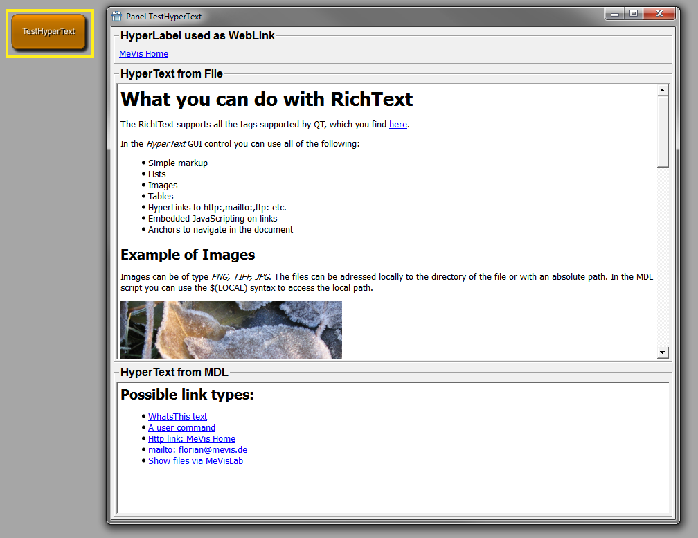
HyperLabel is identical to HyperText in its features, but shows the text as a label. Therefore, it is not scrollable and automatically gets as big as the contained text. It behaves like a normal label but has the features of dynamic scripted links. Another advantage over a normal label is that the text can be selected and copied. For details see the HyperText control above. Note that title, titleField and titleFile are aliases for text, textField and textFile of HyperText. If the displayed text should be arranged in one line, it has to be enclosed in "<nobr></nobr>".
HyperLabel is derived from Frame.
Dynamic scripting: MLABHyperLabelControl
HyperLabel {
title = RICHTEXT
titleField = FIELD
titleFile = FILE
command = SCRIPT
// Additional: tags from Frame
}title = RICHTEXTSets the text that is shown. If you want to reference local files or images, use the
$(LOCAL)/variable to address these.titleField = FIELDSpecifies a field that provides the text. The text is updated whenever that field changes.
titleFile = FILESpecifies a file to provide the text. Local links in the text are resolved local to that file, so you can link to other documents and images.
Example 4.21. HyperLabel
Have a look at the module TestHyperText. This module features a HyperLabel at the very top of its GUI.
ListBox shows a list of single line items. The list can be set
by scripting or from fields providing the items via splitting the
string. The ListBox takes the string value of the values tag or of the given field and creates
items out of these strings. If a field is given, the list box is
updated on the field's string value changes. Scripting methods can be
found in the MeVisLab Scripting reference.
Dynamic scripting: MLABListBoxControl
ListBox [FIELD] {
values = STRING
visibleRows = INT
selectionMode = ENUM [Single]
rowSeparator = STRING [@]
selectionChangedCommand = SCRIPT
selectedCommand = SCRIPT
currentChangedCommand = SCRIPT
doubleClickedCommand = SCRIPT
returnPressedCommand = SCRIPT
contextMenuOnEmptyList = BOOL [Yes]
contextMenu {
// See definition of SubMenu
}
}values = STRINGSets a string that is used for the values instead of the FIELD.
rowSeparator = STRING (default "@")Sets a separator string used for columns.
visibleRows = INTSets a minimum height to show at least number of visible rows.
selectionMode = ENUM (default: Single)Defines whether selection is possible and if multiple items can be selected at a time.
Possible values: Single, Extended, Multi, NoSelection
SingleOnly a single item can be selected at any time.
ExtendedWhen the user selects an item in the usual way, the selection is cleared and the new item selected. However, if the user presses the CTRL key when clicking on an item, the clicked item gets toggled and all other items are left untouched. If the user presses the SHIFT key while clicking on an item, all items between the current item and the clicked item are selected or unselected, depending on the state of the clicked item. Multiple items can be selected by dragging the mouse over them.
MultiWhen the user selects an item in the usual way, the selection status of that item is toggled and the other items are left alone. Multiple items can be toggled by dragging the mouse over them.
NoSelectionNo item can be selected.
contextMenuDefines a context menu to show on right-clicking the list. See SubMenu on how to define a menu.
contextMenuOnEmptyList = BOOL (default: Yes)Sets whether the context menu should be shown on an empty list.
selectionChangedCommand = SCRIPTDefines a script command that is called when the selection has changed.
selectedCommand = SCRIPT (argument: index)Defines a script command that is called when an item is selected (RETURN is pressed or double-click on the item).
currentChangedCommand = SCRIPT (argument: index)Defines a script command that is called when the current item has changed.
doubleClickedCommand = SCRIPT (argument: index)Defines a script command that is called when an item is double-clicked.
returnPressedCommand = SCRIPT (argument: index)Defines a script command that is called when RETURN is pressed on an item.
Example 4.22. ListBox
Have a look at the module TestListBox. This module features a dynamic setting and clearing of items, and it shows how to display items with icons.
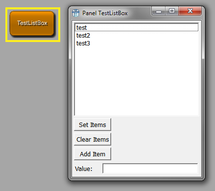
ListView shows a list containing strings in rows/columns. The
list can be set by scripting or from fields providing the items via
splitting the string. The ListView takes the string value of the
values tag or of the given field and
creates items out of these strings. If a FIELD is given, it updates
everything (even the number of columns) from the field's string value
changes. The first row in the string is taken as header titles if
headerTitles is not
specified, further rows can contain fewer columns. The header titles
have to be present even if the header visibility is turned off.
Limitations: Currently, CheckBox items cannot contain RichText
(see richText tag).
Dynamic scripting: MLABListViewControl and MLABListViewItem
ListView [FIELD] {
values = STRING
headerTitles = STRING
rowSeparator = STRING [\n]
columnSeparator = STRING [@]
layout = STRING
visibleRows = INT
cellSpacing = INT
selectionMode = ENUM [Single]
tabDirection = ENUM [Vertical]
sortByColumn = INT [-1]
sortAscending = BOOL [Yes]
header = BOOL [Yes]
// advanced:
richText = BOOL [No]
toggleField = FIELD
checkList = BOOL [No]
updateDelay = UINT [0]
rootIsDecorated = BOOL [No]
contextMenuOnEmptyList = BOOL [Yes]
contextMenu {
// See definition of SubMenu
}
// scripting:
selectionChangedCommand = SCRIPT
currentChangedCommand = SCRIPT
doubleClickedCommand = SCRIPT
returnPressedCommand = SCRIPT
clickedCommand = SCRIPT
// advanced scripting
itemRenamedCommand = SCRIPT
itemCollapsedCommand = SCRIPT
itemExpandedCommand = SCRIPT
checkListItemChangedCommand = SCRIPT
prepareEditCommand = SCRIPT
contextMenuRequestedCommand = SCRIPT
}values = STRINGSets a string that is used for the values instead of the FIELD.
headerTitles = STRINGA string that is used for the header titles instead of the first row item of values or the content of the FIELD. The same columnSeparator is used.
rowSeparator = STRING (default "\n")Sets a separator string that is used for rows.
columnSeparator = STRING (default "@")Sets a separator string that is used for columns.
layout = STRINGSets a string that defines the layout of the columns "rlcet, rlcet, ..." ("right", "left", "center", "edit", "toggle").
rlc- Results in different alignment (right, left, center).e- Column is editable.t- One of the columns may have the "t" toggle flag, which means that a CheckBoxListItem is used and the toggleField updates checkbox states.visibleRows = INTSpecifies a minimum size to fit number of visible rows (+ header) into the ListView.
cellSpacing = INTSets an extra spacing value to all items.
selectionMode = ENUM (default: Single)Defines if selection is possible and if multiple items can be selected at a time.
Possible values: Single, Extended, Multi, NoSelection
See selectionMode for details.
tabDirection = ENUM (default: Vertical)Defines the direction when jumping to the next editable field through the use of the Tab key. When Horizontal is selected, the cursor automatically switches to the next row when reaching the table border.
Possible values: Vertical, Horizontal
sortByColumn = INT (default: -1)Sets the column number by which to sort (default -1 means no sorting).
sortAscending = BOOL (default: Yes)Sets whether the sorting should be in ascending order.
header = BOOL (default: Yes)Selects whether the header row is visible. If set to
No, the header is not shown, while the titles still have to be provided via headerTitles, values or FIELD.richText = BOOL (Default: No)Sets whether the items in the list are used as RichText, allowing to change font type, size, colors, etc.
See Section 4.9.2, “RichText” for details on RichText.
toggleField = FIELDSpecifies a field to set the toggle state encoded in 0/1 chars (field is updated/updates in both directions).
checkList = BOOL (default: No)Sets whether the ListView uses CheckListItems. Normally this flag is not used; the ListView is a ToggleList if a toggleField is specified.
updateDelay = UINT (default: 0)Sets the delay in milliseconds of the ListView update when the given FIELD is changed. If set to zero, the update is immediate. This flag can be useful if the ListView is updated very often due to user interaction since it is slow to update. If you set, e.g., a value of 100, the ListView will only update 10 times a second.
rootIsDecorated = BOOL (default: No)Sets whether icons are shown if a node (item) is collapsed or expanded.
contextMenuDefines a context menu to show on right-clicking the list. See SubMenu on how to define a menu.
contextMenuOnEmptyList = BOOL (default: Yes)Sets whether the user's contextMenu is shown if the list has no entries.
selectionChangedCommand = SCRIPTDefines a script command that is called when the selection has changed. If you want to get the selected item, call
selectedItem()on the ListView.currentChangedCommand = SCRIPT (argument: item)Defines a script command that is called when the current item has changed.
doubleClickedCommand = SCRIPT (argument: item, column)Defines a script command that is called when an item is double-clicked; column is the index of the column where the double click happened.
returnPressedCommand = SCRIPT (argument: item)Defines a script command that is called when RETURN is pressed.
clickedCommand = SCRIPT (arguments: item, column)Defines a script command that is called when an item is clicked (press+release of mouse button); column gives into which column the user clicked.
mouseButtonClickedCommand = SCRIPT(arguments: button, item, position, column)This command is like clickedCommand, but provides more information. "button" is a number: 1 is the left mouse button, 2 is the right mouse button, and 4 the middle mouse button. "position" indicates the click position inside the clicked cell.
Note Since the switch to Qt5, this is not called for the right mouse button anymore; if you used this to open a context menu for the current item you should use contextMenuRequestedCommand instead.
itemRenamedCommand = SCRIPT (argument: item, column, newvalue)Defines a script command that is called when an item is renamed.
itemCollapsedCommand = SCRIPT (argument: item)Defines a script command that is called when an item with children is collapsed.
itemExpandedCommand = SCRIPT (argument: item)Defines a script command that is called when an item with children is expanded.
checkListItemChangedCommand = SCRIPT (argument: item, column)Defines a script command that is called when a checklist item is toggled. The column parameter is important if you have created checkboxes on other columns than the first with item.setCheckBoxOn().
prepareEditCommand = SCRIPT (argument: item, column)Defines a script command that is called when a cell in the list view is about to be edited. This is mainly intended for use with the method setStringEditorValues() on the list view control, which allows to provide a ComboBox instead of a simple line edit widget for editing of cells with string content.
contextMenuRequestedCommand = SCRIPT(arguments: item, position, column)This command is called when the context menu is requested, usually by pressing the right mouse button, but, e.g., on Windows, there is also a key for this. This is called before showing the context menu defined by the contextMenu attribute. "position" indicates the global position where the context menu should be opened.
Example 4.23. ListView
Have a look at the module TestListView. This module features the dynamic creation and removal of different list items.
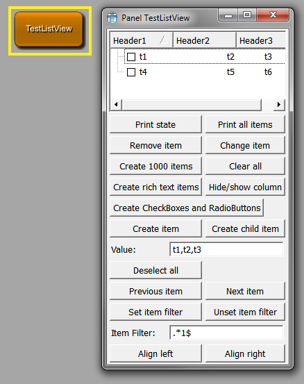
IconView shows a grid of icons with text. The items can be set by using the dynamic scripting API.
Dynamic scripting: MLABIconViewControl
IconView {
allowRenaming = BOOL [No]
autoArrange = BOOL [Yes]
wordWrap = BOOL [No]
maxTextLength = INT [255]
maxItemWidth = INT
selectionMode = ENUM [Single]
arrangement = ENUM [TopToBottom]
resizeMode = ENUM [Fixed]
itemTextPos = ENUM [Right]
spacing = INT
selectionChangedCommand = SCRIPT
currentChangedCommand = SCRIPT
selectedCommand = SCRIPT
doubleClickedCommand = SCRIPT
returnPressedCommand = SCRIPT
itemRenamedCommand = SCRIPT
clickedCommand = SCRIPT
rightButtonClickedCommand = SCRIPT
pressedCommand = SCRIPT
rightButtonPressedCommand = SCRIPT
contextMenuOnEmptyList = BOOL [Yes]
contextMenu {
// See definition of SubMenu
}
}allowRenaming = BOOL (default: No)Sets whether in-place renaming of items is allowed.
autoArrange = BOOL (default: Yes)Sets whether items should be arranged anew when new items are inserted.
resizeMode = ENUM (default: Fixed)Sets whether the items should be arranged when the view is resized.
Possible values: Fixed, Adjust
wordWrap = BOOL (default: No)Sets whether words are wrapped in the text.
maxTextLength = INT (default: 255)Sets the maximum number of displayed chars.
maxItemWidth = INTSets the maximum width an item can have.
selectionMode = ENUM (default: Single)Defines whether selection is possible and if multiple items can be selected at a time.
Possible values: Single, Extended, Multi, NoSelection
See selectionMode for details.
arrangement = ENUM (default: TopToBottom)Defines how items are arranged.
Possible values: LeftToRight, TopToBottom
itemTextPos = ENUM (default: Right)Sets the position of the text.
Possible values: Right, Bottom
spacing = INTDefines the spacing between items.
contextMenuDefines a context menu to show on right-clicking the list. See SubMenu on how to define a menu.
contextMenuOnEmptyList = BOOL (default: Yes)Sets whether the user's contextMenu should be shown if the list has no entries.
selectionChangedCommand = SCRIPTDefines a script command that is called when the selection has changed. If you want to get the selected item, call
selectedItem()on the IconView.selectedCommand = SCRIPT (argument: index)Defines a script command that is called when a single item is selected (in Single selection mode).
currentChangedCommand = SCRIPT (argument: index)Defines a script command that is called when the current item has changed.
doubleClickedCommand = SCRIPT (argument: index)Defines a script command that is called when an item is double-clicked.
returnPressedCommand = SCRIPT (argument: index)Defines a script command that is called when RETURN is pressed.
itemRenamedCommand = SCRIPT (argument: index, newvalue)Defines a script command that is called when an item is renamed.
clickedCommand = SCRIPT (argument: index)Defines a script command that is called when an item is clicked with the left mouse button (mouse button pressed and released).
rightButtonClickedCommand = SCRIPT (argument: index)Defines a script command that is called when an item is clicked with the right mouse button (mouse button pressed and released).
pressedCommand = SCRIPT (argument: index)Defines a script command that is called when the left mouse button is pressed on an item. This can, e.g., be used to initiate dragging.
rightButtonPressedCommand = SCRIPT (argument: index)Defines a script command that is called when the right mouse button is pressed on an item. This can, e.g., be used to initiate dragging.
Example 4.24. IconView
Have a look at the module TestIconView. This module features the dynamic adding and removing of icon items, as well as a scripting example on how to react on clicking an icon.
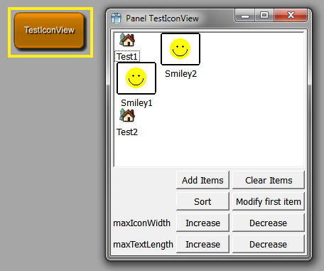
Label shows a RichText label that can be multiline. The label content can be given as a text or by the string value of a field.
Label is derived from Frame.
Dynamic scripting: MLABLabelControl
Label STRING {
title = STRING
titleField = FIELD
image = FILE
indent = INT
buddy = NAME
textAlignment = ENUM
textWrap = ENUM [SingleLine]
textFormat = ENUM [Auto]
trim = ENUM [None]
selectable = BOOL [No]
allowLinks = BOOL [No]
linkActivatedCommand = SCRIPT
linkHoveredCommand = SCRIPT
// Additional: tags for Frame
}title = STRINGSets the text of the label.
titleField = FIELDSpecifies a field that provides the text for the label; the text is updated when that field changes.
image = FILESpecifies a pixmap that is shown on the label.
indent = INTSets the number of pixels to indent the text.
buddy = NAMESets the name of another control that is used as a "buddy" of the label, which gets the input focus when the label gets the focus (e.g., by pressing an ALT key). Use the & char to set a keyboard shortcut.
textAlignment = ENUMDefines the alignment of the text in the label.
Possible values: Auto, TopLeft, Top, TopCenter, TopRight, Left, Center, Right, BottomLeft, Bottom, BottomCenter, BottomRight
textWrap = ENUM (default: SingleLine)Defines how the text in the label is wrapped.
Possible values: SingleLine, WordBreak
textFormat = ENUM (default: Auto)Defines the text format. The default is Auto, which searches the first text line for <> tags and switches between Rich and Plain. For keyboard shortcuts, write an & char in the plain text (&& means a literal &). In Rich mode, you can use HTML-like syntax for the label.
Possible values: Auto, Rich, Plain
trim = ENUM (default: None)Trims the string.
Possible values: Left, Center, Right, None
Left...LongText
CenterLong...Text
RightLongText...
NoneNo trimming
selectable = BOOL (default: No)Sets whether the selection of text is allowed with the mouse.
allowLinks = BOOL (default: No)Sets whether clicking on hyperlinks is allowed. It also enables linkHoveredCommand and linkActivatedCommand. If the linkActivatedCommand is not set, the links are opened via the external program given in MeVisLab preferences.
linkHoveredCommand = SCRIPT (arguments: String)Defines a command that is called when the user hovers over a link and allowLinks is set to Yes.
linkActivatedCommand = SCRIPT (arguments: String)Defines a command that is called when the user clicks on a link and allowLinks is set to Yes.
Control that shows an image. The image can be automatically resized to fit the available space.
Image is derived from Frame.
Dynamic scripting: MLABImageControl
Image {
image = FILE
scaleFactor = FLOAT [1.0]
autoResize = BOOL [No]
// Additional: tags for Frame
}Separator is a visual separator (like <HR> in HTML). It
has a direction and a frame style. Depending on the direction,
expandX and expandY are automatically set to
expanding.
Separator is derived from Frame.
Dynamic scripting: MLABSeparatorControl
Separator {
direction = ENUM [Horizontal]
// Additional: tags for Frame
}Empty is a control that represents empty space. Depending on its size policy, it will extend or be of fixed size. Its tags are derived from the basic control, typically one only uses the given tag.
There are four aliases that have useful presets in vertical and horizontal direction:
VSpacer, SpacerX - control that fills the space
vertically by expanding (if you have a control with a stretch
factor, you might want to change the stretch factor as well).
HSpacer, SpacerY - control that fills the space
horizontally by expanding (if you have a control with a stretch
factor, you might want to change the stretch factor as well).
Empty is derived from Control.
Empty {
expandX = ENUM
expandY = ENUM
stretchX = INT
stretchY = INT
w = INT
h = INT
}ProgressBar shows the current status as a bar between 0% and 100%. The status is controlled by a FloatField or DoubleField, which should yield values from 0 to 1.0. The field needs priority 0 to cause an update of the progress immediately; otherwise, the update is not guaranteed.
If a MLABBoolField is used, the progress bar starts to show a busy indicator instead, after the field is set to True. To force updating the busy indicator, MLAB.processEvents(True) must be called for each update.
ProgressBar is derived from Frame.
Dynamic scripting: MLABProgressBarControl
ProgressBar FIELD {
textVisible = BOOL [Yes]
orientation = ENUM [Horizontal]
// Additional: tags for frame
}Example 4.25. ProgressBar
Have a look at the module WEMIsoSurface. On this module, a ProgressBar is used to display the progress of scanning the slices of the input image.
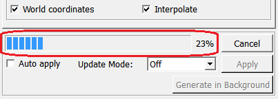
Menus can be created at various GUI controls, e.g., as a context menu. All these menus start at the level of a SubMenu as given in the following section.
Example 4.26. PopupMenu, SubMenu, and MenuItem
For the use of the controls PopupMenu, SubMenu, and MenuItem, have a look at the module TestPopupMenu.
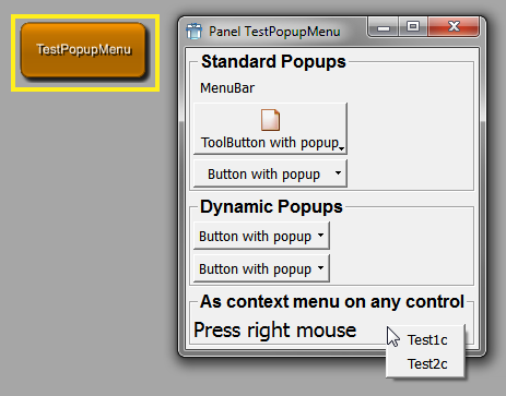
A PopupMenu defines a menu that can be popped up via scripting. It is derived from the SubMenu control and is not visible by default. It should be given a name and then be shown via the popup() method. It pops up at the cursor position or at a screen point given by the caller.
Dynamic scripting: MLABPopupMenuControl
PopupMenu {
name = NAME
showCommand = SCRIPT
hideCommand = SCRIPT
// possible children:
Separator = ""
SubMenu = NAME { ... }
MenuItem = NAME { ... }
// advanced children:
Action = NAME
}name = NAMESets the internal name used in scripting (like Control name/instanceName).
showCommand = SCRIPThideCommand = SCRIPTDefines script commands that are called when SubMenu is shown/hidden.
A SubMenu can contain multiple MenuItems, SubMenus, Separators, and Actions. When an item is selected, a script command is called on the item. An ALT keyboard shortcut can be assigned with the "&" character.
Actions are an advanced concept and are currently only supported for the internal MeVisLab menus.
Dynamic scripting: MLABPopupMenuControl
SubMenu STRING {
name = NAME
showCommand = SCRIPT
hideCommand = SCRIPT
itemActivatedCommand = SCRIPT
// possible children:
Separator = ""
SubMenu = NAME { ... }
MenuItem = NAME { ... }
// advanced children:
Action = NAME
}name = NAMESets the internal name used in scripting (like Control name/instanceName).
showCommand = SCRIPThideCommand = SCRIPTDefines script commands that are called when SubMenu is shown/hidden.
itemActivatedCommand = SCRIPTDefines a script command that is called when a direct child of the SubMenu is activated.
MenuItems can be declared inside a SubMenu or a tag used as
a submenu (e.g., contextMenu,
menuBar).
Dynamic scripting: MLABPopupMenuControl, using the name of the menu item.
MenuItem STRING {
command = SCRIPT
name = NAME
field = NAME
enabled = BOOL [Yes]
dependsOn = FIELDEXPRESSION
visibleOn = FIELDEXPRESSION
checked = BOOL [No]
icon = FILE
accel = KEYSEQUENCE
whatsThis = STRING
// advanced:
slot = QTSLOT
receiver = NAME
// possible child:
TouchBarItem { ... }
}command = SCRIPT (arguments: name)Defines a script command that is called when the item is selected.
name = NAMESets a name for this item that can be used in the interface of the SubMenu to interact with the item via scripting.
field = NAMESets an existing field that can be of type bool or trigger. If this is used, selecting this menu item either toggles the boolean value or notifies the trigger field.
accel = KEYSEQUENCESets an additional accelerator key sequence.
enabled = BOOL (default:
            Yes)
Sets whether the item is enabled (or disabled/grayed out otherwise).
dependsOn,visibleOn = FIELDEXPRESSIONDetermines whether the button is disabled/hidden; otherwise, it is enabled/visible. See dependsOn/visibleOn of the generic Control for a more detailed explanation of the expression.
whatsThis = STRINGSets an additional explanation text.
icon = FILESpecifies an additional icon that is shown.
checked = BOOL (default:
            No)
Sets the initial state for toggle items.
slot = QTSLOTSpecifies a Qt slot instead of a script command (used for MeVisLab internal menus). This is an advanced feature.
receiver = NAMESpecifies the name of a Qt receiver object (used for MeVisLab internal menus). This is an advanced feature.
Panel is a control that can "clone" a subregion of a given
module's windows. If panel and
panelByGroupTitle are not specified,
the control shows the window of a module given by its name. If the
window is not specified, the entire default window is shown.
This also clones all FieldListeners contained in the cloned
code; this way, a cloned panel should work like the original one. The
window you get when you call window() in the
context of the cloned script will be the window in which the Panel
is.
Note that no field connections can be established between fields
that are shown on a macro's GUI because of a panel declaration. In order to be able to
establish a field connection to such a field, you need to declare the
according field in the macro module's interface section.
Panel is derived from Control.
Dynamic scripting: MLABPanelControl
Panel {
module = NAME
panel = NAME
window = NAME
// tags that should not be used anymore in new panels:
panelByGroupTitle = NAME
}module = NAME (required)Sets the name of the module in the network.
panel = NAMESets a name to search for in the given module by looking for a
panelNametag with the name NAME.window = NAMESets the name of the window to clone.
panelByGroupTitle = NAME (deprecated!)Sets a name to search for by comparing NAME with the values of all group tags in the module's window.
Example 4.27. Panel
Have a look at the module View3D. As explained in the Window example, the View3D module defines
four different windows. The first window (named 'View3D') defines a
viewer and a settings panel. The latter has its panelName set to 'Settings'. The third
window of the module (named 'Settings') just cuts out the settings
part of the first window by using the Panel tag.
DynamicFrame shows a user-defined MDL script file or dynamically generated string. Its contents can be changed interactively from Python. This gives the user the power to create and update dynamic user interfaces in an application without the need to specify the complete GUI when the application script is started.
The controls in the content of the frame (named with the
name tag) are visible in the global
scope of the window.
You can use the Python methods
setContentFile(string) or
setContentString(string).
Dynamic scripting: MLABDynamicFrameControl
Have a look at the module TestDynamicFrames that shows how to use dynamic frames in scripting.
| Tip |
|---|---|
If you dynamically add modules to your application network, you can use this control to clone a panel of the new module or to show fields of the new module on-the-fly. |
DynamicFrame {
autoSize = BOOL [Yes]
contentFile = FILE
}Viewer shows an OpenInventor viewer. Typically, the Inventor
viewer is taken from a SoViewerNode module in the network, especially
SoExaminerViewer, SoRenderArea, etc. A viewer has to be attached to a
SoNode field, typically the "self" field of an InventorModule. If you
specify a type, the viewer is
generated independent of any viewer node in the network.
Dynamic scripting: MLABInventorViewerControl
| Tip |
|---|---|
If you want to access the internal Inventor viewer, you should use the viewer together with a SoExaminerViewer or a SoRenderArea on a network and use the 'self' field of that module for the viewer. |
Viewer FIELD {
viewing = BOOL [Yes]
hiResRendering = BOOL [No]
backgroundColor = COLOR
type = NAME
clone = BOOL [No]
delay = BOOL [Yes]
values = STRING
popup = BOOL [No]
popupMenu {
// see tags for SubMenu
}
}viewing = BOOL (default: Yes)Sets whether the viewer is in viewing mode.
hiResRendering = BOOL (default: No)Sets whether the viewer enables OpenGL for high-resolution drawing on supported systems. Because adding more pixels to renderbuffers has performance implications, you must explicitly opt in.
popup = BOOL (default: No)Sets whether the viewer has a pop-up menu.
backgroundColor = COLORSpecifies the background color of the viewer.
type = NAMESets the type of the viewer if the SoNodeField is not from a SoViewerNode module.
Possible values: SoExaminerViewer, SoRenderArea, SoCustomExaminerViewer
clone = BOOL (default: No)Sets whether the viewer shoud be cloned (this is automatically done when two viewers are shown from the same module in the network).
delay = BOOL (default: Yes)Sets whether the viewer is created in delayed mode. That means that its content is rendered AFTER the window is drawn the first time to avoid waiting for the drawing of the rest of the GUI.
values = STRINGSets the field values of the viewer in Inventor style (you need to know what you are doing and which fields are available).
popupMenuDefines a menu that is shown when the user clicks the right mouse button on the viewer. The internal pop-up menu of the viewer (from OpenInventor) has to be turned off; otherwise, this menu will not be shown. See SubMenu for details on how to define a menu.
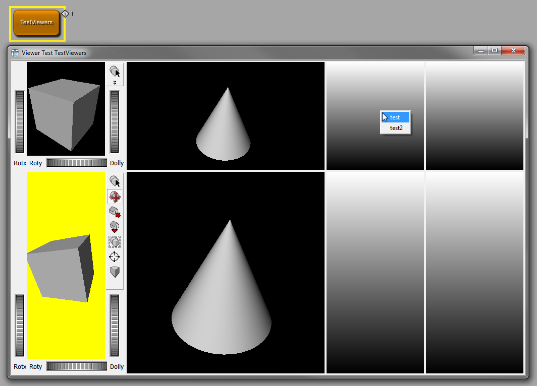
PathBrowser displays a directory tree for browsing. Clicking a directory will open and show its subdirectories. Double-clicking a directory selects a directory.
Pressing r on a PathBrowser always resets the current path to
the original root path.
PathBrowser is derived from Control.
Dynamic scripting: MLABPathBrowserControl
PathBrowser {
root = PATH
visibleRows = INT
minLength = INT
sortBy = STRING [Name]
cd = STRING
pathSelectedCommand = SCRIPT
pathDblClickedCommand = SCRIPT
}root = PATHSpecifies the root path of the PathBrowser. If not given, or if PATH does not exist or is not readable, the current working directory is used.
visibleRows = INTSets the minimum number of visible rows (defining the minimum height).
minLength = INTSets the minimum width to show INT characters.
sortBy = ENUM (default: Name)Specifies the sorting order of directories.
Possible values: Name, Size, Time, Unsorted
cd = PATHSpecifies the relative path from
rootto the initially opened subdirectory.pathSelectedCommand = SCRIPT (argument: absolute path)pathDblClickedCommand = SCRIPT (argument: absolute path)Defines a script command that is called when the path is selected/double-clicked with left mouse button.
The MoviePlayer allows to play AVI movies. The movie can be given as a filename and the control can be controlled interactively by Python.
MoviePlayer is derived from Control.
Dynamic scripting: MLABMoviePlayerControl
MoviePlayer {
filename = FILE
autoStart = BOOL [No]
enableContextMenu = BOOL [Yes]
showControls = BOOL [Yes]
}filename = FILESpecifies the filename of the movie (should be an AVI).
autoStart = BOOL (default: No)Sets whether the movie should start immediately.
enableContextMenu = BOOL (default: Yes)Sets whether a context menu with advanced control functions is enabled.
showControls = BOOL (default: Yes)Sets whether play, stop, pause, etc., controls are shown to the user.
The ScreenshotGallery can be used in an application to collect screenshots for that application. It can be used via scripting to obtain a list of taken screenshots and movies, to control the directory where these files are written, and more.
ScreenshotGallery is derived from Control.
Dynamic scripting: MLABScreenshotGalleryControl
ScreenshotGallery {
application = NAME
}The MDL WebEngineView provides a complete web engine to the MDL developer. It is based on the open-source Chromium engine, which powers most browsers nowadays.
We recommend that you use this control only to display content controlled by you, since we cannot provide the same level/frequency of security updates as the main browser applications. However, it uses the same broad code base, which is subject to intense scrutiny for code flaws.
It offers:
A standards compliant web browser.
ECMAScript 2021, CSS2, CSS3, and HTML5.
Scripting interface to control the browser content, text selection, menu, etc.
Scripting interface to call browser JavaScript from MeVisLab Python.
Access to MeVisLab objects from within JavaScript through the WebChannel API (see the "Scripting" demo in the TestWebEngineView example module).
WebInspector for debugging HTML, CSS, and JavaScript (Inspect option on context menu).
PDF Viewing.
Note This requires setting a special flag from Python code after the control has been created:
from PythonQt.QtWebEngineWidgets import QWebEnginePage, QWebEngineSettings ... webControl = ctx.control("yourwebview") webControl.webPage().settings().setAttribute(QWebEngineSettings.PluginsEnabled, True)You might call this, e.g., from an Execute command in your panel.Note that this enables support for all Pepper API plugins!
WebEngineView is derived from Control.
Dynamic scripting: MLABWebEngineViewControl
WebEngineView {
contentUrl = URL
contentFile = FILE
contentString = STRING
contentStringBaseUrl = URL
loadStartedCommand = SCRIPT
loadProgressCommand = SCRIPT
loadFinishedCommand = SCRIPT
linkClickedCommand = SCRIPT
urlChangedCommand = SCRIPT
selectionChangedCommand = SCRIPT
logConsoleOutput = BOOL
enablePrinting = BOOL [No]
linkDelegation = ENUM
linkDelegation = ENUM (default: depends on linkClickedCommand)Defines how clicks on links are handled. All links that are delegated are passed to the linkClickedCommand instead of switching the WebEngineView to the URL internally. By default, links are delegated if the
linkClickedCommandis set. If thelinkClickedCommandis not implemented, butlinkDelegationis set to All, the delegated URLs are passed to MeVisLab, which uses the default programs registered for the scheme of the URL to open the URL.NoneNo links are delegated.
AllAll clicked links are delegated.
The MDL GraphicsView offers a freely configurable area that can contain:
Graphics items (Lines, Pixmaps, RichText, etc.)
MDL panels
Inventor render areas
WebKit HTML
Vertical, Horizontal, Grid, and Anchor layouts
HotArea layout with HotAreas
These items can be arranged and blended over each other as desired. This allows to create new types of interactive GUIs including animated transitions.
For detailed examples, have a look at the TestGraphicsView and TestGraphicsViewHotArea modules, which demonstrate some of the possibilities.
GraphicsView is derived from Control.
Dynamic scripting: MLABGraphicsViewControl
GraphicsView {
}
The ItemModelView provides a view of the ItemModel base object contained in the specified field, representing an abstract hierarchical item model with generic named attributes. The user can select which attributes are displayed in the resulting table and how they are displayed.
This control resembles the ListView control in appearance but takes a more abstract approach and clearly differentiates between model and view.
ItemModelView FIELD {
selectionField = FIELD
currentField = FIELD
doubleClickedField = FIELD
clickedColumnField = FIELD
selectableAttribute = NAME [none]
idAttribute = NAME [none]
idAsFullPath = BOOL [No]
idPathSeparator = STRING
idSeparator = STRING
selectionMode = ENUM [Single]
tabDirection = ENUM [Vertical]
sortByColumn = INT [-1]
sortAscending = BOOL [Yes]
header = BOOL [Yes]
alternatingRowColors= BOOL [No]
autoExpandAll = BOOL [No]
autoExpandToDepth = INT [0]
visibleRows = INT [5]
editTrigger = STRING [SelectedClicked and EditKeyPressed]
editableAttribute = NAME [No]
checkboxEditableAttribute = NAME [No]
automaticParentCheckboxState = BOOL [No]
colorAttribute = NAME [none]
tooltipAttribute = NAME [none]
boldFontAttribute = NAME [No]
italicFontAttribute = NAME [No]
floatDecimalPlaces = INT [-1]
automaticResize = BOOL [Yes]
align = ENUM [Left]
headerAlign = ENUM [Left]
DerivedAttribute NAME {
sourceAttribute = NAME
defaultValue = STRING
defaultPathValue = FILE
Case STRING {
value = STRING
pathValue = FILE
}
...
}
...
ComputedAttribute NAME {
expression = EXPRESSION
}
...
Column STRING {
displayAttribute = NAME (see text)
displayAsColor = BOOL [No]
editAttribute = NAME (see text)
editableAttribute = NAME (see text)
checkboxAttribute = NAME (see text)
checkboxEditableAttribute = NAME (see text)
automaticParentCheckboxState = BOOL [No]
iconAttribute = NAME [none]
tooltipAttribute = NAME [none]
colorAttribute = NAME [none]
sortAttributes = STRING (see text)
comboboxAttribute = NAME [none]
comboboxTooltipsAttribute = NAME [none]
comboboxItemDelimiter = STRING [|]
boldFontAttribute = NAME [No]
italicFontAttribute = NAME [No]
visibleOn = FIELDEXPRESSION [1]
floatDecimalPlaces = INT [-1]
automaticResize = BOOL (see text)
align = ENUM (see text)
headerAlign = ENUM (see text)
}
...
}
selectionField = FIELDA string field that will contain the currently selected items.
How items are identified must be specified with the
idAttributeand following tags.currentField = FIELDA string field that will contain the current (focused) item.
doubleClickedField = FIELDA string field that will receive the last double-clicked item.
clickedColumnField = FIELDAn integer field that can be used in conjunction with the
doubleClickedFieldand that contains the index of the column where the last click happened. This will be updated before thedoubleClickedFieldis touched but theclickedColumnFieldmay not be touched if the column did not change.selectableAttribute = STRINGSpecifies the name of an attribute that will determine if an item can be selected. If no attribute is specified, the default is True.
idAttribute = STRINGSpecifies the name of an attribute that can be used to clearly identify items from the model, e.g., a unique name or a numerical ID.
idAsFullPath = BOOLSets whether the
idAttributes of all parents are needed to clearly identify an item.idPathSeparator = STRINGIf
idAsFullPathis set, use this string to separate identifying value of the item and its parents. For an ItemModel representing the file system, this would ideally be the slash character, leading to a natural path ID.idSeparator = BOOLIf several items must be specified (in the selectionField), use this string to separate the IDs.
selectionMode = ENUMThe selection model of the control. The following values exist:
SingleOnly a single item can be selected at any time.
ExtendedWhen the user selects an item in the usual way, the selection is cleared and the new item selected. However, if the user presses the CTRL key when clicking on an item, the clicked item gets toggled and all other items are left untouched. If the user presses the SHIFT key while clicking on an item, all items between the current item and the clicked item are selected or unselected, depending on the state of the clicked item. Multiple items can be selected by dragging the mouse over them.
MultiWhen the user selects an item in the usual way, the selection status of that item is toggled and the other items are left alone. Multiple items can be toggled by dragging the mouse over them.
NoSelectionNo item can be selected.
tabDirection = ENUM (default: Vertical)Defines the direction when jumping to the next editable field through the use of the Tab key. When Horizontal is selected, the cursor automatically switches to the next row when reaching the table border.
Possible values: Vertical, Horizontal
sortByColumn = INTSpecifies which column to sort by initially. By default, the items are sorted by the value used for the
displayAttributebut this can be overridden with thesortAttribute. Set this to -1 to disable sorting.sortAscending = BOOLSpecifies whether sorting should initially be ascending or descending.
header = BOOLSpecifies whether the column headers should be shown.
alternatingRowColors = BOOLSets whether alternating background colors for the rows of the table are used.
autoExpandAll = BOOLSpecifies whether all items with subitems should be expanded by default. This takes precedence over autoExpandToDepth if both are specified.
autoExpandToDepth = INTSpecifies the depth to which items should be automatically expanded. Top-level items have depth 1. If you want to expand all items regardless of depth, you should rather use
autoExpandAll.visibleRows = INTSpecifies the minimum number of visible rows.
editTrigger = STRINGSpecifies what triggers editing of editable cells. This tag can appear multiple times to specify multiple edit triggers.
The available edit triggers are:
NoEditTriggersNo editing possible.
CurrentChangedEditing start whenever the current item changes.
DoubleClickedEditing starts when an item is double-clicked.
SelectedClickedEditing starts when clicking on an already selected item.
EditKeyPressedEditing starts when the platform edit key has been pressed over an item.
AnyKeyPressedEditing starts when any key is pressed over an item.
AllEditTriggersEditing starts for all above actions.
editableAttribute = NAMEGives the name of an item attribute that specifies if cells should be editable by default. This can be overridden for single columns.
You can use pseudo-attribute names "True/Yes" or "False/No" here to enable or disable editing independent of specific items.
checkboxEditableAttribute = NAMEThe same as editableAttribute for columns. You still need to specify a checkboxAttribute in the columns to display checkboxes.
automaticParentCheckboxState = BOOLThe same as automaticParentCheckboxState for columns.
colorAttribute = NAMEGives the name of an item attribute that shall provide the default color for all columns.
Colors can also be provided as strings, either as
#rrggbb(hexadecimal notation, e.g.,#ff0000), or as a color name as defined in the list of SVG color keyword names.tooltipAttribute = NAMESame as the tooltipAttribute for columns, but this value applies to all columns.
boldFontAttribute = NAMESame as the boldFontAttribute for columns, but this value applies to all columns.
italicFontAttribute = NAMESame as the italicFontAttribute for columns, but this value applies to all columns.
floatDecimalPlaces = INTSame as the floatDecimalPlaces for columns, but this value applies to all columns.
automaticResize = BOOLSpecifies whether all columns should resize automatically if their content changes. This can be overridden in single columns.
align = ENUMSpecifies the default alignment for all columns. Possible values are Left, Right, or Center
headerAlign = ENUMSpecifies the default alignment of the header content for the entire table. Possible values are Left, Right, or Center
DerivedAttribute NAMESometimes it is necessary to change the color of a row depending on an item's attribute or display an icon, but the color or icon should belong to the view, not to the model. In this situation, DerivedAttributes can be used to create a pseudo-attribute that depends on another real (or another derived) attribute. This new derived attribute can be accessed under the name given after DerivedAttribute.
Derived attributes can be used everywhere where real attributes can be used.
sourceAttribute = NAMEGives the source attribute to derive the value from.
defaultValue = STRINGProvides a default value if no other case fits.
defaultPathValue = FILEProvides a default value if no other case fits. File path-specific manipulations may occur to achieve the desired result. Only used if defaultValue is not specified.
Case STRINGSpecifies the value to use if the sourceAttribute has the value given after Case.
ComputedAttribute NAMEComputed attributes are another kind of DerivedAttribute where you can specify an expression instead of a value table.
They can be used everywhere where real attributes can be used.
expression = EXPRESSIONSpecifies the expression to compute. This is basically a field expression, but instead of field names you can use every attribute name of the displayed item model, or any DerivedAttribute or ComputedAttribute that has been defined before this one.
Additionally, you can use the pseudo-attribute
depth, which gives the tree depth of the current item, with top-level items having the depth 1.
Column STRINGAdds a column to the view. The string given after Column will be used as the header string. If not specified otherwise, it will also be used for the names of the
displayAttributeandeditAttribute.displayAttribute = NAMESpecifies the name of the attribute to show as the value of this column cell.
You can specify the pseudo-attribute
noneif you do not want to have text displayed in this column.displayAsColor = BOOLSpecifies that the attribute given in
displayAttribute(andeditAttribute) should be interpreted as a color and displayed accordingly.Editing a color is possible and will always produce a string in the format
#rrggbb.editAttribute = NAMESpecifies the name of the attribute to use when editing a cell value (if this is different from the
displayAttribute).Note that the
editableAttributemust still be set to enable editing for a column and item.editableAttribute = NAMESpecifies the name of the attribute to decide whether the column text should be editable. This might override the default given on level of the control.
You can use pseudo-attribute names
True/YesorFalse/Nohere to enable or disable editing independent of specific items.checkboxAttribute = NAMESpecifies the name of a bool attribute to display a checkbox in this column.
checkboxEditableAttribute = NAMESpecifies the name of the attribute to decide whether the checkbox should be editable. This might override the default given on level of the control.
You can use pseudo-attribute names
True/YesorFalse/Nohere to enable or disable editing independent of specific items.automaticParentCheckboxState = BOOLParent items show the cumulative checkbox state of all their children with checkboxes, and may display a "partially checked" state.
The checkbox is only shown if the checkboxAttribute is defined for the parent item, regardless of its value.
If there are no direct child items with checkboxes in this column, the checkbox state is determined by the value given through the
checkboxAttribute.iconAttribute = NAMESpecifies the name of an attribute that contains an image or the file path of an image to display an icon in this column.
Note: For many use cases, this might be a DerivedAttribute. If a filename is chosen for the icon, then "pathValue" should be set instead of "value" in the derived attribute.
tooltipAttribute = NAMESpecifies the name of an attribute that contains the text that is used to display tooltips in this column.
Note: For many use cases, this might be a DerivedAttribute.
colorAttribute = NAMESpecifies the name of an attribute that contains a color or color name to change the text color in this column. This will override the
colorAttributespecified on the control level.Note: For many use cases, this might be a DerivedAttribute.
sortAttributes = STRINGSpecifies the names of attribute to sort the items by if this column is selected for sorting. Several attributes may be specified (separated by comma) if values of single attributes may be the same. The first attribute takes precedence over later attributes. The sort order for certain attributes may be inverted by prepending an exclamation mark (
!) before the attribute name.Note: Attributes used for sorting do not necessarily need to be used for display.
comboboxAttribute = NAMESpecifies an attribute that contains the items of a ComboBox that will be used for editing string values. Use this if you only want to allow certain values while editing. If your list of possible items is static for the entire column, you can define a DerivedAttribute with only a
defaultValueand use that.Note: You still need to set the
editableAttributeto allow editing.Note: An empty list of items will allow free editing.
comboboxTooltipsAttribute = NAMESpecifies an attribute that contains the items of tooltips for the ComboBox items specified via the
comboboxAttribute. Will be used for editing string values. If your list of possible items is static for the entire column, you can define a DerivedAttribute with only adefaultValueand use that.Note: Only useful in combination with
comboboxAttribute. Make sure both strings contain the same amount of values.comboboxItemDelimiter = STRINGSpecifies the character (or an entire string) that separates items in the
comboboxAttributeandcomboboxTooltipsAttribute. The default is the|character.boldFontAttribute = NAMESpecifies an attribute that evaluates to True or False. If this is True for an item, the displayed text is shown with a bold font.
italicFontAttribute = NAMESpecifies an attribute that evaluates to True or False. If this is True for an item, the displayed text is shown with an italic font.
visibleOn = FIELDEXPRESSIONSame meaning as with visibleOn tag of a control, but applied on the column.
floatDecimalPlaces = INTSpecifies the number of digits after the decimal point to show for floating-point numbers. -1 means show all (relevant) digits, possibly selecting scientific notation.
automaticResize = BOOLSpecifies whether this column should resize automatically if the content of the column changes. This overrides the value given on the control level.
align = BOOLSpecifies the alignment of text in this column. Possible values are Left, Right, or Center. This overrides the value given on the control level.
headerAlign = BOOLSpecifies the alignment of text in the header of this column. Possible values are Left, Right, or Center. This overrides the value given on the control level.
For detailed examples, have a look at the FileSystemItemModelData and FileSystemItemModelView modules, which demonstrate some of the possibilities of this control. This example is taken from FileSystemItemModelView:
ItemModelView input {
selectionField = selection
idAttribute = name
idAsFullPath = Yes
idPathSeparator = "/"
idSeparator = ";"
sortByColumn = 0
DerivedAttribute "icon" {
sourceAttribute = directory
case "1" {
pathValue = "$(MLAB_MeVisLab_IDE)/Modules/IDE/images/fileopen.png"
}
}
Column "name" {
sortAttributes = "!directory,name_nocase"
iconAttribute = icon
}
Column "size" {
align = right
}
Column "writable" {
displayAttribute = none
checkBoxAttribute = writable
checkBoxEditableAttribute = Yes
}
}
Also have a look at MLStandardItemModelWrapper for a way to generate a custom item model from scripting.
ItemModelView is derived from Control.
The ImageMap control enables an interactive image map in which the user can select a single region.
Two images must be specified: an RGBA overlay image visible to the user and an index image encoding regions.
The ImageMap is derived from Control.
Dynamic scripting: MLABImageMapControl
ImageMap {
regionChangedCommand = SCRIPT
buttonPressedCommand = SCRIPT
buttonReleasedCommand = SCRIPT
doubleClickedCommand = SCRIPT
labelMap = IMAGEFILE
overlay = IMAGEFILE
invertOverlay = BOOL [No]
scale = DOUBLE [1.0]
colorTable = STRING
autoHighlightValue = INTEGER [0]
// Additional: tags from Control
}
regionChangedCommand = SCRIPT (arguments: left region number, entered region number)Defines a script command that is executed when the mouse cursor changes a region defined by the label map.
buttonPressedCommand = SCRIPT (arguments: region number, mouse button number)Defines a script command that is executed when a mouse button was pressed.
buttonReleasedCommand = SCRIPT (arguments: region number, mouse button number)Defines a script command that is executed when a mouse button was released.
doubleClickedCommand = SCRIPT (arguments: region number, mouse button number)Defines a script command that is executed when a mouse button was double-clicked.
labelMap = IMAGEFILESpecifies the path to a label map image in indexed format (it must not be stored in RGB(A) format).
Each region, including the background, should have a unique integer number. The number for the background is typically 0.
overlay = IMAGEFILESpecifies the path to an image in RGBA format that is visible to the user.
invertOverlay = BOOLIf set to
Yes, the overlay image is inverted. Note that this works best if the overlay is a black and white image.scale = DOUBLESpecifies a scaling factor for displaying the image map.
colorTable = STRINGSpecifies a color table as a list of space-separated colors. The colors are given in Qt format, meaning they can be a name (e.g., "transparent," "white," "green") or in hexadecimal RGB notation (e.g., "#ff00ff"). The list may include a mix of both notations.
If this list is not provided and the control is not initialized with a call to
setLabelColors, the colors of the label map image are used.This color list is used together with an initializing call to
setLabelColorsof MLABImageMapControl, which sets an index list for referencing colors in this table.For example, if the label map image contains the labels 0, 1, and 2, the color map is defined as "transparent green red," and
setLabelColorssets the list [1, 1, 0], the region with label 0 will be rendered in green.autoHighlightValue = INTEGERSpecifies a value that darkens the regions under the mouse cursor if less than 0 and lightens them if greater than 0. A value of 0 has no effect.
Have a look at the module TestImageMap.
The MatplotlibCanvas is a GUI control that enables drawing plots with the Matplotlib library in Python.
MatplotlibCanvas {
useToolBar = BOOL [No]
hideToolBar = BOOL [No]
}
Have a look at the module MatplotlibMDLExample.
How to use it:
Implement an
initCommandin the body of the control in the.scriptfile.For example:
initCommand = initFigure.In Python, define the function
initFigure(control), access the control'sobject, and callfigure(),canvas(), ortoolbar(), which return objects from the Matplotlib library.For example:
def initFigure(control): figure = control.object().figure() figure.set_facecolor("#e0e0e0") figure.set_dpi(96) figure.set_size_inches(6, 3) subplot = figure.add_subplot(111) t = numpy.arange(0.0, 3.0, 0.01) s = numpy.sin(2 * numpy.pi * t) subplot.plot(t, s)
Provides a GUI control for rendering applications defined in the QML format.
QuickView {
source = FILE
}
Have a look at the module TestQuickView.
Accel allows to add keyboard shortcuts that trigger fields or execute a Python command when pressed. They are local to the window they are declared in, thus they are only triggered when their parent window is active.
Accel can appear inside all Group GUI controls. The field and command tags are both optional. Note that Accel should be specified before the other GUI controls for which the defined shortcuts should be available. For instance, if a certain shortcut should be available for an entire window, place the corresponding Accel statement at the beginning, just after the Window statement.
Dynamic scripting: MLABAccelControl
Accel {
key = KEYSEQUENCE
field = FIELD
command = SCRIPT
}The EventFilter is a non-GUI control that can be placed anywhere in the GUI. It allows to listen to the events that other controls (and optionally their children) receive and can then either prevent the event from being delivered or just pass through the event. It is a very powerful control since it allows to react on GUI events on a low level. You can, e.g., use it to implement drag-and-drop features for other controls, to notice when a window gets visible/hidden, when a control gets entered with the mouse, and much more.
Dynamic scripting: MLABEventFilterControl
EventFilter {
name = NAME
command = SCRIPT
filter = NAMELIST
eatEvent = BOOL [No]
children = BOOL [No]
debug = BOOL [No]
control = NAME
...
}name = NAMESets the name of the EventFilter, for usage with the
ctx.control()method.command = SCRIPT (argument: eventPropertyMap [, control, QEvent])Defines a script command that is called for each event that matched the filter. For details on the event properties, see below. The optional control parameter can be used to directly access the EventFilter control. The optional QEvent parameter allows to directly access the Qt event for advanced usage. Make sure to
import PythonQt.QtGuiin your Python code if you want to access the QEvent directly.filter = NAMELISTA list of event names that should be filtered.
eatEvent = BOOL (default: No)Sets whether the filtered events are eaten automatically (i.e., eaten events are not delivered to other controls).
children = BOOL (default: No)Sets whether the filter is applied to all subwidgets or just to the given controls.
debug = BOOL (default: No)Sets whether all events are printed to the console (just to see which events happen and which you might be interested in).
control = NAMESets the name of the control to filter events on. This tag can appear multiple times so that the filter listens to multiple controls at a time.
The filter can contain a number of Event names. These names are taken from Qt. You can find the event details at https://doc.qt.io/qt-6/qevent.html.
All events share the type property, which
can be checked if multiple events are filtered. To print all
properties of an event, just print the passed event property map in
Python.
The most useful events are:
MouseButtonPress, MouseButtonRelease, MouseButtonDblClick, MouseMoveReacts on mouse button press or release and movement.
Event properties: x, y, globalX, globalY, button (one of "left", "mid", "right"), ctrlKey, shiftKey, altKey
Show, HideReacts on a control being shown or hidden.
Event properties: none (except type)
Enter, LeaveReacts on mouse entering or leaving the control area.
Event properties: none (except type)
DragEnter, DragMove, DropHandles drag-and-drop on a low level.
Event properties: x, y, globalX, globalY
WheelHandles the mouse wheel event.
Event properties: x, y, globalX, globalY, delta, orientation (one of "vertical", "horizontal"), ctrlKey, shiftKey, altKey
ResizeHandles resize event.
Event properties: width, height, oldWidth, oldHeight
KeyPress, KeyReleaseHandles the key press event, where "ascii" is the ASCII char, the text is unicode, and the key can be used to access special keys, e.g., "Left", "Right" for cursor keys. See the Qt key defines or have a look at the example in TestEventFilter.
Event properties: ascii, text, key, ctrlKey, shiftKey, altKey
Example 4.29. EventFilter
Have a look at the module TestEventFilter. This module features the reacting of certain areas of the GUI on defined mouse actions (button pressed, mouse enter, mouse leave, etc.) and the implementation of dragging and dropping of files or images.
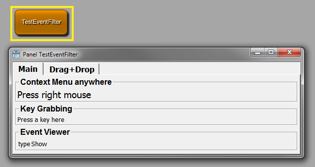
This chapter explains other options used in many GUI controls: the layout engine, RichText, and the MDL styles.
By default, various GUI Controls are laid out depending on each other, e.g., Field controls in a Vertical automatically get the same label size. This behavior can explicitly be specified by the concept of "Align Groups". A group is specified by its unique name that you have to choose. All controls in the same group are aligned according to the type of the group.
There are three type of groups (given by their tag names):
In simpler terms: if two controls, e.g., Fields in the same Vertical, have the same alignGroup tag, all the subwidgets in the Field controls are aligned well in their widths.
The labelAlignGroup can be used to just align the labels, so
that the other children of a Control will not be aligned. Have a look
at the TestLayouter MacroModule in MeVisLab,
which shows the differences.
![[Important]](images/important.png)
In addition to the above tags, which are used directly inside a control that should be aligned, you can also use the childAlignGroupX (alias childAlignGroup) and childAlignGroupY tags, which can be specified in any control that has children. This causes all "simple" controls inside this control to get the specified align group. This way, you can just see it as a helper tag that helps you write fewer tags:
Vertical {
childAlignGroup = group1
Box {
Field test1 { }
Field test2 { }
}
Box {
Field test3 { }
Field test4 { }
}
}This is identical to the following, note that the boxes do not get the alignGroup and that the childAlignGroup tag works recursively.
Vertical {
Box {
Field test1 { alignGroup = group1 }
Field test2 { alignGroup = group1 }
}
Box {
Field test3 { alignGroup = group1 }
Field test4 { alignGroup = group1 }
}
}The labelAlignGroup tag can also be used at a higher level and
it causes all "simple" controls to get their labels aligned. See the
TestLayouter MacroModule in MeVisLab for an
example of the above tags.
The following tables give you an overview of which tags are
available in RichText. The RichText can be used in tooltips, whatsthis
boxes, Label, HyperText, HyperLabel, and various other places. The
syntax is a simple subset of HTML, including lists, tables, images, and
links. Have a look at the TestHyperText module
in MeVisLab to see some examples.
| Table tags | Notes |
|---|---|
<table>...</table> | A table. Tables support the following attributes:
|
<tr>...</tr> | A table row. This is only valid within a table. Rows
support the following attribute:
|
<th>...</th> | A table header cell. Similar to td, but
defaults to center alignment and a bold font. |
<td>...</td> | A table data cell. This is only valid within a table
row. Cells support the following attributes:
|
| Special tags | Notes |
|---|---|
<img> | An image. The image name for the MIME source factory
is given in the source attribute, for example, <img
src="qt.xpm">. The image tag also understands the
attributes width and height that determine the size of the
image. If the pixmap does not fit the specified size, it will
be scaled automatically. The align attribute determines where
the image is placed. By default, an image is placed inline
just like a normal character. Specify left or right to place
the image at the respective side. |
<hr> | A horizontal line. |
<br> | A line break. |
<nobr>...</nobr> | No break; prevents word wrap. |
| Style tags | Notes |
|---|---|
<em>...</em> | Emphasized. By default, this is the same as
<i>...</i> (italic). |
<strong>...</strong> | Strong. By default, this is the same as
<b>...</b> (bold). |
<i>...</i> | Italic font style. |
<b>...</b> | Bold font style. |
<u>...</u> | Underlined font style. |
<s>...</s> | Strike out font style. |
<big>...</big> | A larger font size. |
<small>...</small> | A smaller font size. |
<code>...</code> | Indicates code. By default, this is the same as
<tt>...</tt> (typewriter). For
larger chunks of code, use the block-tag
<pre>. |
<tt>...</tt> | Typewriter font style. |
<font>...</font> | Customize the font size, family, and text color. The
tag can have the following attributes:
|
| Anchor tags | Notes |
|---|---|
<a>...</a> | An anchor or link.
|
| Structuring tags | Notes |
|---|---|
<qt>...</qt> | A Qt RichText document. It can have the following
attributes:
|
<h1>...</h1> | A top-level heading. |
<h2>...</h2> | A sublevel heading. |
<h3>...</h3> | A sub-sub-level heading. |
<p>...</p> | A left-aligned paragraph. Adjust the alignment with
the align attribute. Possible values are left,
right and center. |
<center>...</center> | A centered paragraph. |
<blockquote>...</blockquote> | An indented paragraph that is useful for quotes. |
<ul>...</ul> | An unordered list. You can also pass a type argument
to define the bullet style. The default is
type="disc"; other types are
circle and square. |
<ol>...</ol> | An ordered list. You can also pass a type argument to
define the enumeration label style. The default is
type="1"; other types are "a" and
"A". |
<li>...</li> | A list item. This tag can be used only within the
context of <ol> or
<ul>. |
<pre>...</pre> | For larger chunks of code. Whitespaces in the contents are preserved. For small bits of code, use the inline-style code. |
Styles can be defined globally but also locally in a user
interface to change the GUI appearance. Every control supports the
style tag, where you can give a style
by its name (declared with DefineStyle) or by just opening a local
style and deriving from the current style.
Example: See TestStyles macro module in MeVisLab.
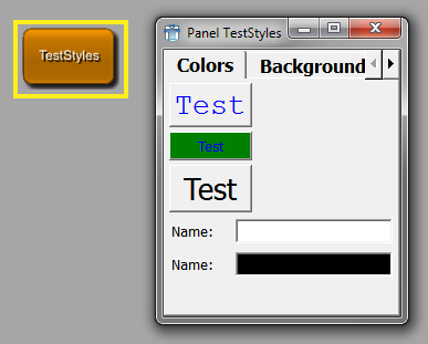
DefineStyle allows to define a new GUI style, either complete or just extending an existing style. The style provided with MeVisLab is called "default". Old ILAB4 styles are also supported, being defaultVerySmall, defaultSmall, defaultBig, defaultHuge. These styles should no longer be used and are replaced by the scale tag, with which you can resize all fonts in a GUI control by just giving the scale tag and a positive or negative integer for bigger/smaller fonts and spacings.
Styles can be used to change the entire user interface appearance or just to change a single color/font in a given control. See below for an example on how to do that.
A style contains Fonts, Colors, and Prototypes. You can specify a different font for each of the following roles:
Titles (
titleFonttag)Editable text (
editFonttag)TabBar text (
tabFonttag)Box group titles (
boxFonttag)
There are two different sets of colors, the default colors and the disabledColors, which specify which colors a
control uses when it is drawn. The disabledColors are used when a
control is not enabled (also called "grayed out").
DefineStyle NAME {
derive = NAME
// Font for titles in the GUI (Buttons, Labels, etc.)
titleFont {
family = NAME
size = INT
weight = ENUM
italic = BOOL
fixedPitch = BOOL
}
// Font for editing components in the GUI (NumberEdit, TextView, etc.)
editFont {
// see titleFont
}
// Font for TabViews
tabFont {
// see titleFont
}
// Font for Box group titles
boxFont {
// see titleFont
}
colors {
fg = COLOR
bg = COLOR
button = COLOR
buttonText = COLOR
editText = COLOR
editBg = COLOR
base = COLOR
alternateBase = COLOR
light = COLOR
midlight = COLOR
dark = COLOR
mid = COLOR
shadow = COLOR
highlight = COLOR
highlightedText = COLOR
brightText = COLOR
link = COLOR
linkVisited = COLOR
boxText = COLOR
tabText = COLOR
toolTipBase = COLOR
toolTipText = COLOR
}
disabledColors {
// same as above colors
}
}derive = NAMESelects a style to derive from, all attributes are copied and you may overwrite any of the tags, e.g., just the font sizes, an individual color.
titleFont, editFont, boxFont, tabFontDefines properties of a font. You do not need to specify all tags, reasonable defaults are taken from the underlying system settings.
family = NAMESpecifies a font family name; possible names are: Helvetica, Courier, etc.
size = INTSets the point size of the font.
weight = ENUMSets the weight of the font.
Possible values: Light, Normal, DemiBold, Bold, Black
italic = BOOLSets whether font should be italic.
fixedPitch = BOOLSets whether the font should be fixed pitch (depends on the font family).
colors, disabledColorsDefines the normal colors and the disabled colors for all controls in this style.
The syntax for COLOR in the style is:
colorname[:imagefilename]
where colorname can be one of:
#rrggbbX11 color name (also on Windows)
A name specified in the Colors section
and imagefilename can be an extra image used as a brush for that color. Using images is especially interesting for the background colors bg, editBg, and button.
Examples:
bg = black:$(LOCAL)/someBackgroundImage.png editBg = white
fg = COLORThe foreground text color used in Labels, etc.
Aliases: foreground, windowText
bg = COLORThe background color.
Aliases: background, window
button = COLORThe background color of buttons.
buttonText = COLORThe text color on buttons.
editText = COLOReditBg = COLORThe color for editable text and background for text edits and list views.
base = COLORSame as editBg.
alternateBase = COLORDefines the alternate background color for ItemModelViews that have the alternatingRowColors attribute set.
light = COLOR midlight = COLOR dark = COLOR mid = COLOR shadow = COLORColors used for drawing sunken and raised panels and buttons.
highlight = COLOR highlightedText = COLORHighlight background and text color, e.g., for text selection and ListViews.
brightText = COLORText with good contrast to "dark" color.
link = COLOR linkVisited = COLORThe color used for drawing links and visited links (in RichText).
boxText = COLORThe color of box titles.
tabColor = COLORThe color of TabBar titles.
toolTipBase = COLORtoolTipText = COLORThe background and text color of tooltips.
MeVisLab supports translations by using the internationalization framework of Qt.
Modules that use translations must have the tag hasTranslation set to Yes. The languages for the translations must be declared using the translationLanguages tag. It is also possible to provide the names of other modules that will also be translated: translationModules.
Strings to translate are taken from MDL tags and from occurrences of ctx.translate() in Python scripts of the translated modules. Please only use direct strings as argument for ctx.translate, do not use expressions or variables. Panels of other modules that are incorporated into the GUI of referenced modules through the Panel control will also automatically be searched for translatable strings.
After changing the MDL scripts and Python code, it is necessary to
create the translation files (.ts).
This is done from the context menu of the MeVisLab module: Translations → Create/Update. The translation files can then be edited with the Qt Linguist tool,
which is available through Translations → Edit.
The translation files must be compiled into runtime translation
files (.qm) before they can be used.
This can be done with the Qt Linguist tool from the main menu: File → Release. This step is not necessary when building standalone
applications, because MeVisLab will then automatically compile the
.ts files to .qm files.
The .qm files will be included in the installer.
Usually, the operating system localization will determine which
language is chosen. To force MeVisLab to select a different language, it
is possible to provide the preferences variable Locale,
e.g., to en_EN. For testing this can also be achieved by selecting
Translations → Set Language And Reload and then selecting the desired language value.
The MDL syntax for defining test cases is explained in the Test Center Reference.
M
- MDL Tags
- All
- accel, Button, ToolButton, ButtonBar, MenuItem
- acceptDrops, Control (Abstract)
- acceptWheelEvents, TabView, Field, ComboBox, NumberEdit
- activatedCommand, ComboBox
- activeInputIndex, Module (Abstract) Declaration
- activeOffImage, Button, ToolButton, CommonButtonGroup, ButtonBar
- activeOnImage, Button, ToolButton, CommonButtonGroup, ButtonBar
- activeOutputIndex, Module (Abstract) Declaration
- align, ItemModelView
- alignGroup, Control (Abstract), Field, Align Groups
- alignGroup), Align Groups
- alignGroupX, Control (Abstract), Align Groups
- alignGroupY, Control (Abstract), Align Groups
- alignTitle, Box
- alignX, Control (Abstract)
- alignX/Y, Table, Grid
- alignY, Control (Abstract)
- allowedTypes, Interface
- allowLinks, Label
- allowRenaming, IconView
- alternateBase, DefineStyle
- alternatingRowColors, ItemModelView
- application, ScreenshotGallery
- applyButton, Field, VectorEdit
- arrangement, IconView
- associatedTests, Module (Abstract) Declaration
- author, Module (Abstract) Declaration
- autoApply, TextView
- autoArrange, IconView
- autoComplete, ComboBox
- autoExpandAll, ItemModelView
- autoExpandToDepth, ItemModelView
- automaticParentCheckboxState, ItemModelView
- automaticResize, ItemModelView
- autoPageStep, Slider
- autoRaise, ToolButton
- autoRaiseButtons, ToolButtonGroup
- autoRepeat, Button, ToolButton
- autoResize, Image
- autoScale, ToolButton, ButtonBar
- autoScaleIcons, PushButtonGroup, ToolButtonGroup
- autoSize, FreeFloat, DynamicFrame
- autoStart, MoviePlayer
- backgroundColor, Viewer
- base, DefineStyle
- bg, Control (Abstract), DefineStyle
- bgMode, Control (Abstract)
- boldFontAttribute, ItemModelView
- border, Button, CommonButtonGroup, ButtonBar
- borderless, Window
- boxFont, DefineStyle
- boxText, DefineStyle
- brightText, DefineStyle
- browseButton, Field
- browseFilter, Field
- browseMode, Field
- browseSelectedCommand, Field
- browseTitle, Field
- browsingGroup, Field
- buddy, Label
- Button, NetworkPanel
- button, Control (Abstract), DefineStyle
- buttonBgMode, Control (Abstract)
- buttonClickedCommand, CommonButtonGroup
- buttonPressedCommand, CommonButtonGroup
- buttonReleasedCommand, CommonButtonGroup
- buttonText, DefineStyle
- callLater, FieldListener
- Case, ItemModelView
- caseSensitiveAutoComplete, Field, ComboBox
- cd, PathBrowser
- cellSpacing, ListView
- centerField, IntervalSlider
- checkable, Box
- checkableButtons, PushButtonGroup, ToolButtonGroup
- checkboxAttribute, ItemModelView
- checkboxEditableAttribute, ItemModelView
- checked, Box, CheckBox, MenuItem
- checkedField, Box
- checkList, ListView
- checkListItemChangedCommand, ListView
- childAlignGroup, Control (Abstract), Align Groups
- childAlignGroupX, Control (Abstract), Align Groups
- childAlignGroupY, Control (Abstract), Align Groups
- children, EventFilter
- childrenCollapsible, Splitter
- class, MLModule, InventorModule
- clickedColumnField, ItemModelView
- clickedCommand, ListView, IconView
- clone, Viewer
- color, NetworkPanel, Splitter
- colorAttribute, ItemModelView
- colors, DefineStyle
- colors disabledColors, DefineStyle
- colspan, Control (Abstract), Table
- Column, ItemModelView
- columnSeparator, ListView
- comboBox, Field
- comboboxAttribute, ItemModelView
- comboboxItemDelimiter, ItemModelView
- comboboxTooltipsAttribute, ItemModelView
- comboCompletes, Field
- comboEditable, Field
- comboField, Field, ComboBox
- comboItems, Field
- comboSeparator, Field, ComboBox
- command, FieldListener, NetworkPanel, Button, ToolButton, CommonButtonGroup, HyperText, MenuItem, Accel, EventFilter
- comment, Tag Data Types, Module (Abstract) Declaration, Interface, Description
- componentTitles, Field, VectorEdit
- ComputedAttribute, ItemModelView
- console, TextView
- contentFile, DynamicFrame, WebEngineView
- contentString, WebEngineView
- contentStringBaseUrl, WebEngineView
- contentUrl, WebEngineView
- contextMenu, ListBox, ListView, IconView, MenuItem
- contextMenuOnEmptyList, ListBox, ListView, IconView
- contextMenuRequestedCommand, ListView
- control, EventFilter
- currentChangedCommand, ListBox, ListView, IconView
- currentField, ItemModelView
- currentIndexField, TabView
- dark, DefineStyle
- debug, EventFilter
- defaultPathValue, ItemModelView
- defaultValue, ItemModelView
- delay, Viewer
- dependsOn, Interface, Description, NetworkPanel, Control (Abstract), CommonButtonGroup, MenuItem
- deprecatedName, Tag Data Types, Module (Abstract) Declaration, Interface, Description
- derive, DefineStyle
- DerivedAttribute, ItemModelView
- destroyedCommand, Control (Abstract)
- direction, Splitter, ButtonBar, Slider, IntervalSlider, ThumbWheel, Separator
- directory, Deployment
- disabledColors, DefineStyle
- disabledOffImage, Button, ToolButton, CommonButtonGroup, ButtonBar
- disabledOnImage, Button, ToolButton, CommonButtonGroup, ButtonBar
- displayAsColor, ItemModelView
- displayAttribute, ItemModelView
- DLL, Tag Data Types, Deployment, MLModule, InventorModule
- doubleClickedCommand, ListBox, ListView, IconView
- doubleClickedField, ItemModelView
- droppedFileCommand, Commands, Control (Abstract)
- droppedFilesCommand, Commands, Control (Abstract)
- droppedObjectCommand, Control (Abstract)
- duplicatesEnabled, ComboBox
- eatEvent, EventFilter
- edit, Field, VectorEdit, TextView
- editable, Interface, Description, CheckBox, ComboBox, DateTime
- editableAttribute, ItemModelView
- editAlign, Field, NumberEdit, VectorEdit
- editAttribute, ItemModelView
- editBg, Control (Abstract), DefineStyle
- editBgMode, Control (Abstract)
- editField, Field
- editFont, DefineStyle
- editMode, LineEdit
- editText, DefineStyle
- editTrigger, ItemModelView
- enableCalenderPopup, DateTime
- enableContextMenu, MoviePlayer
- enabled, Control (Abstract), Field, CommonButtonGroup, CheckBox, MenuItem
- enablePrinting, WebEngineView
- enumAutoFormat, Field, ButtonBar, ComboBox
- equalButtonHeights, CommonButtonGroup
- equalButtonWidths, CommonButtonGroup
- exampleNetwork, Module (Abstract) Declaration
- exclusiveButtons, CommonButtonGroup
- expandX, Control (Abstract), Horizontal, Separator, Align Groups
- expandX/Y, Table, Grid, Splitter
- expandY, Control (Abstract), Vertical, Separator, Align Groups
- exportedWindow, Module (Abstract) Declaration
- expression, ItemModelView
- externalDefinition, Module (Abstract) Declaration, MacroModule
- family, DefineStyle
- fg, DefineStyle
- field, Tag Data Types, MenuItem, Accel
- fieldDragging, Field, Button, CheckBox, TextView
- FieldListener, Commands
- fields, Persistence
- file, Deployment
- fileDialogCreatesUnexpandedFilenames, Field
- filename, MoviePlayer
- filter, Tag Data Types, EventFilter
- finalizeCommand, Commands
- fixedHeight, Control (Abstract)
- fixedPitch, DefineStyle
- fixedWidth, Control (Abstract)
- flatButtons, PushButtonGroup
- floatDecimalPlaces, ItemModelView
- format, Field, NumberEdit, VectorEdit, DateTime, Slider
- frameLineWidth, Frame (Abstract)
- frameMidLineWidth, Frame (Abstract)
- frameShadow, Frame (Abstract)
- frameShape, Frame (Abstract)
- fullscreen, Window
- fw, Control (Abstract)
- genre, Tag Data Types, Module (Abstract) Declaration, Module Genre Definition
- Genre, Module Genre Definition
- globalStop, Button, ToolButton
- group, Tag Data Types, Module (Abstract) Declaration, ModuleGroup Definition
- h, Control (Abstract)
- hasGroupInputs, InventorModule
- hasTranslation, Module (Abstract) Declaration
- hasViewer, InventorModule
- header, ListView, ItemModelView
- headerAlign, ItemModelView
- headerTitles, ListView
- height, Control (Abstract)
- hidden, Interface, Description
- hideCommand, PopupMenu, SubMenu
- highlight, DefineStyle
- highlightedText, DefineStyle
- hintText, Field, LineEdit, TextView
- hiResRendering, Viewer
- hscroller, ScrollView, TextView
- HSpacer, Empty
- html_class, Control (Abstract)
- html_style, Control (Abstract)
- html_styleField, Control (Abstract)
- hybridMLModule, InventorModule
- icon, MenuItem
- iconAttribute, ItemModelView
- iconHeight, PushButtonGroup, ToolButtonGroup
- iconWidth, PushButtonGroup, ToolButtonGroup
- idAsFullPath, ItemModelView
- idAttribute, ItemModelView
- idPathSeparator, ItemModelView
- idSeparator, ItemModelView
- image, Field, Button, ToolButton, CommonButtonGroup, ButtonBar, CheckBox, ComboBox, Label, Image
- importPath, Commands
- indent, Label
- info, NetworkPanel
- init, FieldListener
- initCommand, Commands, Control (Abstract)
- inlineDrawing, ToolButton
- inlineWidgetsMargin, LineEdit
- inlineWidgetsSpacing, LineEdit
- insertPolicy, ComboBox
- internalName, Interface
- isFilePath, Interface, Description
- italic, DefineStyle
- italicFontAttribute, ItemModelView
- item, Tag Data Types, Interface, Description, Field, ButtonBar, ComboBox
- itemActivatedCommand, SubMenu
- itemCollapsedCommand, ListView
- itemExpandedCommand, ListView
- itemRenamedCommand, ListView, IconView
- items, Interface, Description, CommonButtonGroup, ButtonBar, ComboBox
- itemTextPos, IconView
- key, Accel
- keywords, Module (Abstract) Declaration
- labelAlignGroup, Control (Abstract), Align Groups
- layout, Box, ScrollView, ListView
- leftInlineWidgets, LineEdit
- legacyValue, Interface, Description
- library, Deployment
- light, DefineStyle
- link, DefineStyle
- linkActivatedCommand, Label
- linkClickedCommand, WebEngineView
- linkDelegation, WebEngineView
- linkHoveredCommand, Label
- linkVisited, DefineStyle
- listenField, FieldListener
- loadFinishedCommand, WebEngineView
- loadProgressCommand, WebEngineView
- loadStartedCommand, WebEngineView
- lostFocusCommand, LineEdit
- lowerField, IntervalSlider
- margin, Vertical, Horizontal, Table, Grid, Box, CommonButtonGroup
- max, Interface, Description
- maxCount, ComboBox
- maximized, Window
- maximumHeight, Control (Abstract)
- maximumWidth, Control (Abstract)
- maxItemWidth, IconView
- maxLength, LineEdit
- maxTextLength, IconView
- maxw, Control (Abstract)
- menuBar, MenuItem
- mh, Control (Abstract)
- mid, DefineStyle
- midlight, DefineStyle
- min, Interface, Description
- minimumHeight, Control (Abstract)
- minimumWidth, Control (Abstract)
- minLength, Field, LineEdit, NumberEdit, VectorEdit, PathBrowser
- mode, TabView, ColorEdit, DateTime
- module, Tag Data Types, Deployment, Panel
- Module, Persistence
- moduleItemCreatedCommand, Commands
- moreButton, Field
- mouseButtonClickedCommand, ListView
- mw, Control (Abstract)
- name, Tag Data Types, Control (Abstract), Execute, PopupMenu, SubMenu, MenuItem, DynamicFrame, EventFilter
- normalOffImage, Button, ToolButton, CommonButtonGroup, ButtonBar
- normalOnImage, Button, ToolButton, CommonButtonGroup, ButtonBar
- objectWrapper, Deployment
- onlyOneInstance, MacroModule
- orientation, CommonButtonGroup, ProgressBar
- pageStep, Slider
- panel, Tag Data Types, Panel
- Panel, Panel
- panelByGroupTitle, Panel
- panelName, Control (Abstract), Panel
- pathDblClickedCommand, PathBrowser
- pathSelectedCommand, PathBrowser
- pathValue, ItemModelView
- persistent, Interface, Description
- ph, Control (Abstract)
- popup, Viewer
- popupDelay, ToolButton
- popupMenu, Button, ToolButton, Viewer
- popupMode, ToolButton
- preferredHeight, Control (Abstract)
- preferredWidth, Control (Abstract)
- preloadDLL, Deployment
- prepareEditCommand, ListView
- pressedCommand, IconView
- pressedIndicatorField, Field, Slider, IntervalSlider, ThumbWheel
- priority, Interface, Description
- projectSource, MLModule, InventorModule
- pw, Control (Abstract)
- ratio, ThumbWheel
- receiver, MenuItem
- relatedFile, Module (Abstract) Declaration
- remoteBaseHandler, Deployment
- removed, Description
- resizeCommand, Control (Abstract)
- resizeMode, IconView
- restoredFromUndoHistoryCommand, Commands
- returnPressedCommand, LineEdit, ListBox, ListView, IconView
- richText, ListView
- rightButtonClickedCommand, IconView
- rightButtonPressedCommand, IconView
- rightInlineWidgets, LineEdit
- root, PathBrowser
- rootIsDecorated, ListView
- rotationMode, ThumbWheel
- Row, Table
- rowSeparator, ListBox, ListView
- runApplicationCommand, Commands
- scale, Control (Abstract), DefineStyle
- scaleFactor, Image
- scaleIconSetToMinSize, ToolButton
- scriptExtension, Deployment
- scriptOnly, MacroModule
- seeAlso, Module (Abstract) Declaration
- selectable, Label
- selectableAttribute, ItemModelView
- selectedCommand, ListBox, IconView
- selectionChangedCommand, ListBox, ListView, IconView, WebEngineView
- selectionField, ItemModelView
- selectionMode, ListBox, ListView, IconView, ItemModelView
- shadow, Splitter, DefineStyle
- shouldCloseCommand, Window
- show, ButtonBar
- showButtonNames, CommonButtonGroup
- showCommand, PopupMenu, SubMenu
- showControls, MoviePlayer
- showIconsOnly, CommonButtonGroup
- showItemInternals, ButtonBar
- showLineNumbers, TextView
- showStepButtons, NumberEdit
- size, DefineStyle
- slider, Field
- sliderSnap, Field
- slot, MenuItem
- snap, Slider, IntervalSlider, ThumbWheel
- sortAscending, ListView, ItemModelView
- sortAttributes, ItemModelView
- sortBy, PathBrowser
- sortByColumn, ListView, ItemModelView
- source, Commands, Execute
- sourceAttribute, ItemModelView
- SpacerX, Empty
- SpacerY, Empty
- spacing, Vertical, Horizontal, Table, Grid, Field, CommonButtonGroup, ButtonBar, VectorEdit, IconView
- status, Module (Abstract) Declaration
- step, Field, NumberEdit, IntervalSlider
- stepstep, Field, NumberEdit
- storingToUndoHistoryCommand, Commands
- stretchX, Control (Abstract), Horizontal
- stretchX/Y, Table, Grid, Splitter
- stretchY, Control (Abstract), Vertical
- stripEnumItemPrefix, CommonButtonGroup
- strips, CommonButtonGroup, ButtonBar
- style, Control (Abstract), Styles
- styleSheetFile, Control (Abstract)
- styleSheetString, Control (Abstract)
- sunkenVectorLabels, Field, VectorEdit
- symbol, NetworkPanel
- syntaxHighlighting, TextView
- tabColor, DefineStyle
- tabDependsOn, TabViewItem
- tabDeselectedCommand, TabViewItem
- tabDirection, ListView, ItemModelView
- tabEnabled, TabViewItem
- tabFont, DefineStyle
- tabHierarchy, TabViewItem
- tabIcon, TabViewItem
- tabInitial, TabViewItem
- tabSelectedCommand, TabViewItem
- tabStopWidth, TextView
- tabTitle, TabViewItem
- tabTooltip, TabViewItem
- text, TextView, HyperText
- textAlign, Field
- textAlignment, LineEdit, Label
- textChangedCommand, ComboBox, LineEdit
- textField, HyperText
- textFile, HyperText
- textFormat, TextView, Label
- textPosition, ToolButton
- textVisible, ProgressBar
- textWrap, Label
- tickmarks, Slider
- title, Tag Data Types, Interface, Description, Window, Box, Field, FieldLabel, Button, ToolButton, CommonButtonGroup, ButtonBar, CheckBox, ComboBox, TextView, HyperLabel, Label
- titleField, Box, Field, FieldLabel, Button, ToolButton, HyperLabel, Label
- titleFile, HyperLabel
- titleFont, DefineStyle
- toggledCommand, CheckBox
- toggleField, ListView
- toolTip, Tag Data Types
- tooltip, Control (Abstract), CommonButtonGroup, ButtonBar
- tooltipAttribute, ItemModelView
- toolTipBase, DefineStyle
- tooltipField, Control (Abstract)
- toolTipText, DefineStyle
- tracking, Slider, IntervalSlider, ThumbWheel
- translationLanguages, Module (Abstract) Declaration
- translationModules, Module (Abstract) Declaration
- trim, Field, LineEdit, Label
- type, Interface, Viewer
- updateDelay, ListView
- updateFieldWhileEditing, Field, LineEdit
- upperField, IntervalSlider
- urlChangedCommand, WebEngineView
- useOriginalIconSizes, PushButtonGroup, ToolButtonGroup
- UserGenres, Module Genre Definition
- useSheet, Field
- validator, Field, ComboBox, LineEdit
- value, Interface, Description, LineEdit, ItemModelView
- values, Interface, ListBox, ListView, Viewer
- Viewer, Viewer
- viewing, Viewer
- visible, Control (Abstract), CommonButtonGroup
- visibleOn, Interface, Description, NetworkPanel, Control (Abstract), CommonButtonGroup, MenuItem, ItemModelView
- visibleRows, TextView, ListBox, ListView, PathBrowser, ItemModelView
- vscroller, ScrollView, TextView
- VSpacer, Empty
- w, Control (Abstract)
- w/h, FreeFloat
- wakeupCommand, Commands, Window
- weight, DefineStyle
- whatsThis, Tag Data Types, Control (Abstract), CommonButtonGroup, ButtonBar, MenuItem
- widgetControl, Deployment
- widgetName, Control (Abstract)
- width, Control (Abstract)
- widthField, IntervalSlider
- window, Panel
- Window, Panel
- windowActivatedCommand, Window
- withMilliSeconds, DateTime
- wordWrap, IconView
- wrap, Field, NumberEdit, TextView
- wrapColumn, TextView
- wrapsAround, ThumbWheel
- x, Control (Abstract), Grid
- x/y, Grid, FreeFloat
- x2, Control (Abstract), Grid
- y, Control (Abstract), Grid
- y2, Control (Abstract), Grid
- Complex
- Accel, Accel
- Box, Box
- Button, Button
- ButtonBar, ButtonBar
- ButtonBox, ButtonBox
- Category, Category
- CheckBox, CheckBox
- ColorEdit, ColorEdit
- ComboBox, ComboBox
- Commands, Commands
- CommonButtonGroup, CommonButtonGroup
- Control, Control (Abstract)
- DateTime, DateTime
- DefineStyle, DefineStyle
- Deployment, Deployment
- Description, Description
- DynamicFrame, DynamicFrame
- Empty, Empty
- EventFilter, EventFilter
- Execute, Execute
- Field, Field
- FieldLabel, FieldLabel
- FieldListener, FieldListener
- Frame, Frame (Abstract)
- FreeFloat, FreeFloat
- GraphicsView, GraphicsView
- Grid, Grid
- Horizontal, Horizontal
- HyperLabel, HyperLabel
- HyperText, HyperText
- IconView, IconView
- Image, Image
- ImageMap, ImageMap
- Interface, Interface
- IntervalSlider, IntervalSlider
- InventorModule, InventorModule
- ItemModelView, ItemModelView
- Label, Label
- LineEdit, LineEdit
- ListBox, ListBox
- ListView, ListView
- MacroModule, MacroModule
- MatplotlibCanvas, MatplotlibCanvas
- MenuBar, MenuBar
- MenuItem, MenuItem
- MLModule, MLModule
- MoviePlayer, MoviePlayer
- NetworkPanel, NetworkPanel
- NumberEdit, NumberEdit
- Panel, Panel
- PathBrowser, PathBrowser
- Persistence, Persistence
- PopupMenu, PopupMenu
- PreloadDLL, Preloading DLLs
- ProgressBar, ProgressBar
- PushButtonGroup, PushButtonGroup
- QuickView, QuickView
- RadioButtonGroup, RadioButtonGroup
- ScreenshotGallery, ScreenshotGallery
- ScrollView, ScrollView
- Separator, Separator
- Slider, Slider
- Splitter, Splitter
- SubMenu, SubMenu
- Table, Table
- TabView, TabView
- TabViewItem, TabViewItem
- TextView, TextView
- ThumbWheel, ThumbWheel
- ToolButton, ToolButton
- ToolButtonGroup, ToolButtonGroup
- VectorEdit, VectorEdit
- Vertical, Vertical
- Viewer, Viewer
- WebEngineView, WebEngineView
- Window, Window