| 11.2. Developing the ExampleToggleButton | ||
|---|---|---|
 | Chapter 11. GUI Design in MeVisLab |  |
| 11.2. Developing the ExampleToggleButton | ||
|---|---|---|
| | Chapter 11. GUI Design in MeVisLab | |
In the following section, we will create a new Macro module with a simple on/off button. This is a standard use case for toggling parameters (visible or invisible).
First of all, make sure that you have a user package defined as described in Section 8.2, “Creating a User Package for Your Project” or create it now.
Then run the Project Wizard and select the link Macro Module. This starts the Wizard for Macro Modules. Enter the following:
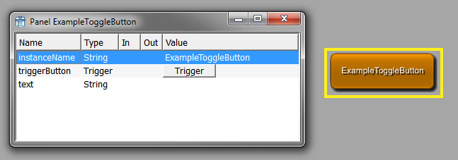
Name: ExampleToggleButton
Keyword: examples
Target Package: Example/General
Project: ExampleToggleButton
Click Next to proceed.
On the dialog Macro Module Properties, click Add Python file to have one created.
On the dialog Module Field Interface, the fields of the module can be defined (more fields can be added later).
Click New to create a new field, then enter the following:
Field Name: triggerButton
Field Type: Trigger
Field Comment:
Field Value:
Click again on New to create a second field:
Field Name: text
Field Type: String
Field Comment:
Field Value:
Click Create to create the module.
In the default file browser of your system, the folder {packagePath}/Modules/Macros/ExampleToggleButton is opened.
Click Close to finish the creation of the macro and to reload the module database to make the new module available. Type “Exam” to have the search deliver a list of available modules, and instanciate ExampleToggleButton. Double-click the module to open its automatic panel.
The automatic panel shows all defined fields. In the next step, we will edit the additional panel.
Right-click the module and look at Related Files. Click the script file ExampleToggleButton.script to open it in the integrated text editor MATE.
The script file looks as follows:
Interface {
  Inputs {}
  Outputs {}
  Parameters {
    Field triggerButton {
      type = trigger
    }
    Field text {
      type = String
      value = ""
    }
  }
}

Commands {
  source = $(LOCAL)/ExampleToggleButton.py
}
In a first step, we add the Window section to create a visible panel.
Window {
Category {
Box {
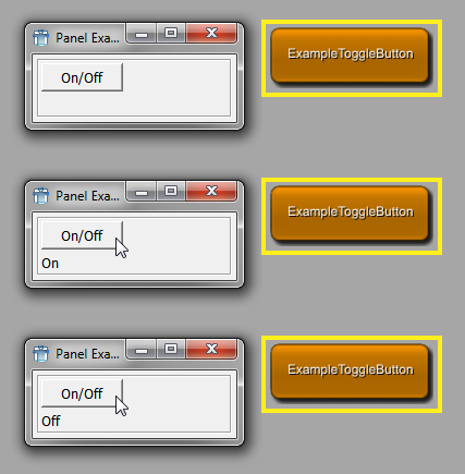
Button triggerButton { title = "On/Off" }
}
}
} After any changes in the .script, save the file, select the module in MeVisLab, and press F5 to reload the module. After the first addition of the Windows section, double-click the module to open the new panel. Panels that are already open are automatically updated upon reload with F5.
The box draws a simple frame around the element, usually with a title. By default, the title is the tag value of the Box tag.
Box "A button" {
}
It can also be substituted by an explicit title element:
Box "A button" {
   title = "Yes, a button"
}
At this point, the button has no effect yet. The action tied to the button will be added as a the Python command in the next section. The Label uses the text field for its title.
Window {
  Category {
    Box {
      Button triggerButton { title = "On/Off" }
      Label                { titleField = text }
    }
  }
} In the Python script, the toggling of the button would need to have an effect, in this case it changes the label text.
Initially, the variable toggleState is False; upon pressing of the button it is toggled. If the toggleState gets True by pressing the button, then the label text is set to “On”, otherwise it is set to “Off”.
# Variable
toggleState = False

# Called when button pressed
def buttonPressed():
    global toggleState
    toggleState = not toggleState
    if toggleState:
        ctx.field("text").value = "On"
    else:
        ctx.field("text").value = "Off"
The value of the text field, which is used as the title field of the label, is set depending on the toggleState variable.
There are two ways to handle the button press. First, it is possible to use a trigger field and a FieldListener.
Note that a FieldListener in the Commands section would not have the required window context to access any controls in the window.
However, since the buttonPressed() function only accesses a field, this would also work in this case:
Window {
  FieldListener triggerButton {
    command = buttonPressed
  }
  Category {
    Box {
      Button {
        triggerButton { title = "On/Off" }
        title = "On/Off"
      }
      Label { titleField = text }
    }
  }
}
Second, the button press can be directly handled without a field:
Window {
  Category {
    Box {
      Button {
        title = "On/Off"
        command = buttonPressed
      }
      Label { titleField = text }
    }
  }
}
The example works now. However, the toggleState value is not persistent. If the network is closed and reloaded later, it is again initialized with False. The next section will explain how values can be made persistent.
Assume that the value of the variable toggleState needs to be persistent, i.e., its last value should be restored when the network is loaded at another time. We can use a persistent field for this. The fields current value will be stored when the MeVisLab network is saved. In a first step, a Bool field for it is added to the Interface section:
Interface {
  Inputs {}
  Outputs {}
  Parameters {
    Field text { type = String value = Off}
    Field toggleState { type = Bool value = false}
  }
}
For the Python script, it would mean a rewrite resulting in:
# Called when button pressed
def buttonPressed():
    toggleState = ctx.field("toggleState")
    toggleState.value = not toggleState.value
    if toggleState.value:
        ctx.field("text").value = "On"
    else:
        ctx.field("text").value = "Off"
The value of the toggleState field is now persistent — if ExampleToggleButton would be used in a network, its last state would be saved with the network.
For a button, a keyboard shortcut could be implemented by adding an Accel control. In our example, we add the key combination ALT+Q.
Interface {
  Inputs {}
  Outputs {}
  Parameters {
    Field text { type = String value = "" }
    Field toggleState { type = Bool value = false}
    Field triggerField { type = Trigger }
  }
}

Commands {
  source = $(LOCAL)/ExampleToggleButton.py
}

Window {
  Accel {
    key = ALT+Q
    field = triggerField
    command = buttonPressed
  }
  Category {
    Box {
      Button  {
        name = triggerButton
        title = "On/Off"
        command = buttonPressed
      }
      Label { titleField = text }
    }
  }
}
The key has to be defined before the other GUI controls for which it should be used, so it is best entered in the beginning of the Windows section. The panel has to be active for the shortcut to have an effect.
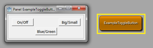
In a Box control, the default layouter is a Vertical control:
Box {
  Button  {
    name = triggerButton
    title = "On/Off"
  }
  Button {
    name = trigger2Button
    title = "Blue/Green"
  }
  Button {
    name = trigger3Button
    title = "Big/Small"
  }
}
The layouter can be changed, see the MDL Reference for a list of possible layouters. For example, a grid can be set:
Box {
  layout = grid
  Button  {
    name = triggerButton
    title = "On/Off"
    x = 0 y = 0
  }
  Button {
    name = triggerButton
    title = "Blue/Green"
    x = 1 y = 1
  }
  Button {
    name = trigger3Button
    title = "Big/Small"
    x = 2 y = 0
  }
}It is possible to define overwrite default values for MDL controls. Prototypes are existing controls with different default values. For example, if all following occurrences of the Vertical control should by default expand in horizontal and vertical directions, the prototype declaration would look like this:
Vertical {
  style {
    Prototype Vertical {
      expandX = yes
      expandY = yes
    }
  }

  // the following vertical now has the defaults as given above
  Vertical {
    Label { title = "test" }
  }
}
Prototypes can be defined for all MDL elements.
Prototypes do not inherit from each other, so if you overwrite, e.g., Vertical, you loose all the default tags that are defined in the default prototype.
Styles inherit the prototypes from the style they are derived from, so you can overwrite individual prototypes without affecting other prototypes from the default style.
See the module TestPrototypes for an example.
On the automatic panel of a module, all parameters are listed. Therefore, there is no necessity to add all parameters as fields to your GUIs. Focus on those fields that the user needs to set or see.
If the module has a high number of fields, the controls can be arranged on the panel, e.g., by using tabs or sub-panels.
As modules may have multiple windows, the GUI can be split into various panels. This is recommended for settings that are possible, but do not relate strongly to other, more important settings of the module.
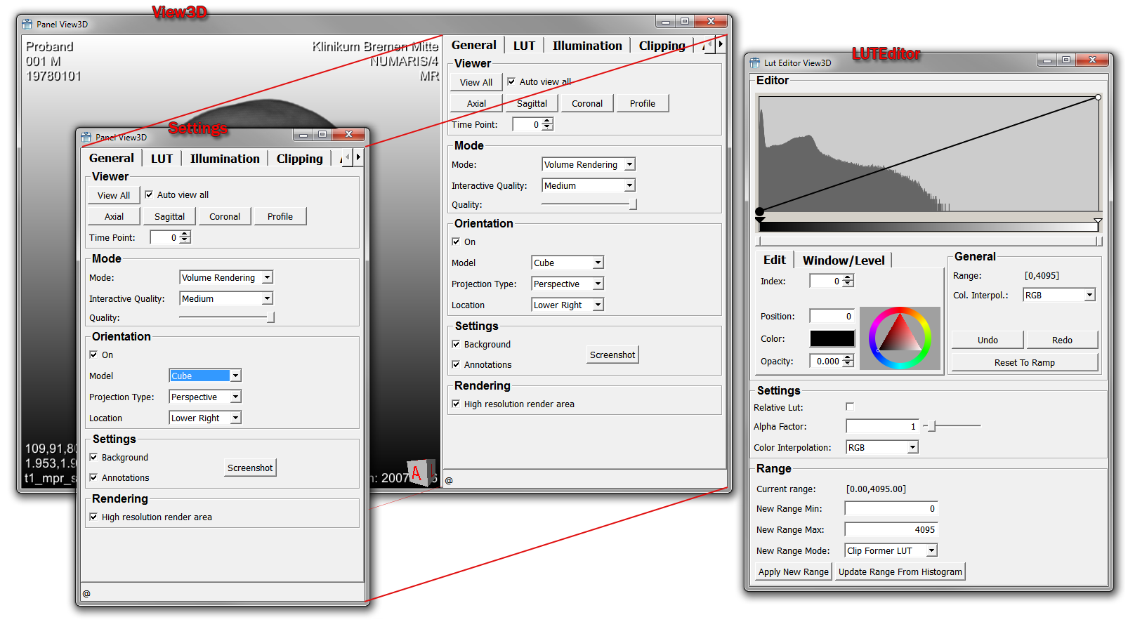
For sharing parts of the GUI between panels, the Panel control can be used. It clones a defined subregion of a module's Windows section.
Excerpt from the View3D script file:
Window View3D {
  Vertical {
    expandX = NO
    panelName = Settings
    TabView {
      TabViewItem General {
        Box Viewer {
          Horizontal  {
            expandX = no
...
The thus defined panel “Settings” can be reused in a panel of its own.
Window Settings {
  Panel {
    panel = Settings
  }
}
The Panel control also clones all FieldListeners contained in the cloned code, so that a cloned panel should work like
the original one. The window one gets when calling window() in the context of the cloned script will be
the window in which the Panel is, in this case the View3D window.
© 2026 MeVis Medical Solutions AG
| |  | |
| Chapter 11. GUI Design in MeVisLab |  | 11.3. MDL Styles |