| 11.3. MDL Styles | ||
|---|---|---|
 | Chapter 11. GUI Design in MeVisLab |  |
| 11.3. MDL Styles | ||
|---|---|---|
| | Chapter 11. GUI Design in MeVisLab | |
As every panel needs some kind of style — or visual theme — for display, MeVisLab provides the concept of styles. Styles are color and font schemes that can be derived from each other, and the
base of all styles is the _default style.
First, it is important to know that there are two modes which affect what style is chosen: the Panel mode and the
Application mode. If you open panels inside of MeVisLab by double clicking on a module, the panels are created in
Panel mode. The Application mode is used when running a macro module as an application,
either via Scripting → Start Network Script or from the commandline.
Two default styles are predefined, one for each mode. Both are directly derived from _default:
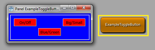
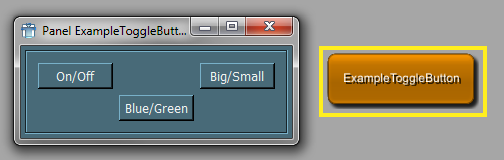
Panel.default is used in Panel mode (gray style).
Application.default is used in Application mode (blue/green style).
The predefined style names from above consist of a prefix (“Panel”/“Application”) and the actual style name (“default”). This allows for using the same style name for two different modes. The actual prefix is detected by MeVisLab, this will be explained below.
Styles can be set and locally derived in MDL controls. They affect the current control and also recursively all its children.
For example, to specify the style for a single Window control the style tag can be used like this:
Window {
  style = ExistingStyleName
  ...
}
To locally derive from an existing style, one can write:
Window {
  style NewLocalStyle {
    derive = Application.default // inherit the default Application style
    colors {
      bg = blue   // background color
      fg = yellow // foreground color
    }
  }
  ...
}
The derive tag can be omitted to inherit from the style that is currently active,
regardless of which that is (see also the style stack, which is mentioned below in “How MeVisLab Applies the Styles”).
It is also possible to omit the style prefix, in which case MeVisLab uses the detected one.
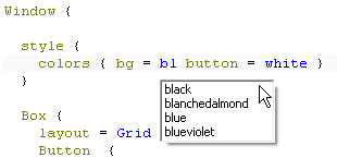
A local style can also be anonymous:
Window {
  style {
    colors { bg = blue button = red }
  }
  Box {
    layout = Grid
...![[Tip]](images/tip.png) | Tip |
|---|---|
MATE offers auto completion for style attributes. See the figure below. |
How MeVisLab Applies the Styles
Before a window is created, MeVisLab initializes a stack with the default style. The name of it is “<style prefix>.default”, e.g., Application.default
(see below how MeVisLab determines the style prefix). Then it recursively creates all MDL controls, beginning with the Window control.
For each control, MeVisLab checks if either a style is specified or if a style is derived locally (local styles are explained below). If one of both is true, then it pushes this style onto the stack and applies it to the widgets that are created by the control. This style is also applied to all sub controls, unless they push another style themselves. After the control is created, the style is popped again.
MeVisLab looks up styles as follows:
If the style name does not contain a dot, it prepends the style prefix and uses it if it exists.
If the style name does not contain a dot, it prepends the fallback style prefix and uses it if it exists.
Use the given style name as it is to look up the style.
How MeVisLab Determines the Style Prefix
In Application mode, the style prefix is the name of the application macro module. The fallback style prefix is either the value of the
MDL preferences variable ApplicationStyle, or “Application” if ApplicationStyle is not specified.
In Panel mode the style prefix is either the value of the MDL preferences variable PanelStyle, if it is given,
or “Panel”. The fallback style prefix is always “Panel”.
To style a window like above for testing, use the style tag as follows:
Window {
  style = Application.default

  Category {
    Box {
    ...
    }
  }
}How to Define MDL Styles
A style is defined globally using the DefineStyle tag. The style name may include a prefix separated by a dot from the actual name, but it is not required (see “How MeVisLab Applies the Styles” above on how MeVisLab looks up styles by name). There are two possibilities to position the definition of a named style:
if globally defined in any *.def file, this style will be available to all windows of all modules under the given name.
if defined inside of a window, this style is only available inside of that window.
DefineStyle AnyStyleName {
   derive = _default
   colors {
     bg = black
     fg = black
     button = black
   }
}
It is possible to define new default styles for application macro modules. The style definition does not have to be in the same .def file. You can have one global .def file where you define your styles.
If you want to use a style as default in multiple application macro modules, you can derive default styles with the macro module names as prefix:
DefineStyle BaseStyle {
  derive = _default
  ...
}

DefineStyle Macro1.default {
  derive = BaseStyle
}

DefineStyle Macro2.default {
  derive = BaseStyle
}
...Custom MDL controls can be created.
The following steps would be necessary to create a MDL control:
Define the control in a .def file (MDL) under the Modules directory of a package. This will make the control available and extend the existing MDL validator.
Implement the control, either in C++ (.h, .cpp) or in Python (.py). Put the files under the Sources directory of a package.
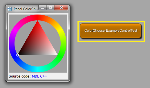
Examples for this are in the MeVisLab/Examples package. It includes the controls
ColorChooserExampleControl,
DiagramExampleControl,
PythonControlExample, and
DoubleSpinBoxExample
Their definitions exist in Examples/Modules/Controls/, their implementations in Examples/Sources/Controls/ (C++) and Examples/Modules/Scripts/python/ (Python). The modules ColorChooserExampleControlTest, DiagramExampleControlTest, and PythonExampleControlsTest demonstrate using the controls.
For example, the ColorChooserExample files are:
The WidgetControl definition, which includes a reference to the DLL that contains the compiled C++ implementation:
Examples/Modules/Controls/ColorChooserExampleControl.def
The C++ implementation:
Examples/Sources/Controls/MLABColorChooserExampleControl/mlabColorChooserExampleControl.h
Examples/Sources/Controls/MLABColorChooserExampleControl/mlabColorChooserExampleControl.cpp
The PythonControlExample files are:
The WidgetControl definition, which includes a reference to the implementing Python module:
Examples/Modules/Controls/PythonControlExamples.def
The Python implementation:
Examples/Modules/Scripts/python/PythonControlExample.py
© 2026 MeVis Medical Solutions AG
| |  | |
| 11.2. Developing the ExampleToggleButton |  | 11.4. Customize GUI Appearance Using Qt Style Sheets (CSS) |