OrthoView2D
- MacroModule
genre
author
package
definition
see also
keywords
Purpose
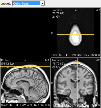
The module OrthoView2D provides a 2D view displaying the input image in three orthogonal viewing directions.
Usage
Use the left mouse button to set a position in the data set. This position will be displayed in all available views.
See also View2D description for basic viewing functionality.
Windows
Viewer
Settings
Input Fields
image
- name: image, type: Image
inInvPreLUT
- name: inInvPreLUT, type: SoNode
Before LUT and viewer Open Inventor input, e.g., for overlays independent of LUT settings
inInvPostLUT
- name: inInvPostLUT, type: SoNode
Between LUT and viewer Open Inventor input
inInvPostViewer
- name: inInvPostViewer, type: SoNode
Behind viewer Open Inventor input, e.g., for diagram overlays
Output Fields
Parameter Fields
Field Index
|
|
|
|
|
|
|
|
|
|
|
|
|
||
|
|
|
|
||
|
|
|
|
||
|
Visible Fields
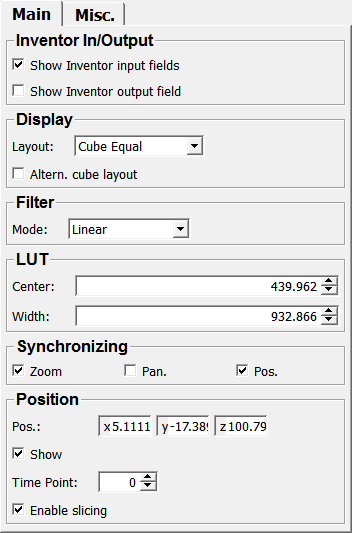
Show Inventor input fields
- name: inventorInputOn, type: Bool, default: TRUE
If checked, Open Inventor input fields are available on the module.
Show Inventor output field
- name: inventorOutputOn, type: Bool, default: FALSE
If checked, an Open Inventor output field is available on the module.
Pos. (synchronizePosition)
- name: synchronizePosition, type: Bool, default: TRUE
If checked, the three views show a slice with the last clicked position.
Layout
- name: layout, type: Enum, default: LAYOUT_CUBE_EQUAL
Defines the layout of the viewer(s).
Values:
Title |
Name |
|---|---|
Axial |
LAYOUT_AXIAL |
Sagittal |
LAYOUT_SAGITTAL |
Coronal |
LAYOUT_CORONAL |
Cube |
LAYOUT_CUBE |
Cube Equal |
LAYOUT_CUBE_EQUAL |
Cube Customized |
LAYOUT_CUBE_CUSTOMIZED |
Row |
LAYOUT_ROW |
Row Equal |
LAYOUT_ROW_EQUAL |
Row Axialextra |
LAYOUT_ROW_AXIALEXTRA |
Column |
LAYOUT_COLUMN |
Column Equal |
LAYOUT_COLUMN_EQUAL |
Hidden |
LAYOUT_HIDDEN |
Mode (filterMode)
- name: filterMode, type: Enum, default: FILTER_LINEAR
Defines the interpolation mode for projecting voxels onto screen pixels. See
SoView2D.filterModefor details.
Values:
Title |
Name |
|---|---|
Nearest |
FILTER_NEAREST |
Linear |
FILTER_LINEAR |
Linear Postclass |
FILTER_LINEAR_POSTCLASS |
Cubic Postclass |
FILTER_CUBIC_POSTCLASS |
Zoom
- name: synchronizeZoom, type: Bool, default: TRUE
If checked, the zooming is synchronized in all viewers.
Pan.
- name: synchronizePanning, type: Bool, default: FALSE
If checked, the panning is synchronized in all viewers.
Use global input image
- name: useGlobalInputImage, type: Bool, default: TRUE
If checked, the module works on a global input image.
Otherwise, the module works on a virtual volume. Uncheck this option if you have memory issues.
Snap to center
- name: snapToCenter, type: Bool, default: FALSE
If checked, all viewers will show the middle of the image in their respective view if the image input is touched.
Altern. cube layout
- name: alternCubeLayout, type: Bool, default: FALSE
If checked, the image is shown in an alternative cube layout.
Time Point
- name: timePoint, type: Integer, default: 0, minimum: 0, maximum: view.maxTimePoint
Sets the time point to be shown.
Use Managed Interaction
- name: useManagedInteraction, type: Bool, default: FALSE
If checked,
Managed Interactionis used for the mouse interaction.This is useful if the rest of the interaction in the scene also uses Managed Interaction, since otherwise, there might overlapping interactions.
Enable slicing
- name: enableSlicing, type: Bool, default: TRUE
If checked, interactive slicing of the image is enabled.
On (borderOn)
- name: borderOn, type: Bool, default: TRUE
If checked, borders will be rendered around the viewer(s).
Color
- name: borderColor, type: Color, default: 0.899999976158142 0.899999976158142 0.899999976158142
Sets the color of the optional border around viewer(s).
Width
- name: grayWidth, type: Double, default: 0.802500009536743, deprecated name: greyWidth
Sets the width of the relative gray value LUT.
Center
- name: grayCenter, type: Double, default: 0.392500013113022, deprecated name: greyCenter
Sets the center of the relative gray value LUT.
Scale current LUT to new image
- name: scaleLUTForNewImage, type: Bool, default: TRUE
If checked, the scale of the current LUT is applied to any newly connected image.
In other words, if the LUT is defined using absolute values, its relative appearance remains unchanged when the input image changes.
If the input image is disconnected temporarily, the previous scaling is stored and reapplied once a new image is connected.
Keep this option unchecked if you want to use the same absolute LUT for different images. Otherwise, on disconnecting the input image, a relative LUT is computed and on connecting a different image, this relative LUT is used to compute the next absolute LUT. This results in having always the same appearance for images with a different image value range.
Compute LUT on image change
- name: computeLUTOnImageChange, type: Bool, default: TRUE
If checked, the module computes a default LUT on each update of the input image.
On (annotationOn)
- name: annotationOn, type: Bool, default: TRUE
If checked, annotations showing image information are rendered over the image.
Mode (annotationSizeMode)
- name: annotationSizeMode, type: Enum, default: ANNO_SHOW_DETAILED
Defines the annotation mode.
This mode can also be toggled by pressing the A key.
The rendering of general image information can be toggled by pressing the I key.
Values:
Title |
Name |
Deprecated Name |
|---|---|---|
Hide |
ANNO_SHOW_HIDE |
HIDE_ANNOTATION |
Short |
ANNO_SHOW_SHORT |
SHORT_ANNOTATION |
Detailed |
ANNO_SHOW_DETAILED |
DETAILED_ANNOTATION |
Size
- name: annotationFontSize, type: Enum, default: ANNO_SIZE_AUTO
Sets the font size of the annotations.
Values:
Title |
Name |
Deprecated Name |
|---|---|---|
Auto |
ANNO_SIZE_AUTO |
AUTO_SIZE_ANNOTATION |
Small |
ANNO_SIZE_SMALL |
SMALL_ANNOTATION |
Medium |
ANNO_SIZE_MEDIUM |
MEDIUM_ANNOTATION |
Large |
ANNO_SIZE_LARGE |
LARGE_ANNOTATION |
User |
ANNO_SIZE_USER |
Display value with high precision
- name: valueHighPrecision, type: Bool, default: TRUE
If checked, the image value (voxel value under the mouse cursor) is displayed with high precision.
Current Pos. in
- name: annoCoords, type: Enum, default: Voxel
Defines in which coordinate system the current mouse position should be displayed.
Values:
Title |
Name |
|---|---|
Voxel |
Voxel |
World |
World |
Show
- name: showCurrentPos, type: Bool, default: TRUE
If checked, the current mouse position is displayed.
Pos. (worldPosition)
- name: worldPosition, type: Vector3, default: 33.2279014587402 -12.9106998443604 49.7336006164551
Shows the current mouse position.
Colored mode
- name: coloredMode, type: Bool, default: FALSE
If checked, a colored border is rendered around a viewer.