| 11.4. Customize GUI Appearance Using Qt Style Sheets (CSS) | ||
|---|---|---|
 | Chapter 11. GUI Design in MeVisLab |  |
| 11.4. Customize GUI Appearance Using Qt Style Sheets (CSS) | ||
|---|---|---|
| | Chapter 11. GUI Design in MeVisLab | |
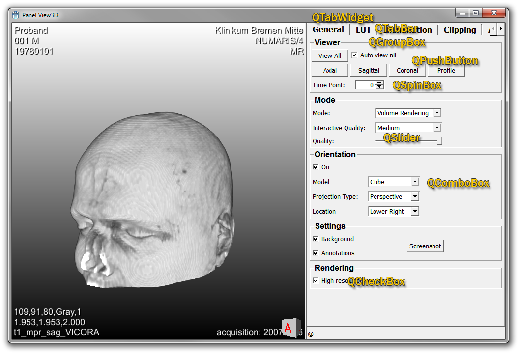
By referencing Qt Style Sheet files in the MDL, the underlying Qt widgets can be styled from the MDL, including tab bars, radio buttons, list view items, etc. For a list of available GUI elements, see Qt Widgets.
The method has to major drawbacks:
The developer needs to learn something about the underlying Qt widgets.
The solution somewhat depends on the underlying implementation of the MDL, which could change over time, for example by using different Qt Widgets internally or just by using a newer Qt version.
The styling works for Qt widgets that are derived from QWidget.
Note that it does not work for the MDL controls themselves, because they have no own visual representation, but they aggregate Qt widgets.
![[Note]](images/note.png) | Note |
|---|---|
Avoid mixing the MDL styles and the CSS styles within the same MDL controls, because MDL styles manipulate the QPalette of the underlying widgets and the style sheets override the QPalette. |
Let's have a look at the panel we already know from its element and control names.
Like for all modules, a module using the CSS style sheets would have a .script in which the elements of the GUI are defined. In addition, the stylesheet is referenced.
Interface  {
   Parameters  {
      Field name {
         type = string
      }
   }
}

Window  {
  styleSheetFile = $(LOCAL)/TestStyleSheets.css
  Vertical Tab1 {
    expandY = yes
    Box Box {
      Field name { }
    }
    Box Buttons { layout = Horizontal
      Button { title = Something }
      Button { title = Testing }
    }
    Box ListView { layout = Horizontal
      ListView {
        values = "Column1,Column2$Value1,Value2$Value3,Value4"
        columnSeparator = ,
        rowSeparator = $
      }
    }
    SpacerY {}
  }
  Vertical Tab2 { expandY = yes
  }
}
The styling of the elements is then done in the style sheet.
Excerpt from TestStyleSheets.css:
QTabWidget {
  background: white;
}

QStackedWidget {
  background: white;
}

QTabWidget::pane { /* The tab widget frame */
     border-top: 2px solid #C2C7CB;
 }

 QTabWidget::tab-bar {
     left: 5px; /* move to the right by 5px */
 }

 /* Style the tab using the tab sub-control. Note that
     it reads QTabBar _not_ QTabWidget */
 QTabBar::tab {
     border-image: url("$(LOCAL)/style/tab1.png") 10 10 2 10;
     border-top:   10px transparent;
     border-right: 10px transparent;
     border-bottom: 0 transparent;
     border-left:  10px transparent;
     min-width: 8ex;
     padding: 2px;
 }

 QTabBar::tab:selected, QTabBar::tab:hover {
     border-image: url("$(LOCAL)/style/tab2.png") 10 10 2 10;
 }

 QPushButton {
     border-image: url("$(LOCAL)/style/button.png") 6 10 6 10;

     border-top: 6px transparent;
     border-bottom: 6px transparent;
     border-right: 10px transparent;
     border-left: 10px transparent;
 }
To inspect the QWidgets of a panel you can use the Widget Explorer. It shows the widget hierarchy of all windows and displays some information about the widgets, for example if the widget is directly owned by a control. The Widget Explorer also allows for dynamically altering the style sheets.
Note that you cannot use the control names for CSS ID selector, because it does not set the object name on the widget, but on the control. You can set the object name of the widget with the MDL tag widgetName.
© 2025 MeVis Medical Solutions AG
| |  | |
| 11.3. MDL Styles |  | Chapter 12. Excursion: Image Processing in ML |