SoView2DSlider
- InventorModule
genre
author
package
dll
definition
see also
inherits from
Purpose
The module SoView2DSlider shows an interactive slider in a 2D viewer.
Usage
The slider consists of a slider (background) and an indicator that shows the current value within the min/max bounds.
The field Current Value is bidirectionally linked to the indicator; if the field is changed, the indicator moves and if the indicator is moved, the field changes.
The user can drag the indicator; the value is incremented/decremented by Snap Size (if the snap size is not 0).
The user can also click onto the slider before or behind the indicator to move the slider by Step Size into that direction. If step size is set to 0, the indicator will not be moved this way.
Windows
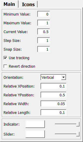
Default Panel
Output Fields
self
- name: self, type: SoNode
Parameter Fields
Field Index
|
|
|
|
|
|
|
|
|
|
|
|
|
|
|
|
|
|
|
|
|
|
|
|
|
|
|
|
|
|
|
|
|
|
|
|
|
|
|
|
|
|
|
|
|
|
|
|
Visible Fields
Minimum Value
- name: minimumValue, type: Float, default: 0, maximum: :field:`maximumValue`
Sets the minimum value.
Maximum Value
- name: maximumValue, type: Float, default: 1, minimum: :field:`minimumValue`
Sets the maximum value.
Current Value
- name: currentValue, type: Float, default: 0.5, minimum: :field:`minimumValue`, maximum: :field:`maximumValue`
Sets and shows the current value.
Use Tracking
- name: useTracking, type: Bool, default: TRUE
If checked, the module updates the current value on any interaction with the slider.
Otherwise, the module updates the current value on finishing the interaction.
Step Size
- name: stepSize, type: Float, default: 1, minimum: 0
Sets a step size to increment/decrement the current value by clicking on the slider (and not on the indicator).
Snap Size
- name: snapSize, type: Float, default: 1, minimum: 0
Sets a snap value for interacting with the indicator.
Revert Direction
- name: revertDirection, type: Bool, default: FALSE
If checked, the minimum and the maximum value are swapped.
Orientation
- name: orientation, type: Enum, default: ORIENTATION_VERTICAL
Defines the orientation of the slider.
Values:
Title |
Name |
Description |
|---|---|---|
Horizontal |
ORIENTATION_HORIZONTAL |
The slider is oriented from left (minimum) to right (maximum) if not reverted. |
Vertical |
ORIENTATION_VERTICAL |
The slider is oriented from bottom (minimum) to top (maximum) if not reverted. |
Relative XPosition
- name: relativeXPosition, type: Float, default: 0.1, minimum: 0, maximum: 1
Sets the slider’s middle x-position relative to the viewport in the range [0..1].
Relative YPosition
- name: relativeYPosition, type: Float, default: 0.5, minimum: 0, maximum: 1
Sets the slider’s middle y-position relative to the viewport in the range [0..1].
Relative Length
- name: relativeLength, type: Float, default: 0.1, minimum: 0, maximum: 1
Sets the length of the slider relative to the width or height of the viewport, depending on the orientation.
Relative Width
- name: relativeWidth, type: Float, default: 0.050000001, minimum: 0, maximum: 1
Sets the width of the slider relative to the shorter edge of the viewport.
Indicator
- name: indicatorColor, type: Color, default: 1 1 1
Sets the color of the indicator.
Indicator Alpha
- name: indicatorAlpha, type: Float, default: 1, minimum: 0, maximum: 1
Sets the alpha value of the indicator.
Slider
- name: sliderColor, type: Color, default: 1 1 1
Sets the color of the slider (background).
Slider Alpha
- name: sliderAlpha, type: Float, default: 1, minimum: 0, maximum: 1
Sets the alpha value of the slider (background).
Use Indicator Icon File
- name: useIndicatorIconFile, type: Bool, default: FALSE
If checked, the module loads and renders an icon as the indicator.
Otherwise, the indicator is rendered as a filled rectangle.
Indicator Icon File
- name: indicatorIconFile, type: String, default: $(MLAB_MeVisLab_Standard)/Modules/Resources/Images/sliderIndicator.tif
Sets the file name to the icon file for the indicator.
The icon file must have an extent that is a multiple of 32. The path can contain relative path variables.
Use Background Icon File
- name: useBackgroundIconFile, type: Bool, default: FALSE
If checked, the module loads and renders an icon as the background.
Otherwise, the background is rendered as a filled rectangle.
Background Icon File
- name: backgroundIconFile, type: String, default: $(MLAB_MeVisLab_Standard)/Modules/Resources/Images/sliderBackground.tif
Sets the file name to the icon file for the background.
The icon file must have an extent that is a multiple of 32. The path can contain relative path variables. The icon is rendered as a border image with a border of 3 pixels.