SoView2DRectangle
- InventorModule
genre
author
package
dll
definition
see also
inherits from
keywords
Purpose
The module SoView2DRectangle allows for a drawing and interactive adjustment of a 2D rectangle in a 2D viewer.
It is also possible to add a text label to the box.
Note: although this mode is called SoView2D*Rectangle*, it actually draws a 3D box.
Interaction
Click and drag with the adjusted key modifier and mouse button to span a rectangle.
The first click determines the start position and the end position is set on a release event.
When using Managed Interaction (see Managed Interaction), press Request Create once to enable creation of a new rectangle when clicking on empty space in the viewer.
Windows
Default Panel
Output Fields
self
- name: self, type: SoNode
Parameter Fields
Field Index
Visible Fields
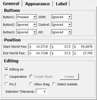
Drawing On
- name: drawingOn, type: Bool, default: TRUE
If checked, the 3D box is drawn.
see also SoView2DExtension.drawingOn
Editing On
- name: editingOn, type: Bool, default: TRUE
If checked, the 3D box can be edited interactively.
see also SoView2DExtension.editingOn
Fix Z
- name: fixZOn, type: Bool, default: FALSE
If checked, the interaction with an existing handle (corner of the 3D box) occurs in the handle’s original z-position.
Color (color)
- name: color, type: Color, default: 1 1 1
Sets the color of the rendered 3D box.
Optionally, the colors of the handles and side lines can be set separately using
Handle ColorandSide Line Color, respectively.
see also SoView2DExtension.color
Selection Tolerance
- name: selectionTolerance, type: Float, default: 4, minimum: 2, maximum: 40, deprecated name: selectDistance
Sets the distance, in pixels, between the mouse cursor and either a handle’s midpoint or a side line required to grab it. Also sets the size of the handles in pixels.
Alt
- name: alt, type: Enum, default: IGNORED
Create Mode
- name: createNewMode, type: Bool, default: FALSE
Request Create
- name: createNewModeRequest, type: Trigger
When pressed, the module creates a new 3D box once the button mask condition is fulfilled.
Note that this button must be pressed if multiple
SoView2DRectanglemodules are present, or if aSoView2DPositionorSoView2DMarkerEditoris also used in the same 2D viewer, to determine which module receives the event when clicking on empty space.Also note that this button must be pressed to create a new 3D box if the viewer uses Managed Interaction.(see
Managed Interaction).
Start World Pos
- name: startWorldPos, type: Vector3, default: -1 -1 -1
Shows and sets the start position of the 3D box.
End World Pos
- name: endWorldPos, type: Vector3, default: -1 -1 -1
Shows and sets the end position of the 3D box.
Blend Inside
- name: blendInside, type: Float, default: 0.2, minimum: 0, maximum: 1
Sets an alpha factor for rendering the faces of the 3D box if the current slice crosses the box.
Blend Onto
- name: blendOnto, type: Float, default: 0.5, minimum: 0, maximum: 1
Sets an alpha factor for rendering the faces of the 3D box that lie directly on the current viewer’s slice.
Blend Outside
- name: blendOutside, type: Float, default: 0, minimum: 0, maximum: 1
Sets an alpha factor for rendering the faces of the 3D box if the current slice does not intersect the box.
Line Blend Inside
- name: lineBlendInside, type: Float, default: 0.5, minimum: 0, maximum: 1
Sets an alpha factor for rendering the edges (handles and side lines) of the 3D box if the current slice intersects the box but does not render the edges.
Line Blend Onto
- name: lineBlendOnto, type: Float, default: 0.69999999, minimum: 0, maximum: 1
Sets an alpha factor for rendering the edges (handles and side lines) of the 3D box if they are rendered on the current slice.
Line Blend Outside
- name: lineBlendOutside, type: Float, default: 0, minimum: 0, maximum: 1
Sets an alpha factor for rendering the edges (handles and side lines) of the 3D box if the current slice does not intersect the box.
Select Outside
- name: selectOutside, type: Bool, default: FALSE
If checked, the rectangle can be selected outside of its z range if
Blend OutsideorLine Blend Outside> 0.
Use Handle Color
- name: useHandleColor, type: Bool, default: FALSE
If checked, the handles use the color defined in
Handle Color; otherwise, theColoris used.
Use Side Line Color
- name: useSideLineColor, type: Bool, default: FALSE
If checked, the side lines use the color defined in
Side Line Color; otherwise, theColoris used.
Handle Color
- name: handleColor, type: Color, default: 1 1 1
Sets the color of the handles.
Side Line Color
- name: sideLineColor, type: Color, default: 1 1 1
Sets the color of the side lines.
Allow Drag
- name: allowDrag, type: Bool, default: FALSE
If checked, an existing 3D box can be translated by clicking it in the interior and dragging it on the viewer.
Cooperative
- name: cooperative, type: Bool, default: FALSE
If checked, the module evaluates internal states so that if other module actually set this state, an interaction is evaluated by only one module.
Shade Exterior
- name: shadeExterior, type: Float, default: 0, minimum: 0, maximum: 1
Sets a darkening factor of the image outside the 3D box. Default is 0 (that is: not darken at all).
Shade All Exterior
- name: shadeAllExterior, type: Bool, default: FALSE
If checked, all exterior is shaded (see
Shade Exterior). Otherwise, if the current slice does not cross the 3D box, the projection area of the 3D box is also shaded.
Line Style
- name: lineStyle, type: Enum, default: SOLID
Defines the line style of the 3D box.
Values:
Title |
Name |
|---|---|
Solid |
SOLID |
Dashed |
DASHED |
Dotted |
DOTTED |
Long Dashed |
LONG_DASHED |
Vertical Offset
- name: labelVerticalOffset, type: Float, default: 0
Sets a vertical label offset in pixels (in addition to the position determined by
Vertical Position on BoxandVertical Alignment).
Vertical Alignment
- name: labelVerticalPosition, type: Enum, default: Center
Defines the vertical label alignment relative to the position specified by
Vertical Position on Box.
Values:
Title |
Name |
|---|---|
Above |
Above |
Center |
Center |
Below |
Below |
Vertical Position on Box
- name: labelVerticalBoxPosition, type: Enum, default: Center
Defines the vertical label position on the 3D box.
Values:
Title |
Name |
|---|---|
Top |
Top |
Center |
Center |
Bottom |
Bottom |
Horizontal Offset
- name: labelHorizontalOffset, type: Float, default: 0
Sets the horizontal label offset in pixels (in addition to the position determined by
Horizontal Position on BoxandHorizontal Alignment).
Horizontal Position on Box
- name: labelHorizontalBoxPosition, type: Enum, default: Center
Defines the horizontal label position on the 3D box.
Values:
Title |
Name |
|---|---|
Left |
Left |
Center |
Center |
Right |
Right |
Horizontal Alignment
- name: labelHorizontalPosition, type: Enum, default: Center
Defines the horizontal label alignment relative to the position specified by
Horizontal Position on Box.
Values:
Title |
Name |
|---|---|
Left |
Left |
Center |
Center |
Right |
Right |
Text
- name: labelText, type: String
Sets the text of the label.
The text can also be multi-line if you enter it through the automatic panel or through scripting.
Font Size
- name: labelFontSize, type: Integer, default: 12
Sets the font size of the label text.
Color (labelColor)
- name: labelColor, type: Color, default: 1 1 1
Sets the color of the label text.
Draw shadow
- name: labelShadow, type: Bool, default: TRUE
If checked, the label text is rendered with a black shadow.
Is Under Mouse
- name: isUnderMouse, type: Bool, persistent: no
Shows whether any of the 3D box’s handles or sides are under the mouse cursor when using Managed Interaction. Additionally, if
Allow Dragis checked, it also shows whether the mouse cursor is over the 3D box itself.