Purpose
The module SoView2DButton implements a simple button for use in a 2D viewer.
Interaction
The button reacts on mouse-over.
The Clicked is triggered from within if the button is pressed and released while the mouse is still over the button. For canceling a button press, move the mouse away from the button before releasing the mouse button.
Windows
Default Panel
Output Fields
self
- name: self, type: SoNode
Parameter Fields
Field Index
|
|
|
|
|
|
|
|
|
|
|
|
|
|
|
|
|
|
|
|
|
|
|
|
|
|
|
|
|
|
|
|
|
|
|
|
|
|
|
|
|
Visible Fields
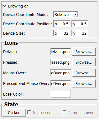
Drawing On
- name: drawingOn, type: Bool, default: TRUE
If checked, the button is rendered and active. Otherwise, the button is not visible and cannot be interacted with.
see also SoView2DExtension.drawingOn
Base Color
- name: color, type: Color, default: 1 1 1
Sets a base color for all button icons that is multiplied with the icon image’s color.
see also SoView2DExtension.color
Device Coordinate Mode
- name: deviceCoordinateMode, type: Enum, default: DEVICE_COORDINATES_RELATIVE
Defines how the field
Device Coordinate Positionis interpreted.
Values:
Title |
Name |
Description |
|---|---|---|
Absolute |
DEVICE_COORDINATES_ABSOLUTE |
Device coordinates are absolute. |
Relative |
DEVICE_COORDINATES_RELATIVE |
Device coordinates are relative in [0..1] with 0.5 being the middle and 0/0 the top left corner. |
Device Coordinate Position
- name: deviceCoordinatePosition, type: Vector2, default: 0.5 0.5
Sets the position of the upper left corner of the button in device coordinates. See also
Device Coordinate Mode.
Device Size
- name: deviceSize, type: Vector2, default: 32 32
Sets the size in device pixels of the button. The loaded icon pixmap is scaled for rendering.
Default
- name: defaultIconFile, type: String, default: $(MLAB_MeVisLab_Standard)/Modules/Resources/Images/SoView2DButton_default.png
Sets a default button icon; the path may contain path variables.
Pressed
- name: pressedIconFile, type: String, default: $(MLAB_MeVisLab_Standard)/Modules/Resources/Images/SoView2DButton_pressed.png
Sets a pressed state button icon; the path may contain path variables.
Mouse Over
- name: mouseOverIconFile, type: String, default: $(MLAB_MeVisLab_Standard)/Modules/Resources/Images/SoView2DButton_mouseOver.png
Sets a mouse over state button icon; the path may contain path variables.
Pressed and Mouse Over
- name: pressedAndMouseOverIconFile, type: String, default: $(MLAB_MeVisLab_Standard)/Modules/Resources/Images/SoView2DButton_pressedAndMouseOver.png
Sets a pressed and mouse over state button icon; the path may contain path variables.
Clicked
- name: clickedTrigger, type: Trigger, persistent: no
This button is triggered from within if the set mouse button was pressed and released over the button.
Is Mouse Over
- name: isMouseOver, type: Bool, persistent: no
Shows whether the mouse cursor is over the button.
Is Pressed
- name: isPressed, type: Bool, persistent: no
Shows whether the mouse button is being held after having been pressed over the button.