MessageBoxExt
- MacroModule
genre
author
package
definition
keywords
Purpose
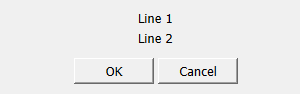
The module MessageBoxExt displays a modal message dialog box with arbitrary title, message, buttons and an optional icon.
It should be used by applications to display messages or obtain user confirmations.
Usage
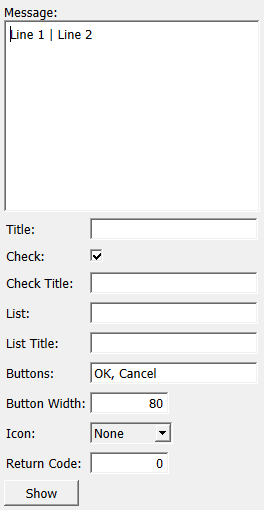
The application configures the message box by setting the message, title and buttons fields.
Optionally, an icon can be selected in the Icon field, and the Button Width field can be used to specify the width of each button.
Next, the application displays the dialog by touching the show field or by calling showModalDialog("dialog") on the module.
When the dialog is closed, the return value and the Return Code field indicate the number of the button that was pressed, or zero if the dialog has been closed using the window’s close box.
Windows
parameters
dialog
Parameter Fields
Field Index
|
|
|
|
|
|
|
|
|
|
|
|
|
|
|
Visible Fields
Show
- name: show, type: Trigger
When pressed, the modal message dialog is shown.
This is the same as calling
showModalDialog("dialog")on the module.
Message
- name: message, type: String, default: Line 1 | Line 2
Sets the message to be displayed.
Multiple lines can be separated by vertical bars ( | ).
Title
- name: title, type: String
Sets the window title.
If left empty, the title can be set using the method’s
showModalPanelWithTitlemethod.
List Title
- name: listTitle, type: String
Sets title for the optional list box.
If left empty, the list box is not shown.
List
- name: list, type: String
Sets the line entries for the list box separated by the default list box separator.
Check Title
- name: checkTitle, type: String
Sets the window title.
If left empty, the checkbox is not shown.
Check
- name: check, type: Bool, default: TRUE
Gives an optional boolean flag.
Icon
- name: icon, type: Enum, default: None
Defines the icon to be displayed beside the message.
Values:
Title |
Name |
|---|---|
None |
None |
Alert |
Alert |
Question |
Question |
Critical |
Critical |
Return Code
- name: returnCode, type: Integer, default: 0
Shows an integer indicating the button pressed to close the dialog.
Contains 0 if the dialog was closed using the close box in the window title, otherwise the index of the button pressed (numbered from left to right, starting with 1).