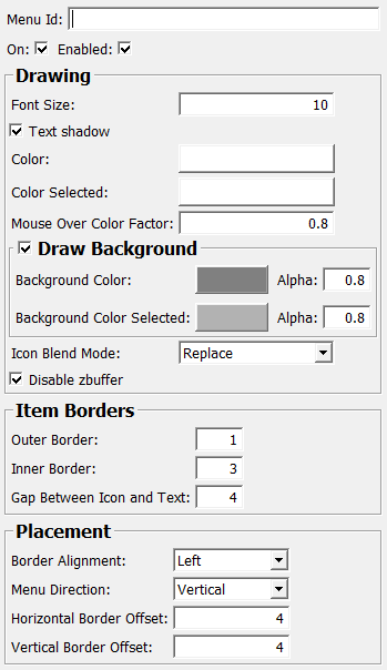
Purpose
This node shows a menu of SoMenuItem items arranged at a border or corner of the view.
Usage
Interaction
The default mouse button is the left mouse button.
This can be overridden with SoInteractionMapping.
Tips
You should place this node before any other node that reacts to the same mouse/key button combination, so that this node has the chance to react to the mouse button first. This is because the menu is always displayed on top of the other scene, and a user would expect a mouse click on the menu to act on the menu and not on something that is show behind the menu.
Output Fields
Parameter Fields
Field Index
Alpha (backgroundAlpha): Float |
Enabled: Bool |
Menu Direction: Enum |
Alpha (backgroundAlphaSelected): Float |
Font Size: Integer |
Menu Id: String |
Background Color: Color |
Gap Between Icon and Text: Integer |
Mouse Over Color Factor: Float |
Background Color Selected: Color |
Horizontal Border Offset: Float |
On: Bool |
Border Alignment: Enum |
hoverItemID: String |
Outer Border: Float |
Color: Color |
Icon Blend Mode: Enum |
popupDelay: Float |
Color Selected: Color |
Inner Border: Float |
Text Shadow: Bool |
Disable ZBuffer: Bool |
interactionProviderID: String |
Vertical Border Offset: Float |
drawBackground: Bool |
lastClickedItemId: String |
Visible Fields
Alpha (backgroundAlpha)
-
name:backgroundAlpha, type:Float, default:0.80000001, minimum:0, maximum:1
Background Color Selected
-
name:backgroundColorSelected, type:Color, default:0.699999988079071 0.699999988079071 0.699999988079071
Alpha (backgroundAlphaSelected)
-
name:backgroundAlphaSelected, type:Float, default:0.80000001, minimum:0, maximum:1
Mouse Over Color Factor
-
name:mouseOverColorFactor, type:Float, default:0.80000001, minimum:0, maximum:1
Border Alignment
-
name:borderAlignment, type:Enum, default:BORDER_LEFT¶ Where to put the menu.
Values:
| Title | Name |
|---|---|
| Top Left | BORDER_TOP_LEFT |
| Top Right | BORDER_TOP_RIGHT |
| Bottom Left | BORDER_BOTTOM_LEFT |
| Bottom Right | BORDER_BOTTOM_RIGHT |
| Top | BORDER_TOP |
| Left | BORDER_LEFT |
| Right | BORDER_RIGHT |
| Bottom | BORDER_BOTTOM |
