MessageBox
-
MacroModule¶ genre GUIauthor MeVis Medical Solutions AGpackage MeVisLab/Standarddefinition dialogs.def keywords info,alert,warning,confirmation,dialog,display
Purpose
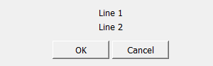
The module MessageBox displays a modal message dialog box with arbitrary title, message, buttons and an optional icon.
It should be used by applications to display messages or obtain user confirmations.
Usage
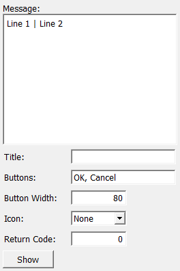
The application configures the message box by setting the message, title and buttons fields.
Optionally, an icon can be selected in the Icon field, and the Button Width field can be used to specify the width of each button.
Next, the application displays the dialog by touching the show field or by calling showModalDialog("dialog") on the module.
When the dialog is closed, the return value and the Return Code field indicate the number of the button that was pressed, or zero if the dialog has been closed using the window’s close box.
Parameter Fields
Field Index
Button Width: Integer |
Buttons: String |
Icon: Enum |
Message: String |
Return Code: Integer |
Show: Trigger |
Title: String |
Visible Fields
Show
-
name:show, type:Trigger¶ If pressed, the modal message dialog is shown.
This is the same as calling
showModalDialog("dialog")on the module.
Message
-
name:message, type:String, default:Line 1 | Line 2¶ Sets the message to be displayed. Multiple lines can be separated by vertical bars ( | ).
Title
-
name:title, type:String¶ Sets the window title. If left empty, the title can be set using the method’s
showModalPanelWithTitlemethod.
Buttons
-
name:buttons, type:String, default:OK, Cancel¶ Sets the button titles from left to right, separated by commas.
Button Width
-
name:buttonWidth, type:Integer, default:80¶ Sets the width of each button. If set to 0, button widths are selected automatically.